Month: August 2016

Eternity’s Island

The author says:

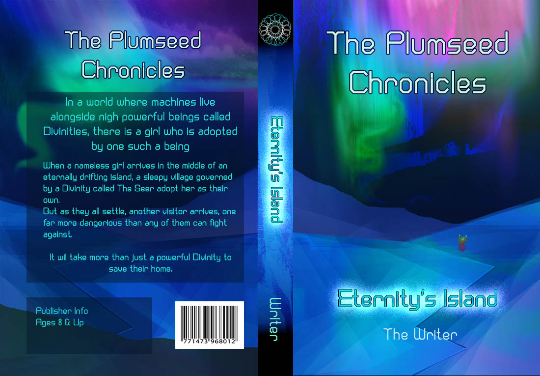
A science fantasy series for children, The Plumseed Chronicles: Eternity’s Island takes place in a world of machines. Eternity’s Island focuses on a nameless girl who arrives on a drifting island with no memory of who she is. As she explores the island that is her home alongside her newly-adopted family and the sleepy village they live in, the girl soon discovers that something else far more dangerous and sinister followed her to this little island. Inspired by A Wrinkle in Time, Doctor Who, and The Golden Compass, The Plumseed Chronicles as a whole is intended for those who love stories that deal with scientific concepts played around with magic.

ES_ConceptA

ES_ConceptA

Nathan says:

This is a competent (though not terribly exciting) cover markup, but it completely misses your target audience.

Let’s do some market research. I pulled up Amazon’s page for science fiction and fantasy, ages 9 – 12.  These are the bestsellers:

children

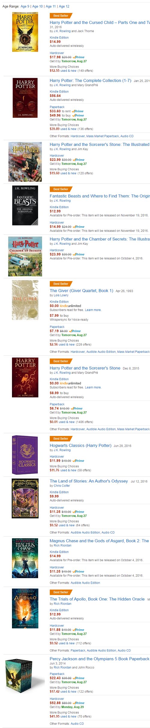
Now, I’ll grant you that it’s very skewed toward name recognition; the only book on here that isn’t related to Harry Potter or Percy Jackson is Lois Lowry’s The Giver.  But still, these are the books that your target audience already knows that they like.  And how does that target audience expect books aimed at them to look?

  • Big words, slightly ornate but still very readable
  • Clear imagery, showing characters in adventurous situations (there are a couple that rely only on an iconic image, but they can do that because they’re Harry Potter books, and readers already recognize the owl or round-glasses-and-scar imagery; you don’t have that recognition)

Compare that to your cover: An unusual but sedate typeface (which is, by the way, completely wrong for your back-cover copy — that needs to be readable, readable, and readable), an abstracted pseudo-landscape in tones of blue, and — if you look really close — something that might be the main character:

ES_ConceptA

This is not how the target audience for your book is accustomed to being marketed to.  It will not snare the attention of the people whose attention you want to snare.

My advice, simply, is to start over.

(And semi-related: You want to give that back-cover copy another scrub. It’s ungainly, and some of the grammar is questionable at best.)

Other opinions?


Blood-Lines [resubmit]

The author says:

This is a freshly minted resubmit of an earlier cover for Blood-Lines, Book I of my Tales of the Weird Wild West series that I will be self-publishing at some point in the near future. Although admittedly I’m still very much using a pre-made template (for a newbie at this, it’s also just that much easier for someone of my artistic level to accomplish what they can 8)), this version seems to have a much better look and feel to it for what I wanted the cover to tell someone at first glance. Hopefully just the right mix of a little bit of hook, some line and a sinker as it were 8)

cover_bloodlines9

cover_bloodlines9

[original submission and comments here]

Nathan says:

It’s true that someone can tell the genre much easier from this cover. Unfortunately — and this sounds a lot crueler than it really is — someone can also tell that you have limited skill/experience in cover design, and that this book is self-published, by which I mean the cover isn’t up to professional levels.  And given that you’re releasing your book to compete against the Big Boys, you can’t afford giving any indication from the get-go that your book isn’t as worthy of a customer’s money as a traditionally published novel.

Indicator #1: The Bleeding Cowboys font.  Yes, I told you previously to find a distressed Western font. But don’t use this one.  It’s been so overused and overexposed in the past decade, on all sorts of inappropriate projects, that no one with any familiarity with book cover design would touch it.  A pity, because this is the kind of book it would have been good for before it became a punchline.

Indicator #2: The floating zombie girl head.  Over at LousyBookCovers.com, this would fall into the running gag of “Photobombing [something]!” — where an element that’s obviously extraneous to the main image has been added.  In this case, you’ve taken an otherwise non-weird Western scene, and added an element that is unrelated to the rest of the image in both style and layout.  Yes, a zombie head is a good indication that this isn’t a typical Western, but again, it’s also an indication that a non-professional put this cover together.

I know that indie writers like the “do-it-yourself” ethic, but remember that you’re not just the writer, you’re the publisher. That means that you need to do the best you can to make sure that the book has a chance on the open market. And I know the budgetary strictures that self-pubbers can be under, but the slogan for this site is true: “In self-publishing, there’s nothing more expensive than a bad cover.” Because a bad cover will cost you sales, and you can’t afford that.

Other comments?

Gift of the Master

The author says:

Tommy Travers is a teenaged recluse who dreams of entering a book and never coming back. When he turns 15 his wish is granted but unlike reading, the consequences are real. YA/Adult novel

Book 1 new background

Book 1 new background


Nathan says:

The artwork’s terrific.  The type treatment, not so much.

As you can see from the thumbnail, the title retreats into the background, and the byline is practically invisible.  It’s even worse on a black-and-white ereader device:

Book 1 new background bw

The bottom half of the image, under not-Godzilla and the ship, has no essential detail in there.  Rather than try to crowd the title over not-Godzilla’s head, I would leave the series title up there (with a larger and clearer icon of an open book worked into it), then put the title below, in clear bold letters on two lines:

GIFTS of
the MASTER

I’d probably try putting the text in a white or cream with a dark border or outline.  And then I’d extend the byline across the width of the image. For both of these, you’d want a wide font, rather than the current tall one.

Other suggestions?

The Straight Dude Up in the Front House

The author says:

Sports plus romance between two dudes, Sports story about two college age dudes who meet when the straight dude moves into the front house, and they start practicing Soccer drills together, and playing on the same team. They draw closer over time, share a lot, and the straight dude finds himself in love with his slightly older mentor, coach, who’s been like a big brother, nurturing him. They run up against circumstances and ingrained attitudes and both have to get some enlightenment in order to reach a happy ending.

Dude in Front House Cover 1-1

Dude in Front House Cover 1-1

Nathan says:

Again, I’m not even remotely the target audience for this, but here’s my first big impression:

BOO-ring.

You’ve got a guy in shorts just standing there, against a white background. Even the type is dull.  Take a look at this and say, “If I saw this in a bookstore or on Amazon, what would make me want to pick this up?”

Remember, your readers have a choice, and the choice isn’t between your book or nothing. It’s between your book and the other books next to it.  Why would someone want to check out the description on your book, instead of the next book to right or left?

There are plenty of romance novels. There are plenty of gay romance novels. I’m guessing (without wanting to check) that there are plenty of sports-themed gay romance novels.  Give the readers of sports-themed gay romance novels a reason to think that this sports-themed gay romance novel is the one they should check out.

Other comments?

The Preparation For Flight 77

The author says:

This book chronicles the steps the five terrorists of Flight 77 (that hit the Pentagon) took in suburban Maryland in the two weeks prior to 9/11.

Eric Book Cover Edited

Eric Book Cover Edited

Nathan says:

The subject matter of this one practically demands that the cover content be (1) an airplane, and (2) pictures of the five hijackers.  You’ve got that part.  Now, what should you do with it?

  1. Lose the swirly filter. Seriously, I don’t even know why they include that with PhotoShop, because it’s impossible to do anything good with it.  The look you want here is “stark” — deep blacks, bold contrasts.
  2. Those cover elements, being obligatory, don’t need to be the dominant elements in your cover.  That should be your title. Nonfiction covers have an advantage over fiction covers in that regard; readers don’t mind if your cover tells them with words what the book is about. If it were me, I’d have the title take up fully half of the real estate here.
  3. While your title font choice isn’t necessarily bad, you’ll notice in other covers that as the subject of the book becomes more serious and worthy to be remembered, the title fonts tend more toward serifed fonts in capital letters.  Why? because a font that connotes two thousand years of history says, “This is important. This is permanent.  This is worth being remembered.”  Trajan Pro (aka “The Movie Poster Font”) is becoming too overused to clearly give that connotation, but there are other serif fonts that can give that same impression.
  4. Your subtitle font clashes with the title font — and I suspect, would clash with a serifed Roman font.  Try using the same font that the book text uses.  (Also, “driving tour” sounds waaay to idyllic for this subject. You’re not sending people on a terror-tourism family vacation here.)
  5. The title is centered, the subtitle is centered, the airplane is smack-dab in the middle, the five headshots are center-aligned… Why isn’t your byline centered?  I understand the impulse to add some variety, but it just ends up being the odd element out.

Other comments?