Month: April 2014

Ghosts of Blackwell

The author says:

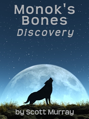
On a stormy night, Amelia Stirling meets Darren Duncan. While stuck at an old station, he could take her on the ride of a lifetime. In a tangle of confusion, could ghosts be afoot? Is danger looming in every corner or is it all an illusion?

Book-Cove4ru12

Book-Cove4ru12


Nathan says:

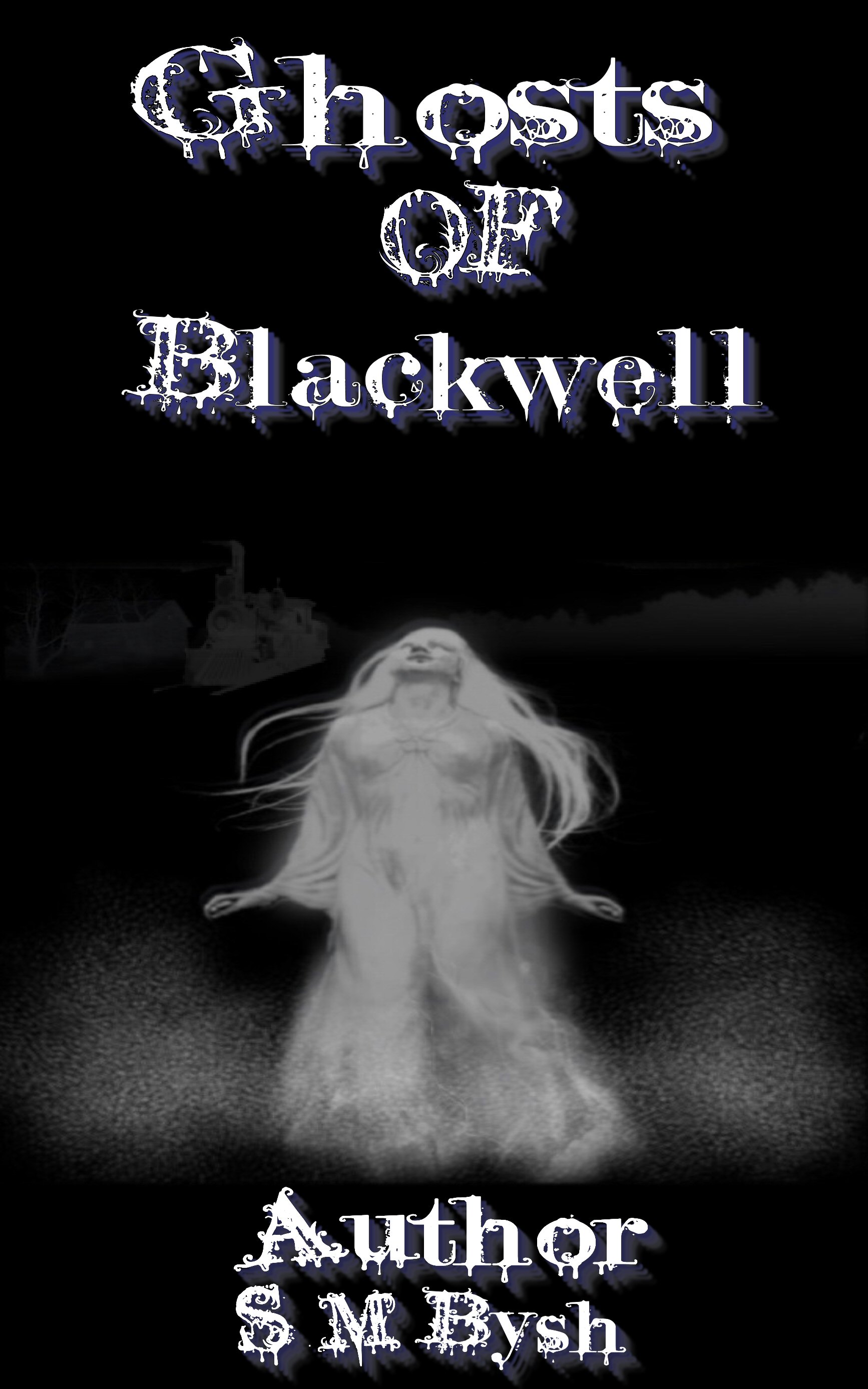
There’s only a little bit of information here, but I’m going to guess that it’s a paranormal romance. Yes?

First: There’s no need to put “Author” before your name, any more than you need to put “Title” before the title.

Second: You may think that the font contributes to the cover, but it actually detracts by competing with the illustration.  And the fact that the lines of type are all different sizes, and have been stretched different directions, doesn’t help.  (Thanks to its size and the fact that it’s in uppercase, the word “OF” looks like it’s the most important word in the title.)  The best option is to go for a plainer or more readable font — either use one that comes “pre-distressed,” or add some texture (don’t overdo it!) by overlaying a texture.

Third: The illustration looks like it’s been stretched a bit.  It’s also not of a terribly high resolution, and that’s readily apparent in contrast to the type.

Fourth: It’s okay to have the text overlap the illustration. Really.  As it is, it feels like all of the elements are separate instead of connected.

Fifth: A little bit of color? I know there’s a little bit in the shadow to the type, but it really gets lost against the monochrome illustration. It doesn’t have to be garish, but even a tint to the shadows could go a long way.

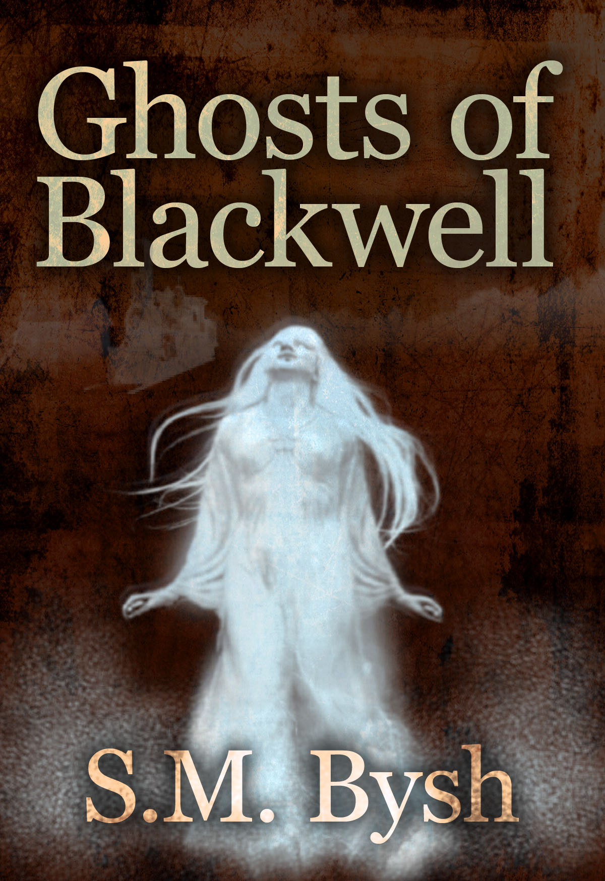
Since the image sent was large enough to work with, I did a five-minute revamp to show some of the things I’m talking about. Again, the description is a little shy on detail, so I’m not at all sure that this version fits the genre or tone of your book, but…

Book-Cove4ru12

I think that’s a good starting list from me. Anyone else?


Life Is Not Enough

The author says:

Slightly above average author Bob Brown, wrote about understanding you, others and the meaning of life in his book, Personal Wisdom. Life Is Not Enough is the backstory to that book; how Brown decided to seek to discover the meaning of life and explain what it is. This memoir describes the moment that stimulated this search, his intellectual and emotional guides, and what he learned over his fifty years of looking. Audience is older adults.

BookCoverImage

BookCoverImage


Nathan says:

The first thing I’d say, from looking at the thumbnail, is that the color scheme is too murky. It doesn’t have to be flashy — a memoir shouldn’t look like a K-Mart flyer — but it all kind of fades to gray.  A slightly deeper background color will also let the title be read more easily at thumbnail size.

The second thing I’d say is that the background detracts more than it adds.  I can only tell (guess?) what it is at thumbnail size; all full size, it’s just a digitized something or other. But it’s distinct enough that it draws attention, and then frustrating the viewer who doesn’t see any point in it.  If the original image you worked from is big enough, then I’d say to try again and render it only just blurry enough to keep it in the background from the headshots and text, but not enough so that it’s a mystery at full size.  (If the image you worked from isn’t big enough, find another image.  Obviously, it must not be important to have this specific image, because if it were, you’d let us see what it is.)  While you’re at it, look at the most visually complex area of the background image; it’s right behind the title, again distracting from it.  Rearrange those two elements so they’re not competing against each other.

The third thing I’d say is that the subtitle (or, as it were, supertitle) font should be replaced; it’s readable, yes, but it’s also so common that it looks like it was chosen without thought.  (And look at how the letters of “GUY” are mashed together.)  And while I understand that the box around the byline is to call attention to it and separate it from the background, that would really only make sense if the background were something that shouldn’t be obscured; instead, I’d recommend you enlarge the byline from side to side and center it, and let its greater size make the box unnecessary.

Well, that’s enough from me. Anyone else?

Koxinga of Taiwan

The author says:

This is a modest digest of what should be known about the life and deeds of Koxinga (Zhèng Chénggōng), the Ming military mandarin who founded Chinese Taiwan, and belonged to a family of international traders commanding a vast fortune and a fleet of merchantmen. Sometimes, instead of smoothly following its predictable course, history swerves to another direction because of an unexpected event. When Ming China was invaded by the Manchus, instead of collaborating to make even more profits, Koxinga launched a resistance movement. Yet, his fate was apparently sealed for hadn’t he been compelled by tradition to celebrate his birthday during the siege of Nanking, he would not have been defeated by the Manchus the morning after. If he had not died suddenly the year he ordered the Spaniards of Manila to pay him a tribute as to their sovereign, the Philippines would now be an overseas Chinese territory like Taiwan.

COX-cover by Ron Miller-Black Cat Studio-2014-04-12

COX-cover by Ron Miller-Black Cat Studio-2014-04-12


Nathan says:

I don’t really see anything wrong here. The only things I would do differently is (a) put the author’s last name in normal upper-and-lowercase, like the rest of the name, and (b) maybe add a tagline or short description: “A Biography of the Founder of Chinese Taiwan” or somesuch. You could drop the byline and put it under the title, or put it at the top of the cover (if you do this, I’d pull down everything on the cover — image and print — and put it in the empty space over the statue’s head).

But still, well done! Anyone else have comments?

Fightcard: The Adventures of Sailor Tom Sharkey

The author says:

The Best Weird, Historical, Humorous, Boxing Stories You’ll Ever Read! He was one of the greatest heavyweight boxers to enter the legendary squared circle during the Golden Age of Boxing. Standing a mere 5’ 8”, Sailor Tom Sharkey was one of boxing’s most feared opponents…Gentleman Jim Corbett, Bob Fitzsimmons, Kid McCoy, and Jim Jeffries all agreed he was their fiercest opponent and gave them their toughest fights. A colorful boxer both in the ring and out, he retired in 1904 after several legendary and controversial failed attempts to win the championship belt. That’s the story you know – But it’s not the end of Sharkey’s story – not by a long shot…In the tradition of Robert E. Howard’s humorous Sailor Steve Costigan boxing tales, this action-packed collection of rowdy, bawdy, burlesque, tall Texas tall feature Sailor Tom Sharkey’s adventures after he hung up his professional gloves. Thrill to Sharkey’s brush with Hollywood’s “It” Girl, Clara Bow…Get chills as Sharkey and Kid McCoy faces down a maniacal bandit…Feel the heat as Sharkey rides the rails with Jim Jeffries and the Vaudeville Carnival into a clashes with a mad scientists and mummified menaces…Watch as Sharkey plays Santa Claus to a bunch of Tammany Hall orphans and end up with a tiger by the tail – literally – and much more! These are the Untold Tales of the Wildest Tale-Teller of Boxing’s Golden Age!

SHARKEY A

SHARKEY A

Nathan says:

It’s a good, well-rendered illustration. However, it’s not exactly dynamic; the static pose means that something else needs to bring the energy to this cover, and the only “something else” you have is the text, which is in a lifeless and boring font.  But I think that if you replace the font, you can add enough dynamism to complement the illustration.  Not that you need to use the wildest fonts imaginable, but you should look at period typefaces.  How was the text usually presented on period posters and placards advertising fights? How was the magazine title rendered in the magazines in which REH’s boxing stories appeared?  That’s where I would look for inspiration.

Also, the chest tattoo looks like exactly what it is: a separate graphic that’s been modified by computer and superimposed.

Other thoughts?

Monok’s Bones: Discovery

The author says:

This is a fantasy story with wolves as the focal point. Monok is the dead wolf god. They have been separated from humans for a long time and suddenly a ship lands on their island and what everyone knows as ‘history’ begins to unravel. “Watership Down” meets “David Gemmell”. Book 1 of 3, other 2 will be called Transgression and Redemption.

x-default


x-default


Nathan says:

The cover art is professional, but unremarkable. I don’t know what details of wolf culture are in your book, but if there is any detail you could add to help distinguish it, that would help.

And with the art being fairly generic, the text needs to carry more weight.  I’d pick a font with more character. Instead of using italics to set the volume title apart from the series title, I’d use either a different font or style treatment, or a line or some other simple ornament.  And lose the “by” on the byline; it’s unnecessary.

Other ideas?