Month: March 2014

Admin: Constructive Criticism Should Be Constructive.

The commenters visible here have all been very helpful toward the covers already posted. However, there have been some that I haven’t let out of moderation.  For anyone wondering why:

This is a site for CONSTRUCTIVE criticism: Point out why something doesn’t work and how to make it better.  That purpose is not served by comments which do nothing but use such words as “awful,” “dull as dishwater,” “boring,” “zero appeal,” and offer no specific advice for how to improve it.  The authors and designers who submit their covers here already know (or strongly suspect) that their covers could be improved; it’s pointless to further drive that point home without telling how to do it better.

And lobbing insults at other commenters’ judgment and skill doesn’t help either.

Giant Robot Planetary Competition: Entry Level

The author says:

Giant robots battle for the mineral rights to an entire planet. An aspiring competitor and his support team enter into a brutal competition where not every robot pilot survives.

GRPC - 1-sm

GRPC - 1-sm

Nathan says:

Nice layout. Very clear, and makes a good thumbnail.

I would play with your fonts.  Impact started out as a great typeface, but after having become the preferred font of lolcats and other graphic memes, it’s gotten tired. Perhaps something that is even more square, to reinforce the whole robotyness.

Also, at full size, the robot fist looks fairly primitive next to the rest othe image elements, and it’s not something that could be fixed by just adding more textures; I think it needs to be replaced/redrawn.

Other thoughts? Anyone?


Locksmith’s Closet

The author says:

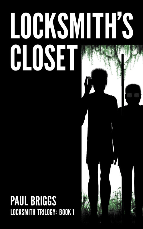
Locksmith’s Closet is a YA science-fiction novel about a boy named Lachlan Smith who discovers a portal to the future in his bedroom closet, goes through and finds an apparently uninhabited world. He and his friend Gary set about trying to discover what happened, and whether it can be changed. Meanwhile, his family has an enemy who wants to steal the portal for his own purposes.

LC cover version 2.1

LC cover version 2.1

Nathan says:

I think this is a good beginning, but we could definitely kick it up a notch.

As it is, I’m not sure if the two figures on the cover are supposed to be Lachlan and Gary or the enemy agents.  Probably the former (since one seems to be wearing shorts), but my first impression was more of shadowy Men In Black types than of two youth discovering the great beyond.  Quickish fixes might be to have them each peering in from one side instead of standing ramrod straight, and showing some color in what they’re wearing; even if you want to keep them as silhouettes, some color showing around the edges would do a lot for nailing down both who these characters are and what the mood of the book is.

That might be enough to counteract the darkness that dominates the cover; I’m not sure about the tone of the book, but the synopsis leads me to believe that it’s more of an adventure story than a suspense thriller.  It also may be useful to have a subtle pattern, something organic (or possibly wood-grained) lighten up the black half of the cover.

Other thoughts?

The Moment of Truth

The author says:

The Moment of Truth is a young adult novel set in a somewhat alternate universe. Minor romance and lots of violence, written mostly for ages 19-25, female and male (mostly female probably).

When Eloise Green finds herself a witness to a hit on a US senator, she’s kidnapped by the hit man, Nico De Niro, and kept alive as a prisoner of the De Niro mafia in order to keep the trail cold. Detective Edward Rulli is determined to find out who murdered his best friend, while struggling to keep his composure when things go nowhere. As he struggles, Nico and Eloise find themselves oddly attracted to one another, and as time goes by, she learns the De Niro family is not as close, or as well functioning, as the media portrays.

TMOTbookcoverpossible

TMOTbookcoverpossible

Nathan says:

First, critiquing the cover solely as a composition: A lot of good potential here, but a look at the thumbnail version points out the biggest design weaknesses: the title is underwhelming, and the byline disappears completely.  The first thing I’d try is sliding the picture to the right (I don’t know if there’s enough of a margin in the original image to do this), increasing the size of the title, letting the byline overlap onto the model’s ankles, and add either a diffuse drop-shadow or a dark outer glow to the text.

However, critiquing the cover as it relates to this book: Unless the synopsis you gave comes across very differently from the book itself, this doesn’t look at all like the cover that should be on this book.  If I were to guess at the novel based solely on the cover, I’d say it’s the story of a professional woman who’s at a crossroads or a crisis and uses an extended vacation to find herself.  This cover says nothing to me about politics and organized crime, running from a hitman, or adrenaline-fueled romance.

Other thoughts?

A Sword Into Darkness

The author says:

HUMANITY IS NO LONGER ALONE IN THE UNIVERSE. AN UNKNOWABLE THREAT APPROACHES EARTH . . . AND WE ARE COMPLETELY UNPREPARED TO FACE WHAT’S COMING.

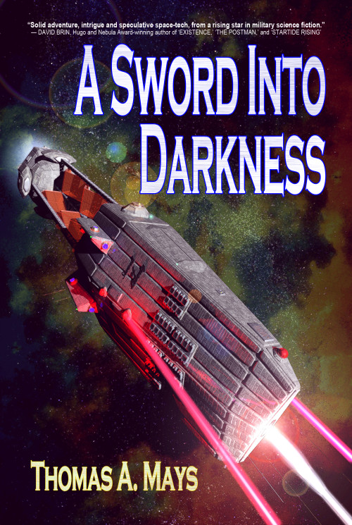
Aerospace tycoon Gordon Elliot Lee cannot stand idly by while a mysterious alien presence from Delta Pavonis bears down upon mankind’s only home. Shut out from NASA and military support, Gordon is forced to go it alone, to sow the seeds for an entirely new sort of planetary defense: a space-based naval force.

Joined by Nathan Kelley — a bloodied naval warrior, scarred by his own actions in the waters off North Korea — and Kris Munoz — an avant garde scientific genius with more ideas than sense — these three will scour the very edges of fringe science and engineering to attempt development of Earth’s first space navy in time to oppose the Deltan invasion.

Beset by ridicule, government obstruction, industrial espionage, and their own personal demons, it will take a miracle just to get off the ground. But the challenges on Earth are nothing compared to what awaits them in space. Against an unknown alien enemy with vastly superior technology, a handful of human scientists and warriors must become the sword that holds the darkness at bay.

MISSILES WILL FLASH, RAILGUNS WILL RUMBLE, LASERS WILL BURN, AND DEFENDERS WILL DIE.

IF THEY FAIL, OUR END IS AT HAND.

ASID Front Cover 2

ASID Front Cover 2

Nathan says:

The only improvement that leaps out at me is the title font. I’m wondering if, instead of a contemporary font with a texture to science-fictionize it up, things would work better with a slightly technological font (or even just a squarish sans-serif one) without the texture.

Other than that, it looks like it’s exactly what it’s supposed to be.

Other thoughts?