Category: Covers

Glory on Mars

The author says:

A one-way journey to Mars may be a mistake. Colonization of Mars is in trouble when the colony psychologist, one of the first eight settlers, commits suicide. Four more settlers are now on their way, bringing renewed hope – and a cat. Emma volunteered so she could explore Mars in her robotic walkabout suit. Even if she gets the chance, that may not make up for everything she left behind. Mars is a hostile planet, danger follows from Earth, and an inexplicable sense of desolation cripples the settlers’ efforts. Would you go?

Science fiction set in the near-future, at the first colony on Mars. Hopefully will appeal to readers of scifi with an emphasis on the science. Some violence and a little romance, but mostly the struggle to survive, explore, and figure out what’s going wrong with the settlement.

Nathan says:

There is no single major problem here, but there are a lot of little issues that, added together, may tip the scales away from you in the eyes of potential buyers.

  • The inconsistency of the black border around the title is confusing.
  • There’s an overabundance of mid-range orange tones, mushing everything together.
  • Mars taking up the perfectly round porthole gives us a crescent of black which ends up being the most eye-catching part of the cover.  You could easily solve this by having the porthole be a different shape.
  • Shadows are inconsistent; the rock face is lit from the left, but the cat is lit from the right.
  • Problems with your cut-and-pasting: the front of the cylinder pedestal is obviously flat instead of rounded, the edges of the cylinder don’t line up with the top, the borders of the porthole are completely texture-less in contrast to the stone wall, the black space in the porthole overlaps onto foreground elements.
  • The cover may make perfect sense once you’ve read the novel, but it doesn’t make sense when seen fresh: If we’re seeing Mars through that porthole, what red rocky place could we be in?  Why aren’t we in a spaceship with riveted, steel-blue bulkheads instead?

Like I say: No single big problem. But it definitely needs a thorough tweaking before it’s ready to compete for eyeballs on Amazon.

Other observations?
 

Loveweaver

The author says:

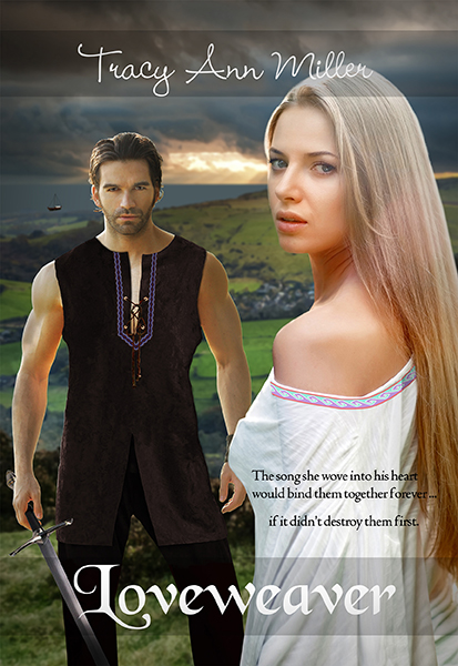
Historical Romance. The year 895. Slayde’s job as an top military leader of Kent is to rid England of the last of the Viking raiders. But Llyrica is no ordinary Viking. She’s a beauty with a mysterious past … and a talent for weaving song spells. Even as Slayde saves her from drowning, he knows Llyrica will be a dangerous distraction. Llyrica is now a stranger in a strange land on a mission to fulfill a deathbed promise. But she must also find her missing brother. This man, Slayde, known as The StoneHeart in his country, seems determined to block her at every turn. And yet she can’t help but be drawn to the affectionate, loving side of him that awakens when he sleeps – The sleepwalker. Unknown to both Llyrica and Slayde, each will use the other to accomplish their quests. Both will also fall under the song spell that she wove into the braid of his tunic. Will her Lovespell ensure a happily ever after for them? Or condemn them to a love that was never meant to be?

Nathan says:

It’s a fair-to-middling example of its kind: A historical romance cover which, while not terrible, screams “self-published.”  Why?

  • First thing I noticed: That male model.  He’s almost as overexposed in indie covers as Jimmy Thomas.
  • The edges of every element composited into the cover are distractingly crisp: It’s obvious at first glance that the man, the woman, and the landscape are separate images, that the sword isn’t really in the man’s hand, that there’s something funky about the man’s right arm and his tunic…  My suggestion would be to try out a very subtle colored texture layer and see if it helps tie all the elements together.
  • The type placement seems to be determined by desperation more than design.  I appreciate the gray bars you used, especially beneath the title where it overlaps both dark and light backgrounds, but it still seems shoved toward the bottom.  And is there a reason that it’s not larger?  I think adjusting the size upward might take care of that “wedged out of the way” look.
  • The font for the byline is not only hard to read at anything less than full size, it’s awfully twee for a historical romance.

Other comments?

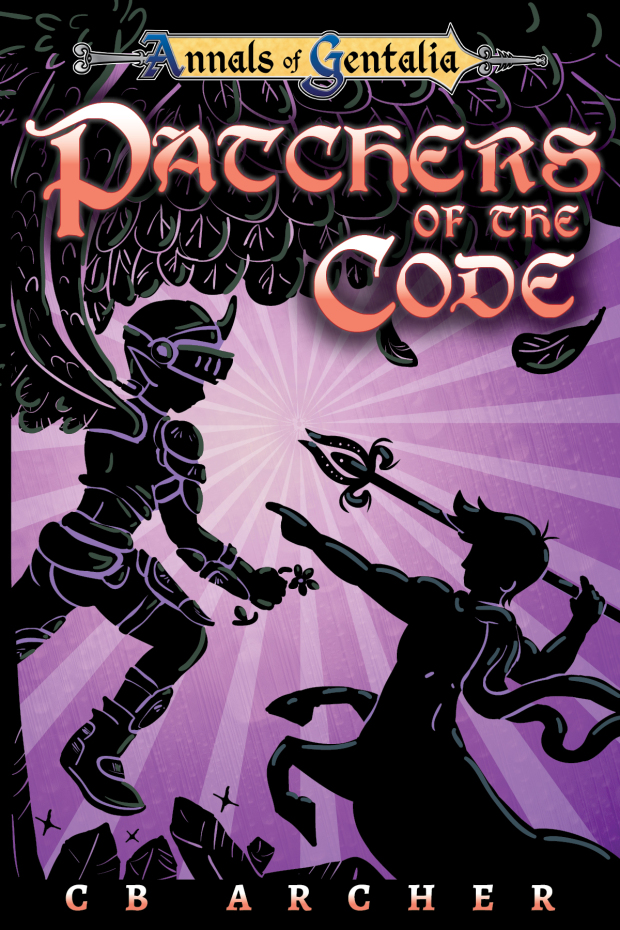
Patchers of the Code

The author says:

Yes. This is happening again. Rejoice! The third book of my Elfrotica series is now covered, with this cover. The name was changed from Redeemers, as that didn’t fit so well. So I present to you Patchers, now with centaurs! (As a bonus I remembered to put highlights and the background solid colour thingies in this one before submitting this! A new record) The angel was going to have a giant sword, but there is no room for it. He has a flower instead. I was thinking of maybe using a dagger, as flowers are not that intimidating but are in the book. He doesn’t actually have a dagger in the book, but it would look more ‘dangerous’.

Nathan says:

I will, of course, go to hell for what I’m about to say:

Phallus harder!

I think that each successive cover needs to be even more suggestive, juuuust inside the bounds of plausible deniability.  I went into this saying, “Surely there’s gotta be some suggestion of phallic imagery in the spear…” Nope.  And you’ve got a centaur, without ever playing with the visual idea of “hung like a horse?” For shame!

(Also,”Patchers” isn’t very readable in that font.)

Anyone else? Also, don’t tell my mom.

Mrs. Hartley and the Senator

The author says:

This is a nonfiction book. It is 1895. A young artist moves into the top floor of a bank building in frontier Reno, Nevada. The bank owner slips something into her drink and, well, has his way with her. The book is told almost completely though newspaper stories of the time, with transitions from one to the other by the author.

Nathan says:

An interesting premise.  And the cover’s professionally done.  But I don’t know that the cover as it is will draw in the audience that would want to read this account.

One of the tests of cover design often mentioned in the comments here (and which I will thus shamelessly steal) is, “Would someone who doesn’t understand English be able to look at the cover and tell what the genre and tone is?”

If I didn’t understand the text, I would assume that we’re looking at possibly a detective story (the newspaper background would lead me there), but I would assume, I don’t know… a chemical or scientific angle? (The drink in the hand isn’t distinctly enough a shot glass at first glance, and coupled with the newsprint, I’d jump to the conclusion of some sort of newsworthy chemical announcement.) And the typefaces chosen say neither “Reno, Nevada” nor “1985.”

Here’s what I’d do:

  • For the title, bylines, etc., I’d find some actual fonts used in newspapers of the time.  If need be, I’d get things a little more Western-looking than the actual fonts (small-town newspapers didn’t WANT to look small-town, after all), but I’d at least use the original fonts as a touchstone, including the wear and printing mistakes that would show up in newspapers of the time.
  • The newsprint is a good idea; I’d put it in several clippings at overlapping angles, riffing off the idea that there are several disparate accounts being assembled here.
  • Rather than a male hand triumphantly holding a drink aloft, I think you’d get a lot more mileage out of a female hand, on the floor, a spilled drink next to it.  There’s a lot more drama to be had there.

Other ideas?

Burner

The author says:

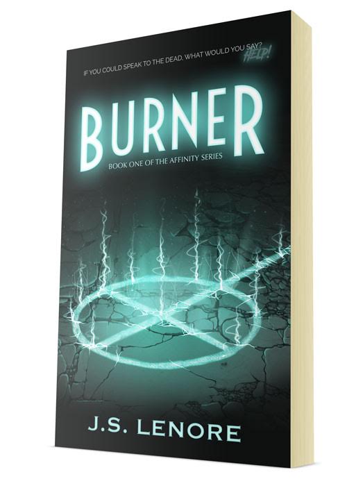
Homicide detective Kim Phillips isn’t like the other officers of the Chicago Police Department. She’s quiet, isolated, and she can speak with the dead. Born with the ability to see into and interact with the afterlife, she is a Burner: a person tasked with hunting down dangerous spirits and sending them to the other side. When Kim exorcises the ghost of a young girl, she’s dragged into a new and unsettling case, one where people like Kim are being killed. The only problem? There’s no connection between the victims, and no proof that they were murdered in the first place. Kim has to catch the killer before he finds his last victim and unleashes an unknown evil on the world.

Burner, the first book in the Affinity Series, is a dark exploration of how life and death are only separated by a single breath and how even those with power can be powerless.

Nathan says:

I think this is a very professional cover — the limited palette works well with the focal element of the art, the fonts chosen are distinctive without being overloaded with novelty… I think it says “urban fantasy novel” very well.  However, as the story is also a police investigation, I think it would work better if you could find some way to say “urban fantasy crime novel.”

Could there be yellow traffic lines on the ground, underneath the glowing sigil (muted to match the color scheme, of course)?  Or some police tape in the shadows behind the title? Or a pair of handcuffs on the ground by the byline?  I would brainstorm on some simple addition like that to add the angle of police involvement to the cover.

Other ideas?

(And since everyone expects me to say it: “Burner? I don’t even KNOW ‘er!”)