The author says:
Local TV news reporter deals with a worldwide plague of antibiotic resistant bacteria, a conspiracy to cover up a new skin disorder in children, and his old high school nemesis forcing himself back into his life.
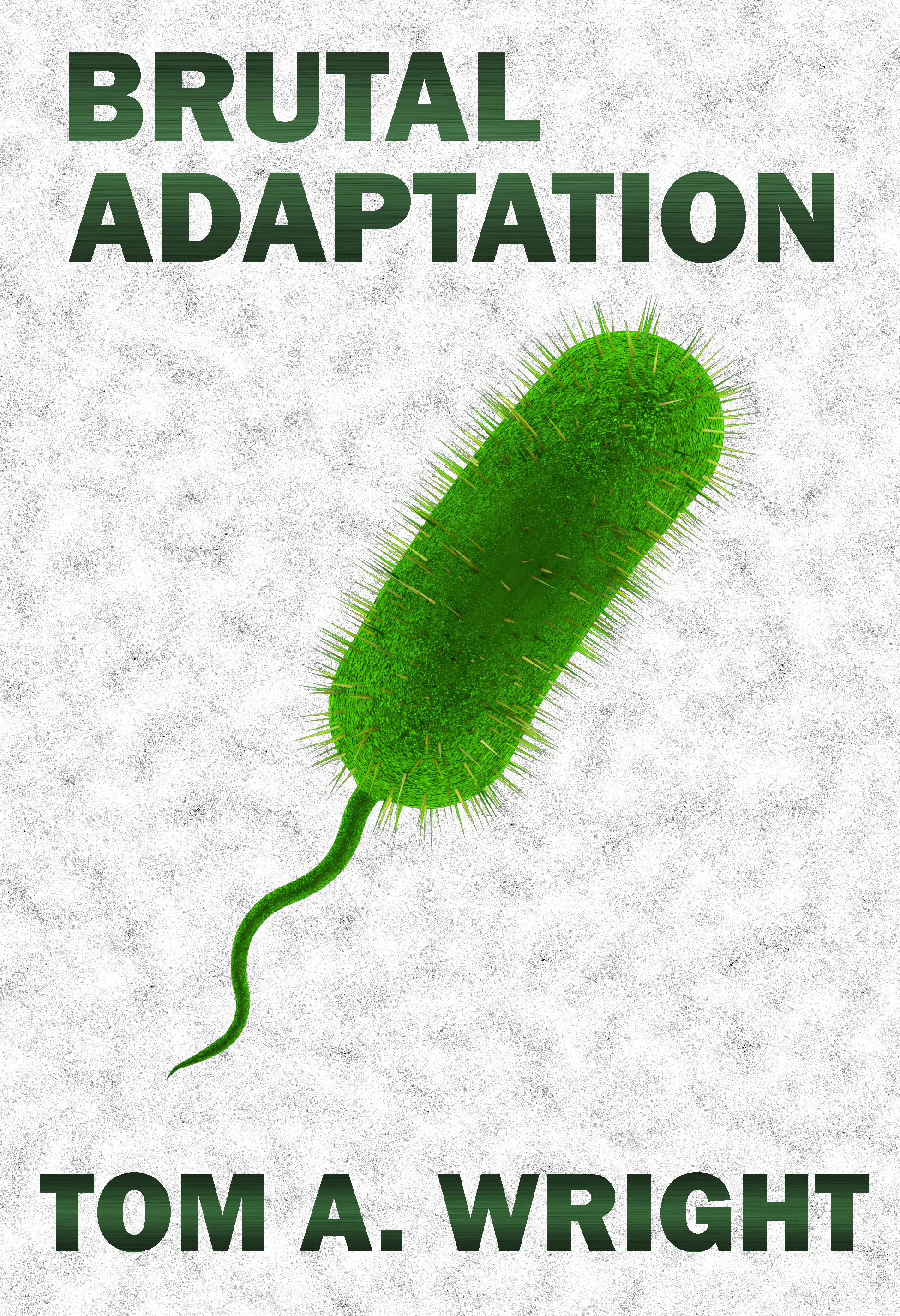
This is my newest proof-of-concept for this book. I took the advice of others and tried to mimic books from the Medical Thriller genre’. Keeping the background a solid white, however, just looked too sterile, so I added a grainy texture to it. And sorry to all those who preferred the round bacteria over the pill shaped ones, but google-searching images of specific antibiotic resistant germs displayed more of this style then the others. Besides, I believe the round ones look more stationary and docile while the long ones look active and aggressive.
[original submission and comments here]
Nathan says:
It… looks like a cross between a pickle, a tampon, and a sperm.
I think you’re moving in the right direction, but it needs a lot more refinement.
- I don’t know why, but it seems that a taller font (usually sans serif, but not always) works for the medical thriller genre.
- With the, um, ease with which the image of the germ could be misinterpreted, a visual cue that we’re looking at something microscopic would help a lot. Googling “view through a microscope” shows me this:
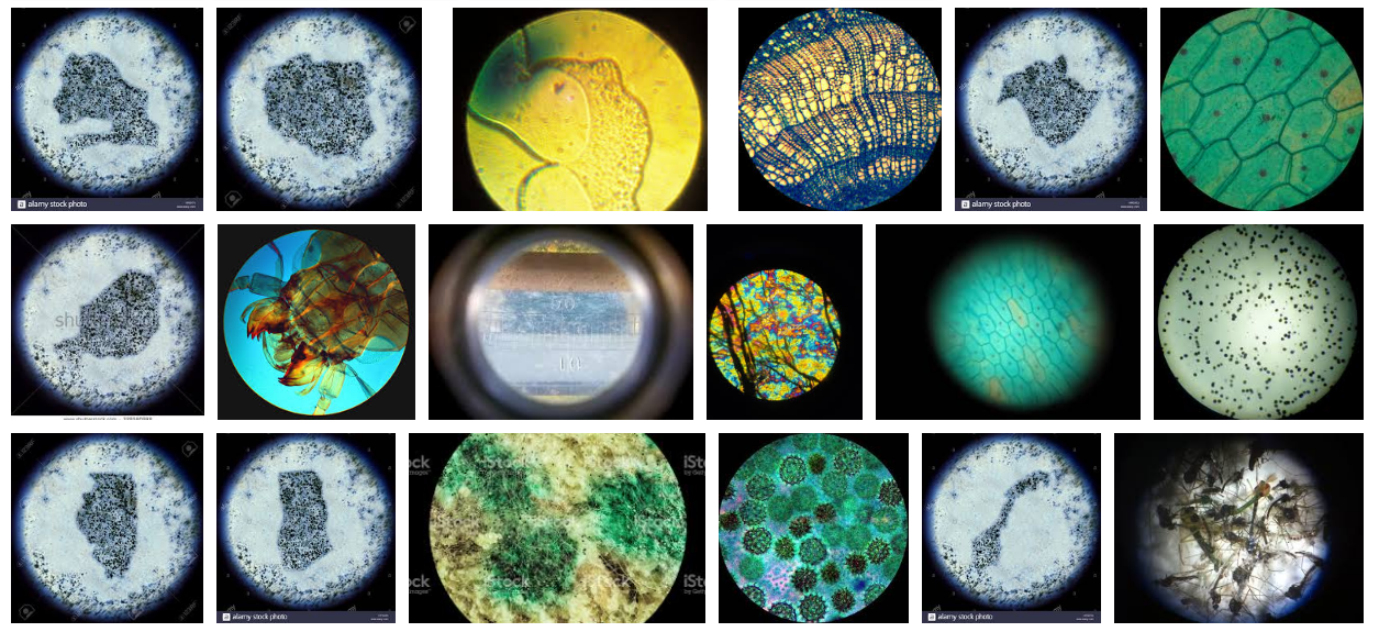
I think showing the blurry circle of the microscope is the main visual cue missing.
Put that together with your revised image, and here’s a five-minute redo:
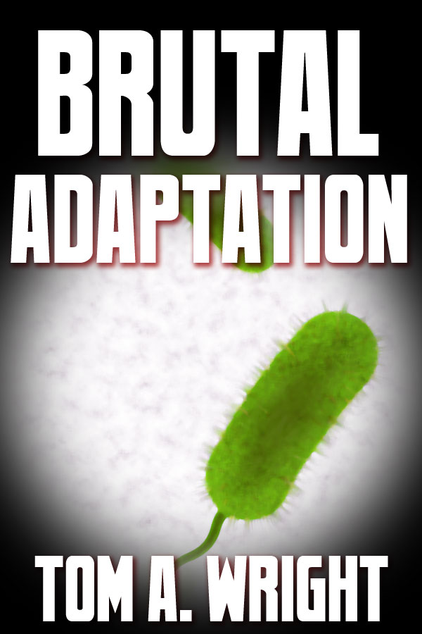
I’m not happy with how the microscope effect turned out — I’d want to refine it to make it more immediately recognizable as such — and the font is the first tall one I came across, but hey, five minutes.
Other comments?