![]()
![]()
The author says:
Reconstructing Christmas is a closed-door sweet romance novella with Christian themes, set in Atlanta during the Christmas season. Taking place one year after the events of For the Love of Rhett, the story centers on love, healing, and renewed hope against a festive Southern backdrop. The target audience is readers of sweet, faith-filled contemporary romance who enjoy emotionally rich holiday stories and gentle happily-ever-afters, particularly fans of authors such as Debbie Macomber, Becky Wade, and Denise Hunter.
Nathan says:
You mentioned that it’s a follow-up to The Love of Rhett, so I looked that up-, and found that it’s the third volume of a series:
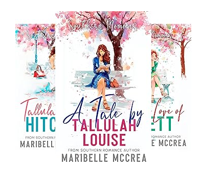
I think you’re missing a bet by not continuing the branding. A reader of your previous books should have some indication that this is a Christmas story that involves the same characters and/or setting. You should be looking at creating a Christmas-themed continuation of the common elements of your previous covers: Same typefaces and locations, same general layout… even just putting a central figure in cold-weather clothing and hanging ornaments on the background tree might be enough.
Even if you want to indicate more of a break between the previous trilogy and this volume, you should look for ways to make it stand out, because as it is the cover of Reconstructing Christmas is far too generic. It looks like the result of asking a LLM for a Christmas romance cover. So even if you don’t want your readers to immediately connect this book with the previous ones, just things like carrying over the title and byline typeface and layout at least preserves an element that isn’t so bog-standard.
Other comments?