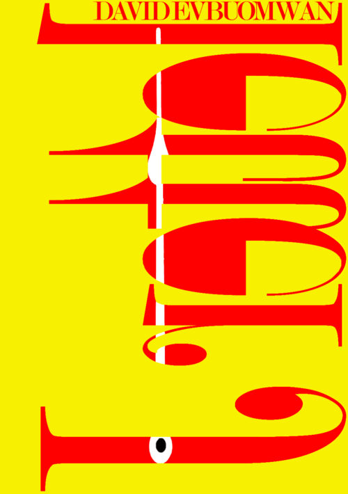
This isn’t Angus Fonteyn’s first time in space. He’s been selected for NASA’s covert mission that’s sending just two individuals 500 years to the past. Much to his dislike, rookie astronaut, Janine Lyton, is selected as his copilot. During the mission, Angus experiences visions and extreme hallucinations but is barely alarmed by them. The real problems start when he successfully persuades Janine into travelling with him to the distant future; his pretext being a half-baked plan to observe how humanity’s actions have affected Earth, then report them back as prophesies in the present. In 2046, Angus and Janine get distracted by the wonders of human innovation, and their adventure spirals into an absurd, harrowing nightmare involving time loops, distorted realities and a courtroom in England. They are forced to suffer the consequences of a human innovation tampering with one of the most defining things in the universe.
Nathan says:
Wow. This one will be hard to critique without sounding mean, but…
No.
This cover is unreadable. (Hell, I’m still not sure on what the title is.) It gives no clue as to genre or content. It will actively deter interest.
Your cover is your billboard. It’s the half-second you have to send out a signal that says, “Hey, reader who likes this kind of book — this is the kind of book you like!”
You need to jettison this and begin again. Try to appeal to your target reader, not confuse or frustrate him.


Graphically, the cover is striking. Sadly, that’s its only virtue. The title is absolutely unreadable. Moreover, there isn’t a clue as to the nature, theme or idea of the book.
The author must have been inspired by another cover or piece of art, and thought it would be clever to use something similar here. I understand that impulse. There is something kinda artsy and cool about it as a stand alone image, but as a cover for your book, it completely misses the mark.
I agree with Nathan that you need to start over from scratch.
Hi:
Boy…I really, really, really do not want to pile on, but NO. Just no. This is not doing its job. I always say (tediously often, ask the others here) your cover is clickbait and this is not doing the job at ALL. And for clarity, in case you’re one of those folks who thinks that having something indecipherable will make people click out of curiosity–they don’t and won’t. If it’s not an immediate grab, an immediate pull, they’re gone and that’s a lost sale.
Start over. I don’t know what you were contemplating here or why you felt it would work. I get the whole visions, hallucinations, trippiness thing, and maybe that’s what you think the cover is saying, but until you explain it to someone, they’re not going to get that, and that, my friend, is the Kiss of Death for a book.
Never leave people wondering what the book is about, if it’s their genre or area of interest…and this book says neither. I further realize that graphically representing time loops, visions, and so forth ain’t easy–but almost anything would be an improvement. I’m sorry that I felt I had to say that.
Good luck and please, really, DO bring it back with your next concept!
Look at the cover of James by Perceval Everett. Is that what you were going for, with the big J? It’s OK to use a text treatment as a cover, but it MUST be readable.
About all that I can say about this cover, everyone else has already said. With all due respect, Mr. Evbuomwan (and since you have as unusual a name as that, your next cover draft should definitely feature your byline more prominently), a book’s cover is advertising first and foremost, nothing else. As even Hollywood’s crassest and most talentless mercenary hacks used to know, advertising is no place for abstract art; if you’re going to do something all weird and symbolic and subtextual and all that artsy-fartsy stuff, you do it in the story itself, not on the movie poster and/or book cover.
As such, a cover consisting of little but a backwards and upside-down uncapitalized title (and yes, I think you read that title right, esteemed host) in red on a yellow background with what looks a little like a safety poster symbol for a comet headed for the ground lurking among that title’s letters is just not going to draw the paying customers. The title by itself isn’t bad: Letter J is a bit intriguing in a “What’s so special about that?” kind of way (“I mean, you can get a bunch of points for a J in a Scrabble game, but…”); but the title by itself—especially when you insist on making it so much more difficult to read by running it backward and upside-down and refusing to capitalize it properly—isn’t going to carry the cover. Text-based as the medium of literature is, your cover needs imagery.
From your summary, this story sounds like it’s heavily borrowing much of its plot from the time traveling framing devices of the original Planet of the Apes movie series (minus the titular simians) with some of the time traveling shenanigans from 12 Monkeys and Back to the Future thrown in for good measure. Those elements do sound like they could provide a most enjoyable science fiction adventure for your readers; so why not advertise your story the same way those movies’ makers did? Show us your astronaut protagonists—or at least their ship—right there in the center of your cover; set the mood—light-hearted action as in Back to the Future or dead serious drama as in 12 Monkeys—with appropriately bright or muted colors (respectively).
In short, you’ve got what sounds like a decent product with potential mass appeal; so market it that way. As I’ve long said concerning the perennial struggle between the writer’s artistic vision and the written work’s commercial viability in the marketplace, write like a starving artist, but market like a mercenary. Now that your story is written and “in the can” as old movie makers liked to say, your job as a writer is done, and it’s time to think like you’re designing the advertising poster for the movie that probably won’t but always potentially could be made from your story.