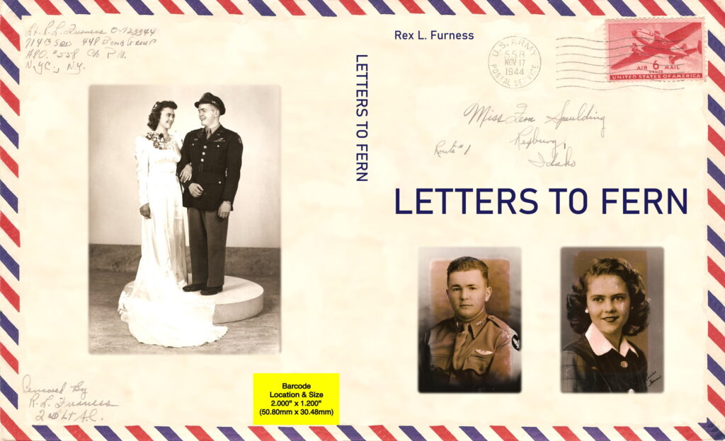
This book contains letters written from England during World War II by a US Army airman to his girlfriend and later wife in the United States. The main purpose of the book is to help their posterity remember them.
Nathan says:
That purpose is the clincher. If this is a book meant for the posterity of the letter-writer, then you have a captive audience whose attention really doesn’t need to be drawn by the cover.
My only suggestion would be a descriptive subtitle: “The Wartime Letters of Rex Furniss 1939-1945” or somesuch.
Preserving our forefathers’ stories is important, so good on you.


I like that when the cover is open flat it looks like an actual postcard. It’s clean. I would suggest adding the author name on the spine too. I agree with Nathan about adding some sort of subtitle, so people know what era/war this is.
Did you scan the actual letters for the inside, and will it be in color? I did a similar book with my father’s postcards and photos from WWII.
Thanks for your suggestions. Yes, I’m including the scanned letters in the book but not in color.
Yes, this is a rather easy sale, as the book’s subject comes with a built-in—albeit also rather limited—target audience. Even so, if you’re going to make this available for sale to the general public, there’s always room for improvement. In the case of personal letters and diaries and autobiographies and such, I’d say the target audience is something like that of any given educational institution’s yearbook: while mostly only the graduates and some of their family and friends will ever be interested in them, if somebody or something in the book later becomes famous (or infamous) and memorable, various biographers and other historians will likely want to get their hands on a copy of it for research purposes; for their sake, you may want to tweak the cover just a tad to make it more generally appealing.
On the whole, the cover’s theme and appearance are good, and the imagery makes its general contents pretty self-evident. About the only areas I see that could use some improvement:
A) The font for all the captioning is kinda bland. Speaking of yearbooks, most covers for them use fairly simple fonts that are broadly deemed dignified and elegant, so I’d recommend using some such on your book’s cover as well.
B) Yes, though most of these details are probably already known to your target audience, the cover could use a subtitle and/or tagline including some further specifics for the sake of your periphery demographic, i.e. those biographers and other historians: e.g. the real full names of these letters’ writer(s) and recipient(s) and the date range during which the letters were sent. I’m not saying to expect someone or something mentioned in these letters to be of interest to outsiders some day, just that providing these references would spark their interest and help make their research easier in the event that any such person or incident does later turn out to be of interest.
Thanks for your suggestions. I’m not happy with how busy the cover is and the proportions and balance of the title and pictures so I’ll work on.
if you’re concerned it looks too busy, maybe move the front cover photos to the back and save the wedding photo for the inside. Then you can you put your title in a nicer font, maybe three lines
(LETTERS
TO
FERN) center aligned and add the suggested subtitle in an easy-to-read script font below the title.
I also hope you’ll donate a copy to your local genealogical society? A book like this is invaluable to people researching their family history!