The author says:
After the murder of her grandmother, Dora Baskin inherits her home, a 172-year-old log house in Manitou Springs, Colorado. Was the murder a random act of violence, or something more sinister? With her new friend, Shawn, Dora gradually finds the answer in a handwritten account of one of her ancestors, Isadora Byrnes, a nineteenth century Englishwoman taken in by a Cherokee family. In the pages of this journal, they learn about the secret organization which spent decades pursuing Isadora Byrnes to America, beyond the Trail of Tears and into the Rocky Mountains, seeking to acquire the mysterious silver artifact she possessed. They also find that this organization is still around, and they still want that artifact. And they think Dora has it.
Nathan says:
Nice try, but I can see misfires at every turn.
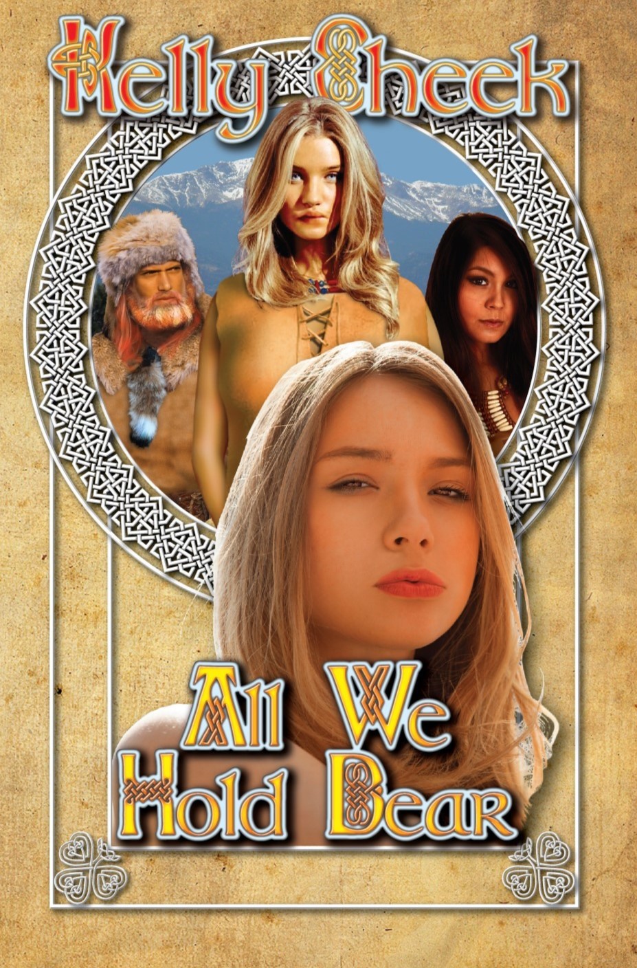
First: This is a thriller/mystery with a centuries-old secret society, right? Something like that should have high contrast and plenty of shadows, not be all sunny and cheerful. This cover looks from the get-go like it might belong to an uplifting historical novel (possibly even a “mail-order bride” romance).
Next: Most of these cheap stock image models are cheap for a reason. I have no idea what the expression is on the mail girl’s face, but it makes me want to slap her. The central girl above her looks like she’s been eating hashish brownies. And the digital airbrushing on everyone’s costumes is pretty noticeable, as are the hard edges where they were cut-and-pasted together.
Third: Nothing about Celtic knotwork says “Colorado” or “Cherokee.” Plus, its inclusion in the type (along with the internal shadow, external glow AND drop shadow) renders everything completely unreadable at anything less than full size. (And even at full size, as God is my witness, I thought the title read” All We Hold Bear.”
I think you need to scrap this and start again with a cover concept that conveys a primary impression of “suspense,” and a secondary impression of “historical.” A dark rustic cabin at night, with light coming from a single window, and clear but slightly antiquated type, would serve the sales needs of the novel 1000% better than what you have here.
Other comments?
I agree with Nathan and don’t think this is salvageable, I thought it was a young girls type of book along the lines of one of the Disney novels for girls.
I think Nathans suggestion of a cabin would be cool or maybe a girl hunched over a journal with candlelight. If you could get her face in profile and have her be shocked/scared that would be awesome but keep it dark and moody with the lighting so lots of shadows on her face and the background. Then go for a totally different font. If the Celt work is important maybe try picking one letter to spice up or using as a simple border on just one part
It’s not salvagable. I honestly thought the book was geared to Nancy Drew readers when I saw the cover and the title does look like All We Hold Bear. It’s important to have a cover that indicates both the genre and the audience it’s meant for. If you book is meant for younger females than I’d redo this cover with matching photo’s and avoid the airbrush tool. (Illustrated or otherwise.) Also, get a different text as it is hard to read, I at first thought your name was Kelly Sheek not Cheek.
However, if it is a more serious suspense filled mystery story than go for a cover that indicates exactly that. I did a Quick mock up of one using three key elements; woman, house, journal.
https://i.imgur.com/XHqLhy9.png
Typically mystery stories hide faces and suspense stories have rich, bold colours. Unfortunately my mock up turned out looking more ominous than I wanted. I haven’t read your story to know if it’s an accurate representation or not. As a tip, Your cover should be described using the same adjectives as you would your story.
If I had more time I would have added the Cherokee element, as your cover seems heavily centered on that. If I found the appropriate photo I’d persoanlly have gone with a girl in Native American garb, not a cloak.
Like this –>https://www.dreamstime.com/stock-photo-beautiful-native-indian-american-woman-walking-background-light-woods-image90473721
or this –> https://www.dreamstime.com/stock-photo-beautiful-native-indian-american-woman-legs-pikestaff-walki-walking-background-woods-image90473787
There is almost no point in critiquing this cover since it really needs to be abandoned and a new cover started from scratch. Everything about it is a misfire…not to say the least the completely inappropriate use–and overuse—of Celtic patterns throughout.
There is nothing about this cover that suggests anything you describe. I strongly suspect that you have fallen into the trap of subjectivity: you know the significance of all the cover elements because you are intimately familiar with the story…but the potential reader is not privy to this information.
You need to start from scratch. Come up with an image that suggests what seems to be the central theme of your book, which would seem to be about a “secret organization which spent decades pursuing Isadora Byrnes to America, beyond the Trail of Tears and into the Rocky Mountains, seeking to acquire the mysterious silver artifact she possessed.”
I’m with Ron this time. I had no clue what I was supposed to get from this cover, and my few guesses (chick lit? something Irish?) were dead wrong. It’s a do-over.
Yes, even laying aside the far-too-obvious cutting and pasting, everything about this cover is far too Celtic and not at all reminiscent of Cherokee or English or Colorado. Looking at the thumbnail initially had me thinking it was either a mail-order-bride romance or possibly another one of those cheesy “shifter” novels with a vaguely Scots-Irish setting. If you published this cover as is, it would almost immediately land on our companion site Lousy Book Covers with a false flagging tag.
If this is a book about a murder mystery taking place in the odd setting of a Cherokee-and-Englishwoman mixed-race family, we need to see a murder mystery up there on the cover, along with very specifically Cherokee-and-English looking people and things. At present, no one can see any of those things for all the Celtic braiding; clear it all away and start over with a mixed-race family (that doesn’t look cut and pasted) more prominently featured on the center of the cover in a setting that actually looks like it might be a nineteenth century crime scene somewhere in Colorado.
Unfortunately, I have to agree with everyone else–the cover needs a complete redo. The font is simultaneously misleading, and unreadable, and two of the models (the two blondes) are extremely offputting in their facial expressions. The front blonde has the type of expression that a tween has, when she thinks that if she pouts her lips, it’s sexy, and the blonde in the back has an unfortunate expression, also looking pouty and sulky. Neither will make someone want to pick up the book, even if the rest of the cover was working–which it’s not.
I could swear that two of these folks–the guy in the buckskins and hat–and the central blonde–are actors that I’ve seen in movies or TV. I hope that they’re not.
The coloring is too light, for a multi-generational saga involving mysteries and apparently or possibly mystical themes. There’s no hint of mysticism, if that’s part of it, nor the multi-generational theme, or the mystery. If you have a murder, you need to convey that on the cover, somehow.
I do agree with the others, that you need to start over. You might want to consider chucking absolutely everything, and thinking about how to convey the idea of a mystery and a murder, rather than all the historical aspects. It is currently sending out the vibe that others mentioned, like the “mail order bride” or western/historical romance.
Good luck. I know that we’d all like to see a revamp, when you have it ready.
Uh…isn’t that face, in the middle, Rosie Huntington Whiteley? I knew that she looked familiar. I suspect, sports fans, that that’s not a stock image. That makes me wonder about the other faces, and from whence those images came.