The author says:
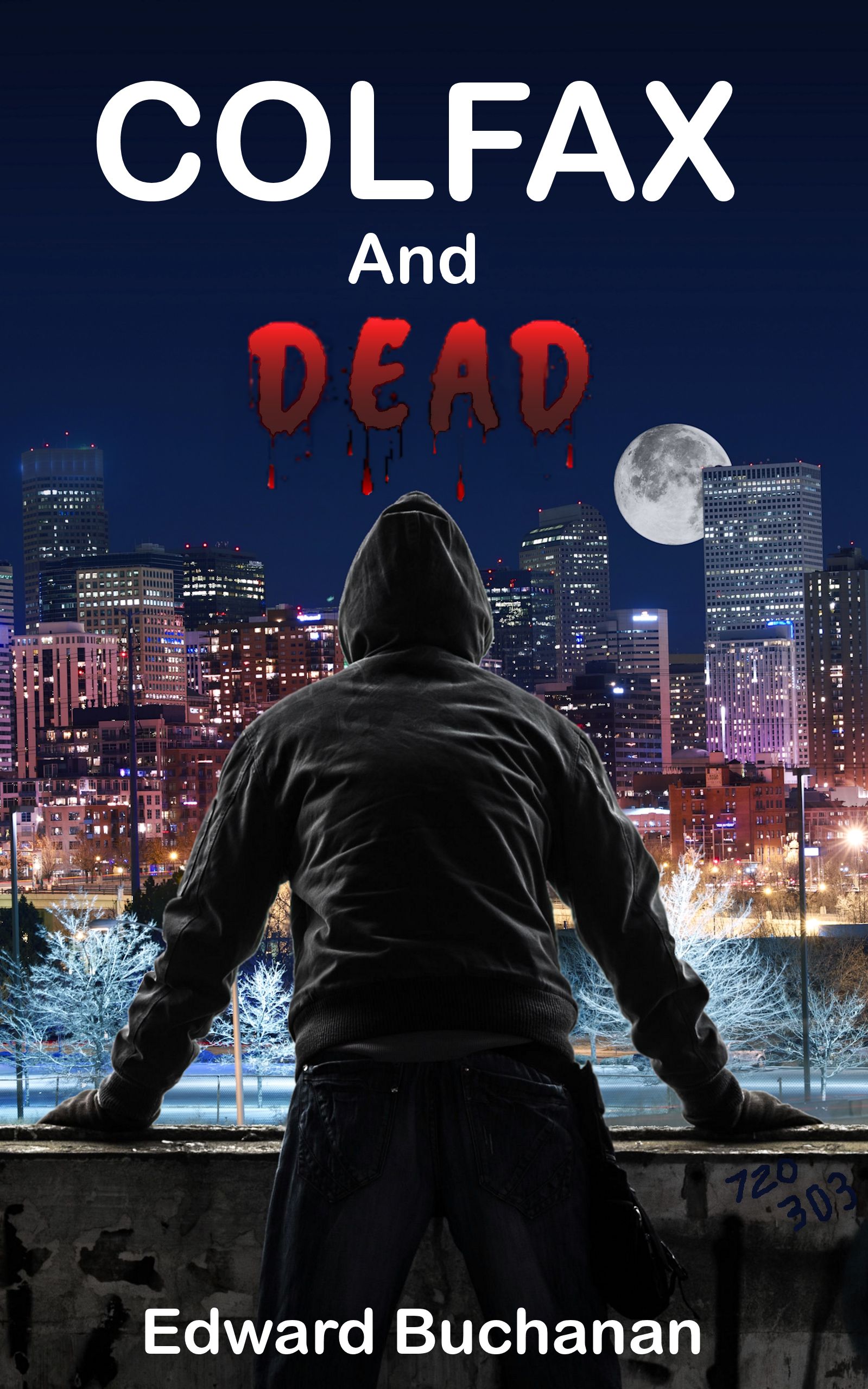
Book Description: Life is tough. Living on Colfax, the longest wickedest street in America, it is often fatal. Since Daxx died, the world keeps trying to put him back in the ground. There is much for Daxx to do, however; seek forgiveness, make sure his daughter doesn’t end up on the streets, and figure out why the hell he doesn’t die. A beautiful lady hires Daxx to find her brother, someone’s kidnapping the homeless, and his daughter still hates him. Daxx needs to solve the case to get paid. Life may be cheap, but living even for the dead is not.
Genre: Urban Fantasy
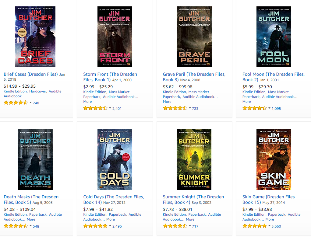
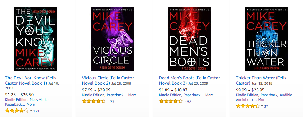
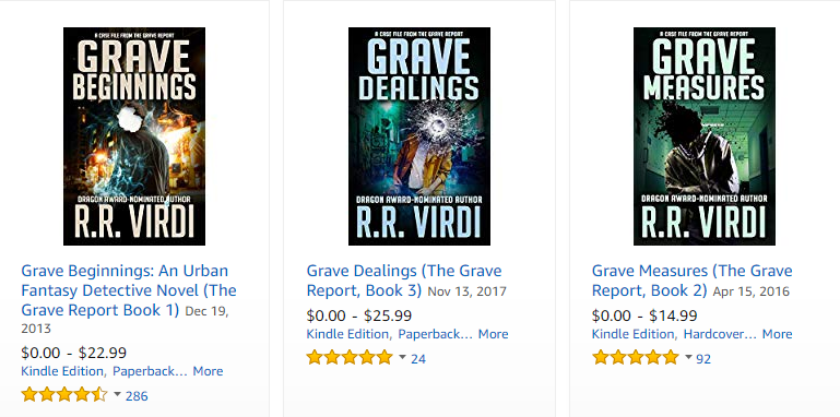
Comparable books: Dresden Files, Felix Castor, Grave Report
Nathan says:
The image is okay — not great, but adequate as a starting point; however, the font choices doom it.
Let’s take a look at the three comparable series you cite. Here’s The Dresden Files:
Here’s Felix Castor:
And here’s The Grave Report:
What do I see in common?
- Dark backgrounds. You’ve got this one.
- Strong typography. (I actually think that the Felix Castor type is a little weak, especially with the byline that keeps blending into the background.) This is a major failing in your cover. Your type politely declines to intrude on the rest of the cover, and the bloody font for “Dead” falls flat.
- A dominant color. If you look at covers for these and other paranormal fantasies, you find that the initial impression of “magical” is conveyed by the color, long before the viewer can actually pick out any specific details.
- Some visual detail that further conveys “magical” and distinguishes it from an urban drama. For The Dresden Files, you can immediately see the silhouette of the uncommon hat, and secondarily the staff. For Felix Castor, the magical element is actually in the title type on each cover. For The Grave Report, it’s the mutilation of the head on each figure. By contrast, your image is just a guy at night. (And the hoodie doesn’t help things — it’s become a visual cue for real-world social drama, not escapism.)
I think you could work backwards in conceptualizing your cover. Your book (and, presumably, series) is about a guy who doesn’t die; could he have several bullet holes and a machete sticking out of his back? Then work on finding a color scheme that features a limited palette of bright colors against a dark background, and then top it off with strong, bold typography.
Other comments?
I don’t see anything at all in this cover that even suggests “urban fantasy.”
The illustration itself isn’t bad (though the moon is far to obviously pasted in), but it doesn’t really say anything about the nature of the book.
Imagine seeing the cover art without the title…what would anyone think the book is about? I would be willing to bet “urban fantasy about the undead” would not be the first thing that pops into mind.
I would strongly suggest not trying to be cute with the typography. Making the word “Dead” not only red but dripping blood is much too much bad Hollywood slasher film poster. Besides, being in a low-key color against a dark background, the word is overwhelmed by “Colfax and.”
You have an excellent point about the cover without text giving an idea of what the book is about. The font on Dead was me trying to add something the picture was missing and the suggestions have given me an idea on how to resolve your criticism as well as others. Thank you.
I love this cover idea! A few simple tweaks and it will really rock. First the font needs to go. I’m sure Hutch can suggest some really awesome fonts. But then match them with your color scheme in the picture itself and use the same types of effects as other books in genre. I’d tone down the backdrop just a bit too.
I’d also add words to match the other books in the genre.
You have a slight cropping error noticeable as a thin white line on his jacket. Add some holes and slashes and a bit of glow to the moon and it will look awesome.
A quick example
https://imgur.com/a/V75UVlh
PS. Adding a hint of glow around him would further say fantasy book
I really like Shelley’s redo image. I think it keeps the best of what the author originally did, and corrects for the font and moon issues. Definitely don’t remove the moon, but fix it like she did. The bullet holes she added to the back are so subtle that they would be missed on a quick glance of the cover, but making them pop more would also make them too unnatural for the lighting of the image. She also seemed to tone down the wall graffiti, so that number isn’t so prominent, and no longer a concern. The eye stays on the character, and the distant city, where you want it to.
Thank you for your suggestions, I really like the route your example went with showing he is dead. This plus the suggestion of another stating the image should tell more about the book and genre I think helps a lot.
I like the art quite a bit, actually, particularly the use of color. The moon needs to go, and so does the graffiti in the bottom right. (Even if the graffiti blended better, the numbers would still be meaningless to us.) I say fix those problems and pick a nice, heavy typeface and you’re good to go.
The same time I posted the image to this site I also posted to a facebook group, someone else commented in effect about things that are unique to Colorado can be distracting to those who are coming into the story blind. Your comment about the graffiti fits along with that and after some thought I agree, it distracts and gives little return. Thank you.
You’ve got the right kind of picture, as the other critics here have noted, but that they can spot all your cutting and pasting so easily should be your tip-off that those modifications aren’t working. You don’t need that graffiti or that moon in the sky anyway. If the picture really needs any modification at all, I’d say what it needs is for the protagonist there to have a fedora, cliched as that sounds for urban fantasy with overtones of a detective story. (Having the guy have a few conspicuous bullet holes in him or the like as others have suggested might also suit the general theme of the story.)
As to the byline and title fonts, well, you see what the other authors in your genre have done with their covers. You’ve got plenty of dead space on the top and bottom, so go ahead and make those fonts big and loud. As noted, letters dripping blood are cliched and difficult to see and not really so good at getting anyone’s attention; blood dripping from (or dried and encrusted around) a few bullet holes or slash wounds on the individual letters of the title might work as long as you can keep everything legible, however.
In short: nice picture, but your captioning and modification of it still needs work.
I admit my photo manipulation skills are rudimentary and it is good to know that I should work on them a little if I wish to pursue making my own cover. I’m not sold on the hat but I do see others in the genre have one on the cover. The idea of visual shortcuts/cue’s to help people easily identify or relate this book to something else they like, is something I need to consider.
Thank you for your thoughts and suggestions.
Nope. All of the changes to the type are not going to make the cover art work. There is not one thing about it that suggests urban fantasy let alone the idea that the lead character is supposed to be among the undead. The art should not depend upon a catchy tag line in order to be understood. All that means is that the cover is not carrying its own weight. It should be able to convey a sense of the nature and subject of the book even without any type…and this artwork fails to do that.
I got urban from it right away, adding the undead fantasy part is just effects. A dagger in the back, some gunshot holes, a pile of broken weapons/spent bullets by his hand, stuff like that would do it. It just needs a bit more glow or other ‘magical’ effect. It doesn’t need to be the moon, he could glow the skyline a bit or smear the city lights a little. Just brightening them or darkening the lights so it doesn’t look ‘real’ would do a lot to say fantasy.
I like the cover art quite a bit. The guy seems dangerous, the setting is clear, he’s a dangerous character looking over his domain- a city. I think its enough of a hook to get me to read his blurb if I’m interested in that sort of story. I do agree he’s missing the potential readers who’d click it because of the undead part but adding the wounds on his back will capture them.
His character heals so he can’t use a zombie figure and I think he nailed it with the black hoody as its like a modern cloak, reminiscent of vampire, ie the undead.
He might want to change his city scape to an alleyway full of bad guys holding weapons but I like his city scape. Its very pretty! Maybe for his next book he can be emptyhanded overlooking a bunch of bad guys…lol
Savoy is dead (!) right. The existing art needs additional elements to make it “urban fantasy” rather than just “urban.” There is no question that the art is decent, if cleaned up a little, but I would defy anyone seeing it by itself to guess what the book is actually about.
The way this site is set up creates an inherent problem. The reviewers get to read a description of the book before seeing the cover. This is not only the opposite of what would take place in the real world, it makes it difficult for anyone here to then see the cover objectively, since they have preknowlege of what a book is about.
I’m certainly open to changing the order of presentation. Anyone else have strong opinions either way?
Doesn’t matter to me because I never read the blurb or your comments until I’ve examined the art so I already have an impression, which sometimes makes for hilarious blurb reading…lol
Same, I always look at the art first, usually in thumbnail on your other site.
Yeah, I self-evidently get urban fantasy from this, even without additional weapons or magicky effects. (The palette is doing a lot of legwork here.) Ron is, of course, entitled to his opinion, but it doesn’t change the fact that other people are able to tell what genre this is with no problem. I think it will easily attract the right readers.
Savoy’s redo looks great!
Well, I will have to stick with my idea that without having already read the description of the book few would think that the cover art is unambiguously “urban fantasy.” Which reiterates my suggestion that having the advantage of having already read the book’s description slews one’s opinion of the cover. Other than the presence of a full moon, where in the world is the fantasy? Where is there even one suggestion or hint regarding the nature of the central character—a nature that is evidently central to the story?
Perhaps the operative word here is “unambiguous.” I think the cover—any book cover for that matter—cannot simply hint vaguely at what the book is about, its subject or nature. It certainly should not depend on a written description or blurb in order to be effective.
I can only again underscore what Nathan said in his original critique.
I’m not a fan of the title. It doesn’t tell us the meaning of Colfax. Is it the main character? Is it a cold medicine? Darren McGavin misremembered? Also, your blurb (and the book?) contradicts itself. First it says he died, then states he can’t die. Is he immortal, dead, or undead. First rule of writing: establish your rules and stick to them.
If it’s the name of the street, “Dead on Colfax Street”, “Undead on Colfax Street”, or “Living Dead on Colfax Street” would have been more informative.
I don’t think a title needs to explain. It needs to intrigue. But I agree it also shouldn’t mislead. I think this title is fine. Even if you misunderstand to what it refers, it isn’t misleading in a serious way. IE if you thought Colfax was a character and learned it was a street it still wouldn’t be enough of an issue to ruin the story. You get the idea right away this a story about death. I agree it would be clearer if in the blurb he changed why the hell he doesn’t die to why the hell he doesn’t stay dead but this is unlikely to be his final draft of the blurb.