The author says:
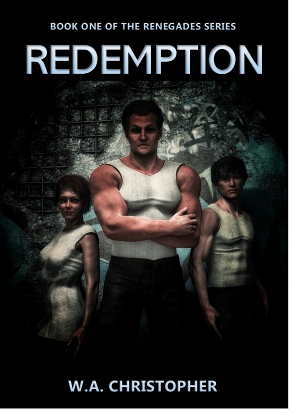
The Renegades is Book One in a New Adult, dystopian science-fiction series, set in a near-future US, in a state no longer run by elected government, but an oppressive, high-tech corporation. BACKCOVER TEASER: “When everything has been taken from you, do you try to return to the past you lost, or take a leap of faith into an uncertain future?”
Nathan says:
First point: There is no reason to use Poser or any of the other “pseudohuman”-generating tools anymore. Say what you will about AI, but its images don’t have limbs looking not quite right, as the main figure’s right arm does.
Second point: Everything’s awfully murky. From the lighting, it seems like the main figure’s pecs or forearm are the most important part of the image.
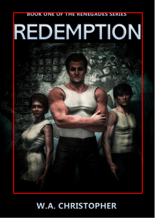
Third point: A lot of wasted space. There’s no reason that the image could be trimmed like this to make it more visible in thumbnail:
 Fourth point: Nothing in this cover — not the main parts of the image, not the typefaces — say “dystopian science-fiction series.” (Maybe the pattern behind the figures is supposed to convey that, but “maybe” doesn’t cut it.) One of the first things your cover needs to convey is the genre, to let fans know that this is a book for them.
Other comments?