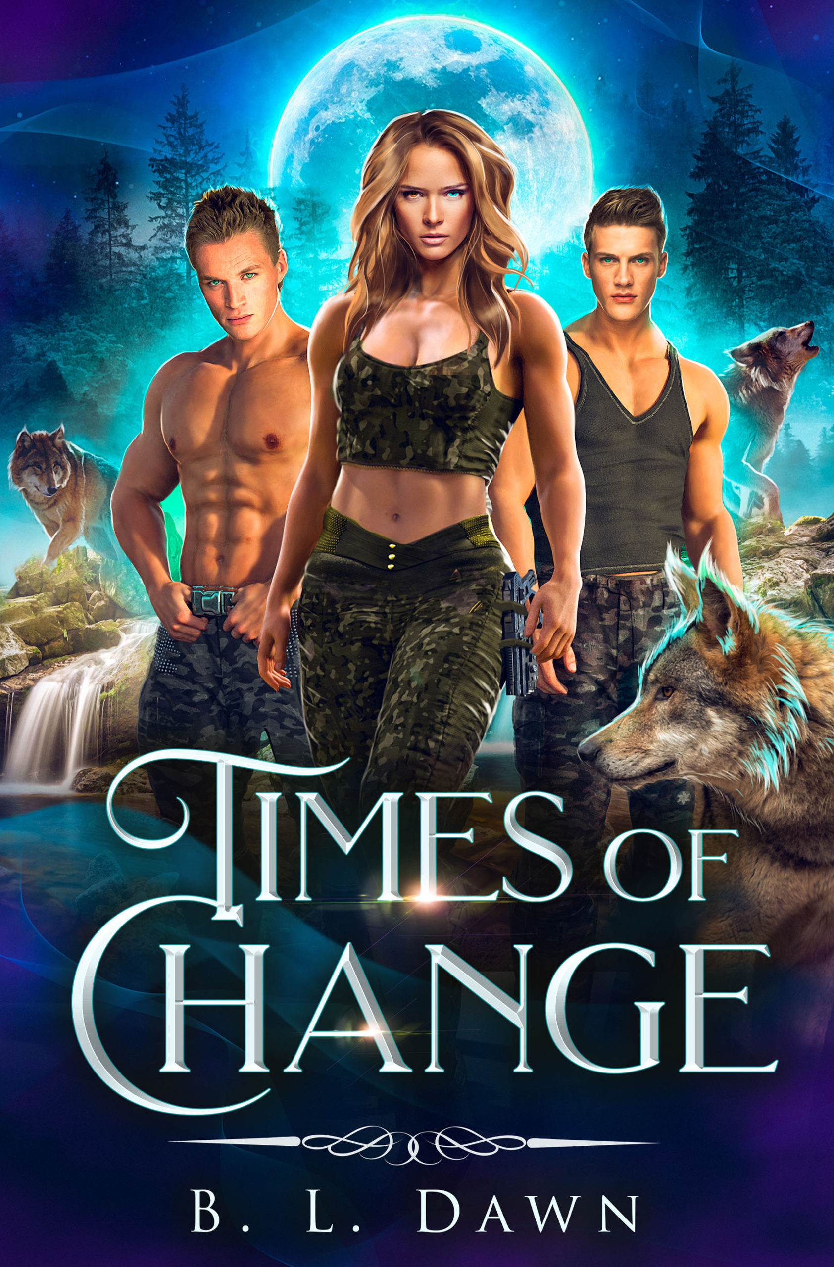
Category: Covers

Every Arm Outstretched

The author says:

[Jacket Copy – Literary/Historical Fiction] In 1978, the tension on the streets of Managua was electric. The whole city teetered on the edge of becoming a war zone. The Somoza family held the people of Nicaragua in a stranglehold, stripping the country of everything of value and making beggars out of honest citizens. The only thing that kept them in power were the feared Guardia Nacional. In order to survive, Paco eked out a living as a street musician, busking and playing university parties. His politics were those of someone never sure of where he would get his next meal.

But when a violent government crackdown erupts on the streets, he’s forced to choose sides in order to survive. Thrust into a fierce guerrilla war, what begins for him as a struggle for survival becomes something more. The heavy cost of the revolution becomes clearer with every battle fought, and every traitor executed. Paco must find the balance between fighting for a cause he increasingly comes to embody, and maintaining his humanity.

Every Arm Outstretched examines historical events through the lens of the human heart. How do we determine right and wrong when society itself has become corrupt? Do we owe our ultimate loyalty to our comrades or to our ideals? And can the end ever truly justify the means?

Nathan says:

It’s a very well-done cover. My only major issue is that, in 2020, the symbol of the raised fist has become very much associated specifically with Black Lives Matter. While your usage of it here is correct historically, I fear that its presence on the book might give the wrong first impression to readers.

The other thought I had was to give some small indication of guerrilla warfare. Perhaps the otherwise innocuous silhouette could include the silhouette of a long gun (probably an AK-47 would be even better, but I’m not confident that that can be rendered identifiably in silhouette).

Other comments?

Legacy of Hunger

The author says:

Legacy of Hunger – Set in Ireland, 1846, historical fantasy drama/adventure (not romance). Not an actual scene in the book, but a conglomeration of several pivotal scenes. The standing stones are a portal into the fae world.

Nathan says:

The cover is beautiful as-is, at least for print sales; I think that some tweaks for the ebook cover would be prudent — pull in closer (it’s okay to have the series title across her skirt, honest), and separate the byline from the background more clearly, so that salient details are more easily seen at less than full size.

Other comments?

Feather of the Blue Heron

The author says:

Magical Realism

Emma’s perfect marriage has fallen apart and she’s not sure why. She’s an avid canoist and camper, so paddles off to a quiet shore to try and figure things out. A beautiful blue heron keeps pace with her, her only companion. There, she meets Little Bear, a mystical spirit who helps her look deep into herself to find the answers she seeks, and to let go of her warring emotions. When he disappears, all that’s left is a blue heron feather that she voted she’ll keep forever.

Nathan says:

I think you missed on this.  “Magic realism” connotes a dreamlike quality to me, of things that don’t necessarily make logical sense or follow cause-and-effect.  The imagery implied by your description — a lone canoeist, a secluded (possibly misty) lake, all would make perfect cover images. Instead you have a tightly drawn feather and a circular motif that would look more at home on a Psycho copycat.

Start over. Go with misty and nebulous. Let us see the space, literal and symbolic, between the protagonist and the “real” world. Go with a font that is whimsical and doesn’t follow straight lines.

Other comments?

207th Bone

The designer says:

This is a book of contemporary Chinese poetry, translated into English. Zhou Li is a doctor as well as a poet, and the poems are reminiscent of Ren Hang: short and simple, about the city, nature, sometimes very explicit and sexual, sometimes everyday – about life, love, and death. The writer isn’t well known, and has never published a full book in China. The target audience is in the US, for those who like modern or translated poetry, but it isn’t intended to be a mainstream book.

The design featured here originally had rain in the background. I liked the concept but I couldn’t make it work, as it was too busy. The translator wanted a simple design, but it needs to stand out enough, and look professional enough, to attract buyers.

Nathan says:

Well, attracting buyers for a book of poetry might be too tall any order for any cover… 🙂

The problem is that this book tells me nothing. Nothing. I don’t even know that it’s poetry rather than a novel or a memoir, and I certainly don’t know the mood or theme — nothing about “the city, nature, sometimes very explicit and sexual, sometimes everyday – about life, love, and death.”

The best I can suggest is to look at the covers of other poetry volumes that you’d expect to find on the same poetry lover’s bookshelf.  Look at how those covers signaled to the reader that this book was for them.  Then incorporate some of those visual cues.

Other comments?

Aeternum

The author says:

Genre: Urban-Fantasy/Soft-Cyberpunk

We follow a seventeen-year-old girl named Winter den Haag. She lives in Frankfurt on the continent of Germania Magna. A Planet Earth nearly identical, yet vastly different. Once more bullied before the summer holidays, and her father hospitalized, Winter eventually finds herself in tears on her bed. Deep in the night, Winter receives a message on her phone from an app that she doesn’t remember installing, asking her if she wants to change her life. From there on, we follow her as she forges her legend, and eventually becomes a pillar of the Free People of Germania.

Nathan says:

The artwork is very competent, but not at all dynamic. She’s literally just standing there with her hands in her pockets; it’s practically a placid scene. And while it looks urban and gritty, there’s nothing there that tells the reader it’s an alien world, or even that it’s science fiction — that’s a pretty contemporary car right there.

The type is a disaster.  Sorry, but between the collection of fonts and the size, it’s an unreadable mess.  I’m still not sure I know what the main word in the title is — I think it’s “Aeternum,” but that’s only after rejecting “Afternun” and “Aftermum.”

If I were going to try to fix this cover (instead of scrapping it and starting over), I would:

  • Rotate it by 10 or 15 degrees counterclockwise, placing the central figure on an angle.
  • Play with the color so it doesn’t look like she’s standing under warm studio lighting.
  • Add a spaceship to the sky behind the lightpole.
  • Redo the type, focusing on readability first, and make the byline bigger.

Other comments?