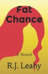
Fat Chance

The author says:

A sarcastic New York private eye gets stuck in a small New Mexico town full of wacky characters where he has to solve a missing persons case. Humor/cozy mystery

Nathan says:

This may sound like I’m taking out my frustrations on you. I’m not, exactly, but your cover is an opportune occasion to remind everyone of some basic facts.

Your cover isn’t meant to be art to tickle the fancy of intelligentsia in a gallery showing.

It’s advertising.

It’s a billboard.

It’s supposed to instantly convey to the target audience, “Hey! This is a book you’d be interested in!” Which means you need to know how that target audience is normally signaled to.

Look at your cover. Is there ANYTHING that says it’s full of wacky characters? That it’s a humorous cozy with a sarcastic private eye? Heck, that it’s even a mystery?  Without “A Novel” on there, we wouldn’t even know where it falls on the fiction/nonfiction divide.

You are doing nothing to attract your target audience. Your cover is a net negative.

This isn’t even an occasion where you need to start over with a different concept. You just need to start over with A concept. You need to brainstorm with someone: How do I let the readers of wacky cozy mysteries that this book is for them? How do I get them interested? 


The Illusionist: Invisible Apprentice

The author says:

They story about Houdini’s great apprentice that history forgot. Charles can still hear his mentor’s words; “It is the names and faces history forgets that often turn the tides.” In order to avenge his the murder of his mentor he must first disappear! He silently writes history as he encounters: Jack the Ripper Harry Houdini Fred Russell (“The father of modern ventriloquism”)

Nathan says:

While I sometimes come across as a defender of A.I. images here, my attitude is simply that A.I. illustration is simply one more tool in a designer’s toolbag, like the advanced version of a stock image catalog. My rule of thumb is this: If a reader can immediately identify it as A.I.-generated, you need to change it. (Why? My assumption is that the reader will identify the originality (or lack thereof) on the cover with the originality (or lack thereof) of the contents.)

Pay attention to the odd finger placement and the lack of background. Those are two of the obvious identifiers of A.I. illustration.

Other problems:

The image doesn’t have any convenience open space for title placement, which is why it’s awkwardly across the body, and in a font and hue that keeps it from standing out.

You really don’t need a colon on the cover; font placement and size should be enough to mark the separation.

You don’t need “by” before the byline; if people see one name on the cover, they assume that that’s the author.

Other comments?

Hostile Earth

The author says:

From Book 1: Terra Vonn is fighting to survive in a destroyed world, surrounded by unspeakable horror . . . and things are about to get much worse. After witnessing the vicious murder of her mother, Terra has a singular focus—exacting revenge on the killers. But before she can complete her plans, savagery intervenes and she is cast alone into a brutal post-apocalyptic world. Terra’s journey south is filled with horror. But she finally makes it to a southern clan and what she thought was safety. Instead, she finds treachery and deceit. Book two follows Terra as she battles packs of killers determined to destroy the remnants of civilization.

Nathan says:

A little bit of tweaking here would reap huge dividends.

  1. The word “Earth” gets lost in the thumbnail.  Move the girl’s head down so that “Earth” lies across a contrasting shadow so it stands out.
  2. I don’t know how much control you have on the artwork (i.e., whether it’s composed of stock elements, or whether the artist works for you and can change things), but the sword is easy to overlook.  As it conveys danger and action, I think it needs to be more immediately noticeable. If you can turn it upward so it crosses the girl’s dark cheek, it will both be more prominent and stand out more because of the contrast.
  3. The color scheme seems a little warm for “post-apocalyptic” (especially with that typeface).  I’d suggest looking at some other post-apoc covers (and movie posters), and experiment with some variations that give a starker color scheme.

Other comments?

Letter J [maybe?]

The author says:

This isn’t Angus Fonteyn’s first time in space. He’s been selected for NASA’s covert mission that’s sending just two individuals 500 years to the past. Much to his dislike, rookie astronaut, Janine Lyton, is selected as his copilot. During the mission, Angus experiences visions and extreme hallucinations but is barely alarmed by them. The real problems start when he successfully persuades Janine into travelling with him to the distant future; his pretext being a half-baked plan to observe how humanity’s actions have affected Earth, then report them back as prophesies in the present. In 2046, Angus and Janine get distracted by the wonders of human innovation, and their adventure spirals into an absurd, harrowing nightmare involving time loops, distorted realities and a courtroom in England. They are forced to suffer the consequences of a human innovation tampering with one of the most defining things in the universe.

Nathan says:

Wow. This one will be hard to critique without sounding mean, but…

No.

This cover is unreadable. (Hell, I’m still not sure on what the title is.) It gives no clue as to genre or content. It will actively deter interest.

Your cover is your billboard. It’s the half-second you have to send out a signal that says, “Hey, reader who likes this kind of book — this is the kind of book you like!”

You need to jettison this and begin again. Try to appeal to your target reader, not confuse or frustrate him.

Redemption

The author says:

The Renegades is Book One in a New Adult, dystopian science-fiction series, set in a near-future US, in a state no longer run by elected government, but an oppressive, high-tech corporation. BACKCOVER TEASER: “When everything has been taken from you, do you try to return to the past you lost, or take a leap of faith into an uncertain future?”

Nathan says:

First point: There is no reason to use Poser or any of the other “pseudohuman”-generating tools anymore. Say what you will about AI, but its images don’t have limbs looking not quite right, as the main figure’s right arm does.

Second point: Everything’s awfully murky. From the lighting, it seems like the main figure’s pecs or forearm are the most important part of the image.

Third point: A lot of wasted space. There’s no reason that the image could be trimmed like this to make it more visible in thumbnail:

Fourth point: Nothing in this cover — not the main parts of the image, not the typefaces — say “dystopian science-fiction series.” (Maybe the pattern behind the figures is supposed to convey that, but “maybe” doesn’t cut it.) One of the first things your cover needs to convey is the genre, to let fans know that this is a book for them.

Other comments?