The author says:
The Moment of Truth is a young adult novel set in a somewhat alternate universe. Minor romance and lots of violence, written mostly for ages 19-25, female and male (mostly female probably).
When Eloise Green finds herself a witness to a hit on a US senator, she’s kidnapped by the hit man, Nico De Niro, and kept alive as a prisoner of the De Niro mafia in order to keep the trail cold. Detective Edward Rulli is determined to find out who murdered his best friend, while struggling to keep his composure when things go nowhere. As he struggles, Nico and Eloise find themselves oddly attracted to one another, and as time goes by, she learns the De Niro family is not as close, or as well functioning, as the media portrays.
Nathan says:
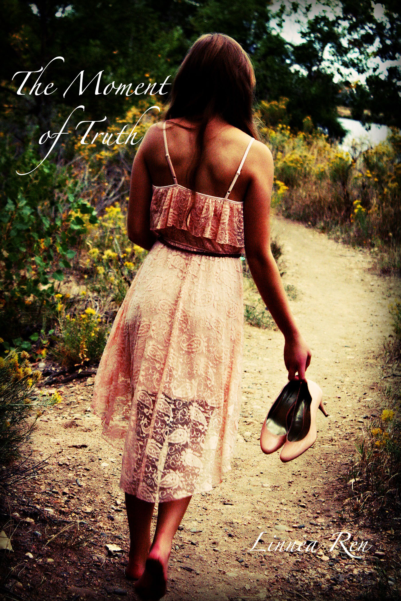
First, critiquing the cover solely as a composition: A lot of good potential here, but a look at the thumbnail version points out the biggest design weaknesses: the title is underwhelming, and the byline disappears completely. The first thing I’d try is sliding the picture to the right (I don’t know if there’s enough of a margin in the original image to do this), increasing the size of the title, letting the byline overlap onto the model’s ankles, and add either a diffuse drop-shadow or a dark outer glow to the text.
However, critiquing the cover as it relates to this book: Unless the synopsis you gave comes across very differently from the book itself, this doesn’t look at all like the cover that should be on this book. If I were to guess at the novel based solely on the cover, I’d say it’s the story of a professional woman who’s at a crossroads or a crisis and uses an extended vacation to find herself. This cover says nothing to me about politics and organized crime, running from a hitman, or adrenaline-fueled romance.
Other thoughts?
I couldn’t agree more, on both counts… but especially about the font. One other thing occurred to me… This image does not convey that it’s an alternate universe at all. I’m not sure HOW you would convey that, but if that’s a crucial detail it should be addressed in some way. What is it about the story that makes it “alternate?”
I don’t know that the “alternate” part is necessary for the cover, really.
Possibly not, but since the author made mention of it, I thought it might be something to think about.
I’m not sure how to make it more alternate either… this is my first ever attempt at a book cover digitally, and I didn’t have many options for the picture (this is a senior photo option from a friend of mine), but I can ask some of my photography obsessed friends how to do that.
That title has gotten me every time. I have four or five different versions with different titles, and they’re all hard to read. But I’ll try what you suggested, Nate, when I get better at using photoshop, and I do agree that it doesn’t completely fit the story. It does in a way, if you just follow Eloise’s side, but then there’s Nico and Ed’s. So I’ll probably look out for a better photo.
Thank you so much! I’ll be sure put these into account when I rework this cover (the story’s on hiatus right now). I appreciate the critique! I hope you have a lovely day.
~Linnea
I agree with the major points above (re: tone, font), but I will add that I find my eye being drawn to the shoes. They’re a nice detail.
I wrote this critique before realizing the cover was 4 years old, and decided to post it any way – if the book didn’t find its audience after 4 years, it’s probably worth it to try all over again with a new cover.
—————
People click on book covers that look like the kind of story they want to read, and that they are in the mood to buy. Then they read the description and the description will confirm whether or not this is the book they were looking for.
This picture is very nice, plenty of feels, but it suggests a completely different type of story. The expectation is a slice of life type of narrative with down to earth details and a strong female character who goes her own way and enjoys the little things of life (she’s leisurely walking barefoot on a dirt path, going away).
It’s completely at odd with the book description and that’s the biggest issue here. Font and title visibility are easy to fix, but the conflicting messages can’t be fixed, and the people who will click on that cover are unlikely to buy a book with the plot you describe.
There are a lot of things you could improve in terms of font, positioning, readability, etc. but gap in communication between your image and the book’s content is too big to be fixed.
Also, there is the matter of the audience. You are targeting female readers who are into violence and the criminal underworld, with romance on the side:
When you type “Mafia romance” in Amazon, you see that most of the bestsellers have covers full of bad guys beefcakes, complete with tats and bulging muscles.
If I had to guess, I’d say this is exactly what your potential audience will click on when they are looking for a story like yours.