The author says:
This work book accompanies our Can Cubs sessions and is a great way to review some of the content from class. Alternatively, it can aid kindergartens and home learning too! This workbook covers 10 different topics/themes, they include:
On the farm
Autumn I’m a little teapot
Old King Cole
Pirates
Circus
Jungle
Manners
Five senses
Shapes
Read | Talk | Solve | Write | Colour Together!
Nathan says:
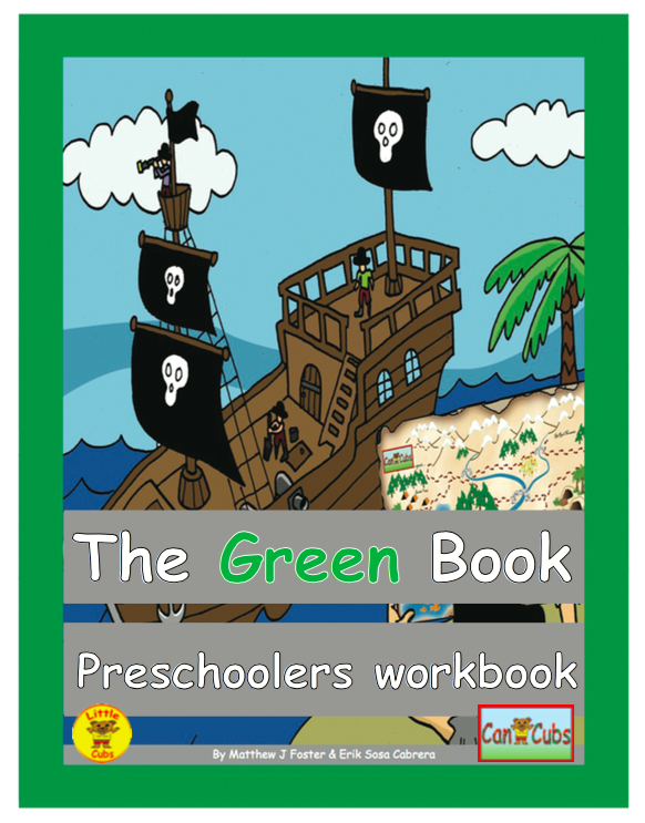
I know that Comic Sans is a very readable font for young readers, and teachers have an inordinate fondness of it. But isn’t there some other handdrawn font you can use that doesn’t give adults hives? Especially when you use it for everything… (Maybe using a handdrawn font for the words that you’d expect preschoolers to read, and a different for for other text, such as “Preshoolers workbook.”) (By the way, is there a reason that “workbook” isn’t capitalized?)
The placement of the type doesn’t seem to have any awareness of the picture it covers. I didn’t realize that there was a person in the foreground holding the map until waaay too long. If you’re not going to make the person visible, just excise the person and map, and move the pirate ship up so the grays bands behind the text don’t do it violence.
Speaking of those gray bars: I understand they can make the text more readable for young readers by isolating the letters from the cover image. Hover, there’s not enough difference in luminosity between the gray and the green of the word “Green” — the word becomes unreadable.
Other comments?
Oh, dear.
All I can suggest, in all honesty, is that you start from scratch and, hopefully, with the help of even a semi professional.
This cover is perilously close to being included in Nathan’s other site.
I agree with Ron: I’d begin again from the start, if I were you, after studying how other books like yours do covers. Seeking pro help is a good idea, too.
First of all, you need an apostrophe in Preschooler’s. It is a workbook belonging to, or for preschoolers. Or, if you want plural preschoolers, then Preschoolers’ Workbook. I don’t really have an opinion about the picture, though the map looks s bit busy to me. But the preschoolers I know like colors, and gray isn’t much of a color, besides the lack of contrast thing. It just doesn’t draw attention. A dark (Navy or indigo) blue might work better, or go with green’s near opposite on the color wheel— a red-orange, maybe. Try different colors and see which works better.
I think it needs a clue as to what type of workbook this is. Is it coloring? is it reading comprehension or number/letter recognition? what sort of tools are inside it? you can use cues to signify it without sating. Like for instance if it’s coloring, leave something obviously uncolored. use a dash line to separate text elements if there is writing guides inside, use a dotted line/outline if connecting the dots await. that sort of thing. Workbooks are not bought by children but for children so you need to appeal to adults. they have to think their kid will love it and think it fun. adults want their kids happy. they want them to learn without a fight so what about this book will make my kid love learning? that’s your selling point and you need it to come across at a glance. Maybe throw a big A+ in there somewhere for the parent. Or just say what’s inside in a way that appeals visually to children but compels adults.
Something like:
The Green Book
Manners made fun!
some sort of subtitle that tells me what’s inside.
I agree with all the posters that your grammar needs to be perfect to sell a school workbook.
Hmmm… Unlike Ron Miller, I wouldn’t exactly give this up as for total loss; what we would call art for a refrigerator over on Lousy Book Covers is actually somewhat appropriate for books for preschool children. The art does need to be more consistent, however: either the map the person in the foreground is holding needs to be less detailed and refined to match the rest of the picture, or the rest of the picture needs to be more detailed and refined to match the map. I’d recommend the latter option if you have the talent for it.
When I first saw this cover in thumbnail, I did at least immediately recognize the basic genre from its layout: my workbooks in elementary school (the very sight of which I came to hate with a passion, but because the contents were loathsome, not the covers) looked something like this. At present, however, that recognizable layout is nearly all this cover has in its favor. Everything else—the color scheme, the font, the clashing artwork, the placement of the byline and titles, the likewise poorly-placed squashed-up-looking logos near the bottom—is a major strike against it: basically, this cover needs nothing less than a major overhaul.
One bit of advice that would serve all our submitters here well before they even begin designing the cover is to look up some covers to see what everyone else publishing books from their book’s genre is doing. For you, here’s an Amazon page showing what designers of workbooks for preschoolers are doing, starting with some of the bestsellers in the genre. Of course, you’ll want your cover to be a little different so it’ll stand out from the others, but only a little different: the secret of originality is to design your cover according to the same general principles as everyone else, while using different specific designs; e.g. you’ll probably want to make your cover look a lot like this one, except with green instead of blue as the primary backdrop fill color and your current pirates-and-a-treasure-map theme for your art instead of its oak-leaves-and-an-acorn-juggling-squirrel theme.
Basically these are the major overhauls your cover needs:
1. For your font, any kind of generic cartoon or comic book font should do fine, but make sure you use anything else besides Comic Sans, which is probably the most hated font in the world.
2. Either shunt your titles and byline to the top and bottom where they won’t get in the way of the artwork, or else remove the solid color backdrops and overlay the letters on some of the artwork’s dead space using a font and color that ensures their legibility even on the cover’s thumbnail.
3. Use bright and cheery colors, and absolutely no gray. Little children’s personal aesthetics, like the rest of their personal philosophies deal in absolutes; grays, like other abstractions and ambiguities, are for more mature audiences.
4. If you absolutely must have logos, try to make them a part of the titles and likewise place them somewhere they won’t get in the way of the artwork; and don’t go messing with their aspect ratio to make them fit.
5. Be sure to have a visible border line between the backdrop and the artwork; the artwork all being a solid line drawing, the panel enclosing it should be a solid line too.
6. Again, make sure the artwork is consistent. If the map has shading and textures, so too must all the rest of the artwork; if the rest of the artwork can’t have shading and textures, neither can the map.
7. As Gail notes, if this book is supposed to belong to preschoolers collectively or individually, the word “Preschoolers” needs to have an apostrophe in it to make it appropriately possessive; if you’re saying this is a workbook about preschoolers (possibly because—like those workbooks I had in elementary school—a full set includes a master copy for the instructor containing various annotations and an answers guide), then say “Teacher’s Guide” or “Instructor’s Key” or “Master Copy” or whatever.
One additional comment: The artwork may be usable, but the grey bars cover up the most interesting and maybe even the most important part: the kid holding the treasure map. And the ship is left taking a kind of nose dive into the title bar.
If you created this artwork yourself, you may want to think about redrawing it. This time, however, keep in mind from the get-go that space needs to be left for the title and other information. Plan for this from the very onset when creating the cover image.
Even as it is, the cover would have worked immensely better if the type had been placed across the top and within grey panels. You could also move the title and subtitle much closer together in that case. This would have left the most meaningful parts of the artwork visible.
In other words, pretty much everything RK suggested.
I meant to type “without the grey panels,” not “within.”
This might be a little off-topic, but given what has been said about spelling and punctuation on the cover, I think this might be advice that could be applied to the rest of the book. There are spelling errors in just the few pages Amazon allows for a preview (and this would seem to be the case with the other books as well).