The author says:
Michael Greyson awoke one morning feeling better than he had in years. Unfortunately, he soon learned he felt so good because he had died the day before. The upside to being dead was he made it to Heaven. The potential downside was he didn’t believe in Heaven, or God. Although Heaven is the last stop, Mike has one other option. This is a thoughtful story about being dead and Mike’s first ten days in heaven; helped by his guide Pete, no relation to the famous saint. Audience is baby boomers seeking a better understanding of the meaning of life. It’s literary fiction.
Nathan says:
I often joke that literary novels go out of their way to look like they’re about nothing, but in this case I think even that has been done to excess. I understand not wanting to go “flashy” on the cover, but even with a muted and understated design, you could at least make the font a touch more eye-catching. (And thicker; there’s no reason that the byline and accompanying credits need to be so hard to read.)
I’ll let others suggest font upgrades if they so choose — as far as I’m concerned, ANY clean, sedate typeface which is more easily read is an upgrade.
Have at it, folks!
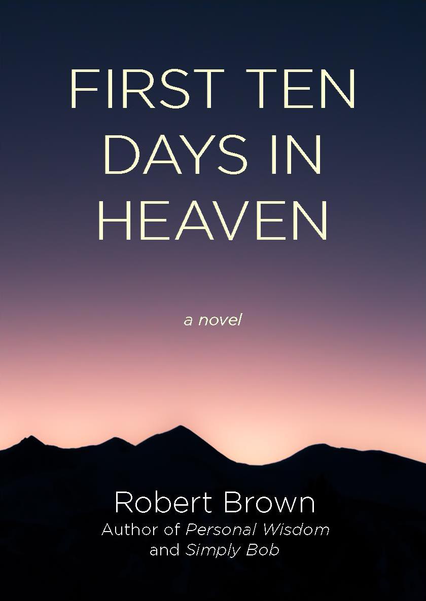
There are a couple of problems with this cover.
The main one is that it is simply not engaging. There is nothing to catch the eye. This doesn’t mean that there has to be bikinis or dinosaurs—but there needs to be something that will cause the potential reader to stop gazing among hundreds of other books and focus on yours.
What you have is not muted and understated: it is not stated at all.
The eye tends to go toward the center of a book cover, so there needs to be some sort of payoff there…but the only thing in the dead center of your cover, among all that otherwise blank space, are the words “a novel.”
You need to include some visual element that conveys the ideas you are talking about in your description.
One gauge I have often suggested is to imagine your book title in a language you don’t know. Would you still be able to tell anything about the nature of the book or what it might be about? In this case, I would believe the answer would be “no.”
There is surely going to be a lot of discussion about your choices in typefaces, etc., but I think you need to reconsider the cover image from scratch before you worry about the typography.
I understand the choice of a peaceful sky & mountains image since the story is related to Heaven, but even with those exact same elements, the image could be made more interesting with a more stylized and/or saturated look. Using rough textured brushes, adding the sun, trees, or some stars, adding clouds or mystical lights, anything that pushes it beyond gradient+flat black could be worth experimenting with. Maybe using the typical “God rays” (light rays coming through clouds) could make for something nice.
Gradients and flats can be used very efficiently but there would need to be more elements to the image, I think, to keep it eye-catching.
Using a completely different image is definitely also an option.
Can you say “anticlimactic”? Oh, the missed opportunities. Where to start? Oh yeah, over. I look forward to your next idea.
So as ever the first port of call is what other books in the same vin look like. Lit fic is as much a genre as SF or crime, and ‘high-concept/philosophical’ is an area you can find useful examples of what has gone before:
The first that springs to mind is The Five People You Meet in Heaven by Mitch Albom.
https://upload.wikimedia.org/wikipedia/en/d/d5/MitchAlbom_TheFivePeopleYouMeetInHeaven.jpg
Not the most exciting or well executed cover ever (though that didn’t stop the book selling millions) but what it does right is picking out a detail from the text that makes interesting and surprising imagery: the ferris wheel. The wheel does have plot significance but it’s also an intriguing object to see on the front of a book with this title.
Another post-mortem-protagonist novel is of course The Lovely Bones. This is the original cover:
http://www.slaphappylarry.com/wp-content/uploads/2015/09/The-Lovely-Bones-cover.jpg
Again, the imagery used is mysterious, somewhat surprising against the title, and moreevocative fo a general feeling than nconveying any information to the uninformed reader.
So from your book, what details might make intruiging cover imagery? The ferris wheel on the front of Albom’s book is significant because the character dies trying to save a little girl at a fairground. And though I haven’t read the book I’m going to make a leap and guess there’s some symbolic value in the wheel too: cycle of life, karma etc. The charm bracelet on the from of The Lovely Bones is similar from the text and has plot/thematic weight.
This is actually kind of the opposite from the advise normally given because for most books in most genres, you’re trying to make the content more obvious and understandable. With literary fiction, vague but intiguing imagery is usually the way to go.
But the rule that DOES still apply (I hope others agree) is that title and cover imagery shouldn’t be playing the exact same note: any imagery used should not be obviously heavenly or even obviously death-related: your title is already doing that work, sending that message. Like Five People You Meet… you need to have imagery that plays interestingly against your title. Your cover is there to harmonise with your title not echo it.
I also like this recent reissue for The Lovely Bones: https://cdn.waterstones.com/bookjackets/large/9781/4472/9781447275206.jpg (though on a tangent I really wish the designer hadn’t included the figure at the bottom I think it rather ruins it)
This DOES use fairly obvious and generic imagery connected with death and heaven (clouds) but because it uses and interesting and well-handled approach (the paper-cut and the way the background interacts with the letters) it transforms what would be boring as a photograph into something interesting and pretty.
The third point I’ll make is that you have a very good title that immediately conveys the tone and content of the books while being interesting. I think if this book was going through a publishing house they’d opt for a typographic-led cover, to a. make the most of a good title b. circumvent the problem of finding appropriate illustration! Many books need their covers to work hard in terms of imagery because title are opaque, and it falls to the visuals to give browsers more of a hint of tone and content. But your title is one of those that immediately tells a browser a lot. So I think a good publisher’s art department would seek a design that let this title stand out and just use a little imagery to support it. The Mitch Albom cover does that (more or less well); the second Lovely Bones cover I’ve linked does that, and here is another example:
http://images.gr-assets.com/books/1338717776l/88389.jpg
From this example you can see that giving lettering an interesting and cover-dominating treatment doesn’t have to take a lot of techincal skill, just a good eye. For The Discovery of Heaven a standard serif font is used with simple flat colours; it’s just the carefully uneven arrangement of those letters that transforms the title/byline treatment into something beautiful.
Similarly, with that second Lovely Bones cover, a simple sans-serif font is used but having it interact with the background makes it interesting.
Like Nathan says, for a book of this theme, simple restrained fonts are probably the way to go. But that doesn’t mean the title treatment has to be bland or boring.
My fourth and final piece of advice is: remember your tone. From your synopsis this is a somewhat funny and bouncy novel, not necesarily light but certainly not po-faced about its subject mater. You cover looks deadly serious. It looks like a church tract. Think about how the covers I’ve linked (particularly both Lovely Bones covers and The Discovery Of Heaven use bright colours to convey a non-sombre tone.
So to summarise: lead with typography and/or find some specific bit of imagery to use instead of generic mountain silhouettes; choose stylings and colours carefully to convey the right tone.
At the very least–and yes, I know that this is probably a bit too literal–If you want to keep this cover, I think I’d put the title in some type of cloud bed, looking, well, heavenly. Not uber-trite, just enough to say “this is what it’s about.” Or even, just supporting heaven, or behind heaven. Something. (FWIW, I honestly think that the second Sebold cover is just really bloody clever, even with the girl’s figure.)
Or…I don’t know, I’m not graphically gifted, like some of the folks here, but an illustrated version of something like this: http://image.shutterstock.com/z/stock-photo-the-sky-is-the-limit-typography-on-a-cream-background-with-clouds-in-the-words-366099539.jpg for the title, on a different background, obviously, would convey the whole idea.
I feel like somehow, there’s a real missed opportunity here. As Kata pointed out, you’ve conveyed the novel to us as not sombre, but lighthearted. Granted, you’re discussing The Meaning Of Life, and all that, but it sounds somewhat light in tone. Perhaps the cover is too dark/downhearted, for this book?
Coloring-wise, I’d also prefer something like this: https://thumb1.shutterstock.com/display_pic_with_logo/3926579/551418820/stock-photo-hello-weekend-word-letter-on-pink-and-blue-pastel-sky-551418820.jpg . Obviously, the words gotta go, but I like how eye-catching the coloration is, and if you used those colors on the cover illo, complete with the skimpy clouds, it would do the job.
Next time, fonts. 🙂 I promise.
The text is aliased, and there are major artifacts around it. It looks like it was made as a bitmap and then saved as a low-quality jpeg.
While one could complain a bit about the blandness of the font, the real problem with this cover is just that nothing about it stands out at all. First seeing this in thumbnail, I expected it to be just another one of about a thousand “inspirational” books (of the sort almost nobody actually buys) that I’ve seen on sale at vaguely Christian-themed book stores. From your description, that’s not quite what this book is, but your cover does seem to be marketing it in the same way as those; needless to say, this is not likely to be a winning strategy.
While your description doesn’t give me enough information to determine the exact genre, it sounds to me like what you’re looking to sell is some kind of religiously themed contemporary fiction. To this end, if you want to know what kind of cover to put on your book, I recommend taking your guidance from studying the covers of the books of Christian fiction writer Frank Peretti. I don’t know who the people who published his books hired to do those covers, but I do know that whoever illustrated them made his covers so eye-catching as to sell me several of them; back in the 1990s when I was buying these as a teen, my particular favorite cover was to his book Prophet, a tale about a contemporary television journalist God taps to prophesy to people through an investigation into the shady activities in which his state’s governor’s family turns out to have been engaged.
Trying to illustrate Heaven itself is kind of a no-win proposition, as by definition, Heaven is supposed to be too glorious to be described. If however (as your description seems to be suggesting) the Heaven where your character has landed is not really all it’s cracked up to be for one reason or another (as in the Twilight Zone episode “A Nice Place To Visit”) and your protagonist is going to go for the “other option” mentioned in your description, a cliche Fluffy Cloud Heaven on your cover might very well be the way to go. Starting with a beautiful illustration of something like the theme park version of Heaven a lot of uneducated people are expecting before delving into something better (or at least different) in the book itself should definitely work better for getting your prospective buyers’ attention than the vaguely pretty “abstract sunset over mountains” look you’ve got right now.
Thank you all. The penny has dropped. I finally can accept that the cover is a marketing tool and not an extension of the words inside. I have examined the examples you have mentioned and have ideas I will work with. Your positive and helpful comments make it easy and rewarding for a wordsmith to enter the world of graphics. And you are correct that the book is not the normal how wonderful heaven is tome; but one where my main character feels out of place and is deciding to commit suicide. One life was all he expected and all he needed. Again, I very much appreciate your knowledge and willingness to share.
Hi, Bob:
You know, I say this to my (eBook production–I’m not a cover designer, so…) clients all the time, and it almost inevitably produces a lot of very negative reactions (disbelief, anger, conviction that I’m daft, more anger, denial, etc.), but:
Your cover is nothing but clickbait.
Anything else is wasted energy on your part. Sure, someday, when you’re up there accepting the Pulitzer, you may be a bit aggrieved that the cover is not more elegantly beautiful, etc., but if that happens–here’s a happy thought–you can change the cover. You’re not married to it, nowadays.
The cover has a single job. To get the buyer to click (or pick it up, in a physical store). Amongst those people that you most want to see/notice the book, prospective buyers, none of them will know the story, and thus, creating something on the cover that’s an extension of the story is useless and moreover, frustrating for the buyer. AND you.
Just remember: clickbait. Nothing more, nothing less. Once Suzie clicks, then it’s the sale’s page’s job to get her to the next step: to read the description. And the description’s job is to get her to click on the cover, on the sales page, again, to read the LITB (Look Inside the Book). (Supplant these things with similar but different motions and acts, in a DTBook Store). THEN, it’s your job, as the author, to grab that reader in the first 1300 words, so that she can’t put it down, and buys or borrows or at least, downloads the free sample. But the cover? The moment she clicks through to the sales page, or picks up the book and cracks the cover–it’s done its job.
Honestly, it wouldn’t matter if you had a woodpecker smoking a pipe on the cover–what matters is, does it roughly convey the genre, and if not that, a feeling of some kind, and does it get clicked/picked up.
None of this is to say that you don’t need a fabulous cover–you do. BUT, when you are considering what “fabulous” is, remember one test: will it get them to click?
Good luck. I know we’d all like to see the next imagineering for this book. I look forward to seeing it.