Month: August 2016

The Untitled History of the Human Condition

The author says:

A werewolf lives through the violence that is human history starting in medieval times and eventually finds himself working for the United States Government, they don’t let him leave when he wants to quit and then he has to team up with other movie monsters, a vampire, alien, demon, and frankenstein monster, to stop an evil robot from destroying the world.
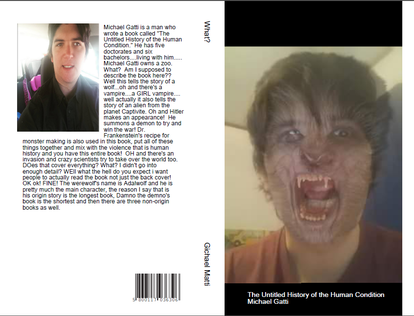
new cover.PNG

new cover.PNG

Nathan says:

No.

This looks like a tumblr meme, or something you slapped together in five minutes to display your makeup FX selfie. This will NOT sell this book, or any book.  You may think I’m being cruel, but that’s the way it is: If you expect readers to spend money on, and time reading, your book, you need to demonstrate that your book is a professional production. This doesn’t do it.

Hire a professional.  Even a cheap one.  The fact that you’re submitting this here for critique means that you do not have the grounding in basic design needs to recognize the deficiencies in your abilities.  Just go pro.

Blood-Lines

The author says:

Welcome to the Weird Wild West. There are people here who are not as they seem and others who watch them. Supernatural and mortal alike unite to reach what peace that can be found between them as hunters can become prey and prey can become the hunter. This is their story.

BookCoverPreview5

BookCoverPreview5

Nathan says:

Nope.

Those pre-made Cover Creator templates look exactly like what they are.  They scream, “I’m self-published, and I tried to save money on a cover!”  At least the image you chose doesn’t clash horribly with the template — the diagonal of the paper background intersects in an interesting way with the diagonal of the roofline — but still: Nope.  It looks impoverished and amateur.

On top of that, the image you chose is Western, sure, but there’s nothing weird or paranormal or off-kilter about it. You miss your entire audience if the cover looks like “a happy market day in the Old West.”

If you just found a Western-themed photo or illustration (preferably one that concentrates on an individual or some other central image, instead of a town) and then applied a color scheme that you find on horror novel covers (stark contrasts, lots of shadows) and a distressed Western font, you’ve be about 400% ahead of where you are now.

Best of luck.  Other comments?

Not a Hero

The author says:

YA Fantasy trying to turn the fantasy tropes on their heads. The main character doesn’t win the trial to become the hero and has to live with all that entails.

Not a Hero cover

Not a Hero cover

Nathan says:

More than anything else, we’re seeing a particular flaw with the book covers submitted here: They don’t look like the kind of book they are.

Take a look at this cover: Does ANYTHING about it say “YA fantasy?” No. I would guess that it was some lit-fic coming-of-age story, or maybe a memoir of child abuse. In other words, if I were a reader who would enjoy a subversive YA fantasy, nothing about this cover would tell me that it’s for me.

You need to rethink the concept, and you need to do it like a marketer: “How do I attract the readers who would enjoy this book?” Because otherwise, having this cover on this book would lose you more readers than having no cover at all.

The Dipole Dilemma

The author says:

A comedy sci-fi set in the far future when humans have spread across the galaxy. The book revolves around a hunt for an elusive ring, which turns out to be a portal. The book has absurd humour in it and the target audience is probably young adult, I’m going for the audience that enjoyed hitch-hiker’s guide to the galaxy.

Book Cover copy1

Book Cover copy1

Nathan says:

So where’s the funny?

Here’s a rule of thumb (I have many more of them than I have thumbs): If your book’s a comedy, something on the cover needs to tell us that.  If the title isn’t absurd at first glance and your name isn’t Douglas Adams, then the art or type need to clue us in.  Your title, while not non-humorous, isn’t funny in and of itself — and the font you chose makes it hard to read anyway.  And while the subtitle edges more toward comedy, it isn’t visible from thumbnail size.  You’re left with something vaguely science-y.

My own inclination would be to start over with a new image, but even if you didn’t do that, there are tons — oodles — craploads of humorous fonts you could try. Like this one. Or this one. Or this one. Those are from a two-minute browse through the top 100 fonts at only one font site. (And I’m sure that Hitch will show up in the comments with other recommendations.)

If your readers can’t tell that it’s a funny book, your cover is doing nothing for you. So funny it up!

Other comments?

Paradox: The Alien Genome

The author says:

The stunning love child born of a human and an alien holds the cure to a pandemic on Earth in her genome. While the humans await a rescue ship 25 light years from home, they must also keep the xenophobic aliens from exterminating the ‘abomination’.

This is classic science fiction genre of adventures in space centered on the characters. I designed this cover entirely myself using Word, Live Photo Gallery, and Paint layering three images which I credit in the front matter. I’m not sure about the pod, lower right. It seemed boring without it. Thanks for your opinions!

cover724-1

cover724-1

Nathan says:

The problem here is that while the main image says “SF,” it doesn’t say “SF adventure.” If I were to look at the cover and guess about the story, I’d probably think that it’s a tale of exploration and isolation like The Martian.  Take a look at how classic SF adventure novels marketed themselves; there was action, usually involving characters, not just spaceships.

That’s aside from the technical problems here: The spacing on the subtitle just looks weird, the font for the byline looks like it was chosen at random, the main landscape image is artifacted, and the pod is pretty clearly added to the image.

My advice to you is a common bit of advice around here:  Pick the books that you expect your readers to compare your book to, and look at how those books are marketed.  (Also look at how they were marketed originally, if they’re classics.) Covers like that are how your target readers are used to being marketed to.

Other thoughts?