The author says:
A sarcastic New York private eye gets stuck in a small New Mexico town full of wacky characters where he has to solve a missing persons case. Humor/cozy mystery
Nathan says:
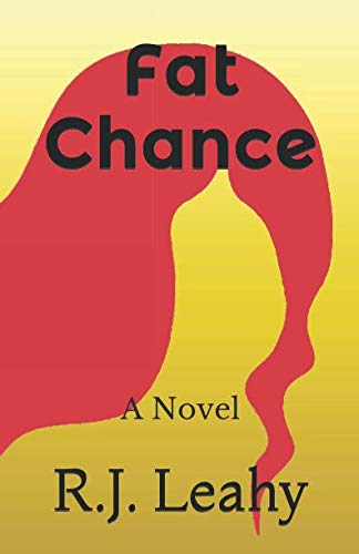
This may sound like I’m taking out my frustrations on you. I’m not, exactly, but your cover is an opportune occasion to remind everyone of some basic facts.
Your cover isn’t meant to be art to tickle the fancy of intelligentsia in a gallery showing.
It’s advertising.
It’s a billboard.
It’s supposed to instantly convey to the target audience, “Hey! This is a book you’d be interested in!” Which means you need to know how that target audience is normally signaled to.
Look at your cover. Is there ANYTHING that says it’s full of wacky characters? That it’s a humorous cozy with a sarcastic private eye? Heck, that it’s even a mystery? Without “A Novel” on there, we wouldn’t even know where it falls on the fiction/nonfiction divide.
You are doing nothing to attract your target audience. Your cover is a net negative.
This isn’t even an occasion where you need to start over with a different concept. You just need to start over with A concept. You need to brainstorm with someone: How do I let the readers of wacky cozy mysteries that this book is for them? How do I get them interested?
I am afraid that I will have to underscore what Nathan says. The design is striking (though it’s unclear exactly what it’s supposed to be: if a face outlined by hair, it’s not working well), but it suggests nothing of the book you describe.
I don’t totally disagree with Ron’s knowledgable points. However, stark simplicity can be effective. Some of my favorite covers have optical illusions using positive and negative space. If you can take 2 recognizable shapes and merge them into something that a viewer puzzles upon for a moment before the illusion hits them, it could be a very successful cover. Of course, these shapes would have to relate to the setting or character, or other relevant components.
Simplicity is fine (as one can observe on e.g. one of the cover designs for A Clockwork Orange before Stanley Kubrick’s movie adaptation was ever made). What’s not working here is that this “image” is completely abstract. As I said for Letter J and as I’m saying now for Fat Chance, put any and all of those “cleverly” confusing symbolic sub-textual abstractions you want to convey to your reader in the story itself, but leave them off the cover.
For the cover, imagery needs to be as concrete—or at least instantly recognizable—as possible. When somebody browsing through books on a sales site like Amazon or Barnes & Noble sees a thumbnail of your book’s cover, you’ve got maybe five seconds tops to grab that prospective reader’s attention before he or she scrolls on past it. This abstract splotch of red-on-white-and-yellow-gradient simply isn’t going to do that, period.
You want to sell a detective story with some flair for humor, we need to see that detective and something at least mildly funny-looking on the cover. My suggestion? Ask DeepAI’s image generator whip up some caricatures of the wacky characters in some funny situation from the story for you on its “Political Satire Cartoon Generator” setting; though AI still doesn’t understand humor (and probably never will), it at least knows how to ape the inherently funny illustrative styles of the satirical political artists who do.
The description of the book sounds like something I’d want to read. The awful cover would prevent me from doing so. You’re doing your book a disservice. Nothing works here: the weird shape, the colors, the typeface. Please start from scratch or better yet, hire a designer. Also, try Shutterstock. There are many images there that may work.
The cover itself is not bad (IMO), but the design plus the title would make me assume it’s literary fiction about a plus-size woman. I might actually be interested…but would be disappointed and befuddled to find out it’s really a wacky cozy mystery with a male main character. You need a cover that will attract readers who want to read the book you actually wrote, not a completely different book.