The author says:
‘The Worst Man on Mars’ is a British Sci-Fi Comedy that’s a cross between ‘The Martian’ and ‘Red Dwarf’. It’s aimed at the same audience who enjoyed ‘Hitchhiker’s Guide to the Galaxy’. A blunt Yorkshireman and reality TV show winner has seized control of the first manned mission to Mars. He finds that the base – built by an advance party of incompetent robots – isn’t ready. Worse still, the planet isn’t as empty as first thought.
Nathan says:
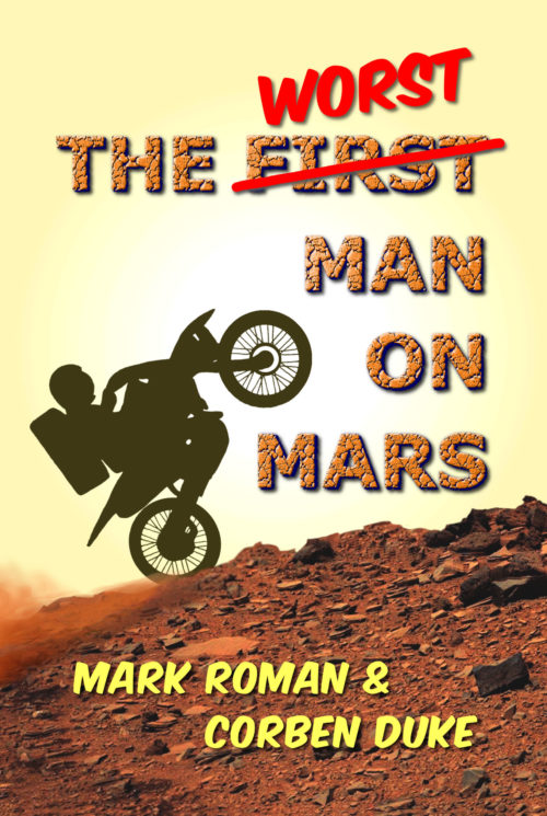
One of the rules of thumb often bandied around here is, “Would a person who knows no English understand the cover?” In this case, I’d have to say that they wouldn’t; while the orange color scheme works if if you know that the book is set on Mars, it could just as easily be a motocross novel set in Southern Utah. I think that the humor of the description really doesn’t come through, either.
Here’s what I would do:
- Replace the main title font with something either “noble” (Trajan, etc.) or computerized.
- Use actual handwritten letters for “worst.”
- Add something that looks like a Mars base in the horizon space behind the motorcycle.
- Add a gradient to the sky, so that it darkens to purple at the top, possibly with some stars showing.
(An aside: Is there enough oxygen in the Martian atmosphere that an internal combustion engine would work? Just asking.)
Other comments?

