Month: March 2016

Bad Sands

The author says:

Title: Bad Sands (The Sandglass Chronicle #1)

Genre: Sword and sorcery fantasy

Target audience: Young adult

Set in the fictional land of Ternia, in the year 99 AS. After the Sunder War, 99 years ago, the people of the three continents of Ignisk, Glyne, and Fernlea mostly avoid contact with one another. A young man, born and raised in the great West Desert of Ignisk, must make the perilous journey north to Glyne in order to save his mother from an illness not seen since the war. Unforeseen developments steer his path, but will it lead to glory, or disaster?

Bad-Sands

Bad-Sands

Nathan says:

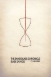
I like the whole “minimalist movie poster” thing as much as the next guy, but I fear it has misled a generation of designers.  The reason that those movie posters can work is that we already know the movies in question — so when we see an iconic image from that movie, we can identify it and understand the image and its meaning.  But if you’ve ever looked at one of those posters for a movie with which you’re completely unfamiliar, it falls flat because it’s completely meaningless to you.

This cover exhibits the same problem.  If we already knew and loved the book, then this cover could be a witty encapsulation or callback to a central image of the story… but if you’re marketing your book only to people who have already read it, I’m thinking you’ve confined yourself to a very small market segment indeed.

Now, I actually like the type treatment very much, and I think it could work wonders with a different image (and if it were larger — there’s no reason to confine it to the center of the cover).  But there’s nothing here to tell the potential reader of YA sword-& sorcery that THIS BOOK IS FOR YOU, which is what a cover’s primary mission is.

But like I said, I like the print.  I think it could work very well to tell the potential reader that this is “not your father’s high fantasy” — but only if juxtaposed with artwork that tells them that it is fantasy.

Other comments?
A Greater Strength

The author says:

Lieutenant Commander Vinyanel Ecleriast, a dragon-riding elf cavalry officer, embarks on a reconnaissance mission vital to the security of his homeland. On a cross-continental quest, he hunts stolen talismans before they fall into the hands of those who would use them to penetrate the illusion that shrouds the elven capitol from enemies. A gypsy prophetess, a rival marksman, a bookish swordsman who fights with grace, and Vinyanel’s would-be assassin make up his eclectic squadron. Only if Vinyanel can keep his worsening symptoms of battle trauma at bay, and the whole squadron can learn to trust one another’s strengths will they intercept the malice set to befall the elven race.

A Greater Strength is sword-and-sorcery fantasy that appeals to the readers of Terry Brooks or Tracy Hickman (Or Jill Williamson in the Christian Speculative Fiction market, but that’s probably more obscure than helpful.) The books aim for a New Adult and Adult audience. This cover is for an ebook re-release of the book, as I have reclaimed my rights from a defunct publisher and would like to get the book back on the market, rather than collecting digital dust on my hard drive. Thanks for any input you have for me!

GreaterStrengthDragonShadow_white

GreaterStrengthDragonShadow_white

Nathan says:

Since this is labeled as the second book of a series, I looked up the first book’s cover on Amazon, because consistent branding between books in a series is very important:

cover[1]

The first two things I noticed are:

  1. The dimensions aren’t the same.  (The first cover is taller than the second.)
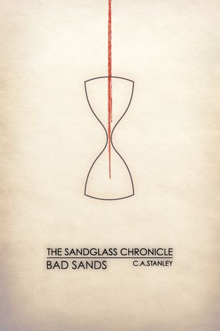
  2. The type treatment, while similar, is still distinctly different.  You have the title in a different place, and you haven’t continued the larger initial letters to the second cover.  The leading on the second cover (that is, the space between lines of type) also makes it harder to read.

I think you should definitely follow the first book on those details — not only are they an integral part of your series’ identity, but their handling on the first cover just looks better.

As far as the cover image itself, the best option would obviously be to have another painted cover in similar style as the first one (again, series identity), but if that’s not an option…

I think the areas for improvement on the second cover become more obvious in the thumbnail: There’s not a focus to your image.  Nothing is central; nothing is distinct, save the dragon’s shadow, which is then competed against by map and sword and book and…  (Plus, if you move the title higher to match the first book, it will interfere with the shadow’s head, which is the most visible part.)

I don’t know how much of the original image was cropped to make your cover; if there’s extra, my first step after moving and conforming the title would be to scootch the image down, so that the shadow’s head is central to the space left between the title and byline. Don’t worry that you lose the sword etc. in the thumbnail if you do that; your thumbnail is better off with a single focal image.  The other details will be just fine if the reader only discovers them at larger size.

Other comments?