The author says:
The realm of Belkin is now in open civil war. The southern county of Turgany rises up to try to defeat the self-proclaimed President and end his tyrannical rule. Will Arbor, Freamhaigh to the druids, must find a way to counter the threat of Erebus. Gaea has been wounded and no longer responds to her druids. Meanwhile, the Sect of the Church of the New Order rises with greater power and threatens to destroy the unstable harmony of the Realm. Will Arbor and the druids are all that stands between Erebus and the land of Belkin. As Freamhaigh, Will must be ready to sacrifice all he holds dear.
Nathan says:
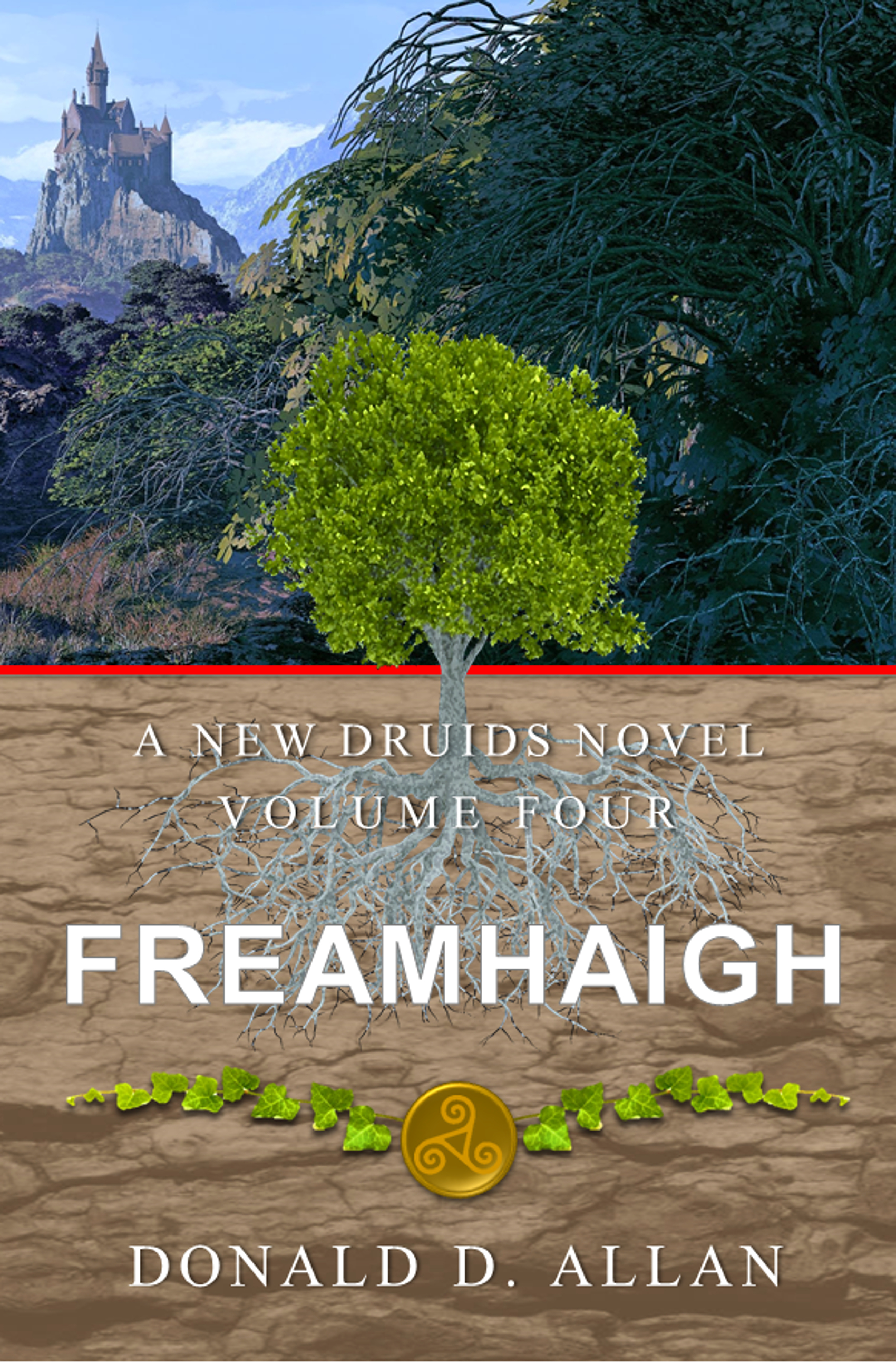
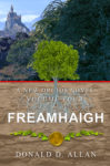
I looked at the previous three volumes up on Amazon, and they all show consistent branding. Unfortunately, those consistent parts are the biggest problems.
- Your title font is the plainest, most non-evocative font imaginable.
- The white type disappears against the light brown background.
In addition, while I understand the progression of the central tree from a sapling on the first cover to a full-grown tree on this one, the tree in the center clashes with the foliage behind it.
Now, I also saw that you have some combined volumes up on Amazon, one with the first two volumes and one with the last two:

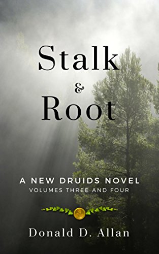
I think these covers are a lot closer to what you need. Simply switch out the title font with something a bit more evocative of ancient Britain, and I think you’re good.
Other comments?