The author says:
Locksmith’s Closet is a YA science-fiction novel about a boy named Lachlan Smith who discovers a portal to the future in his bedroom closet, goes through and finds an apparently uninhabited world. He and his friend Gary set about trying to discover what happened, and whether it can be changed. Meanwhile, his family has an enemy who wants to steal the portal for his own purposes.
Nathan says:
I think this is a good beginning, but we could definitely kick it up a notch.
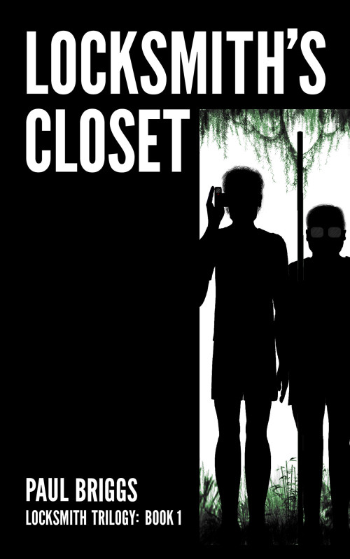
As it is, I’m not sure if the two figures on the cover are supposed to be Lachlan and Gary or the enemy agents. Probably the former (since one seems to be wearing shorts), but my first impression was more of shadowy Men In Black types than of two youth discovering the great beyond. Quickish fixes might be to have them each peering in from one side instead of standing ramrod straight, and showing some color in what they’re wearing; even if you want to keep them as silhouettes, some color showing around the edges would do a lot for nailing down both who these characters are and what the mood of the book is.
That might be enough to counteract the darkness that dominates the cover; I’m not sure about the tone of the book, but the synopsis leads me to believe that it’s more of an adventure story than a suspense thriller. It also may be useful to have a subtle pattern, something organic (or possibly wood-grained) lighten up the black half of the cover.
Other thoughts?


I’ll second Nathan’s comments. A little bit of color could help things. I don’t think you need a lot, subtle hints of it probably would be fine if you want to keep the mystery. Unless the closet has a light in it, it’s typically dark.
But that could be another angle. An unadorned light bulb could throw off some light and provide interesting contrast if its bright, but if the filament is dying, you can play with varying degrees of illumination.
I get that one guy has a video camera (the red dot gave it away), but what is that pole the other guy has? Is it a weapon of some kind? Maybe if there was a bit of color, that would help. It could help set the tone that you’re trying to convey.
I love the two figures, yet they confuse me because it seems as if they’re looking OUT of the closet where the portal is. We’re seeing their fronts (glasses and camera pointed our way confirm that) but the discovered world appears to be behind them.
I also would like to see some texture or even black/gray gradient of some kind on the black blocks–so there is a difference between it and the figures’ shadowy images. If he wanted to keep the black surrounding the doorway a single color, I could deal with that if then he maybe applied some texture or dimension to the words. That plain white text is kinda simple looking. The letters could even be filled with a bit of the plant matter (even a semi-transparent version of it) we see through the doorway. That would look cool.
These are good ideas. I can definitely add some color to the edges of the clothes (and hair?) to make it look like the sun is shining through them. I also like the idea of a subtle texture over the black area — I’m thinking moss over crumbling brickwork for that Ruins-of-the-Modern-Age feel. I’m sure there’s a way to do that in GIMP.
One thing I’m realizing is that the image doesn’t convey as much of the story as I thought, and the title isn’t much help. Would a tagline be a good idea? There’s plenty of room for one on the left. Something like:
A time portal.
An empty world.
A mystery that
must be solved…
Would that be an improvement?
Well, you’ve certainly got a ready-made space for it.
I absolutely love the “Frank Miller-esque” glasses on the short kid. Very effective.
Here’s a preliminary redesign of the cover. I couldn’t do anything about the poses — I hope the clothing highlights are visible. Apart from the tagline, it looks about the same in thumbnail.
Am I on the right track?