Month: March 2016

A World Alone

The author says:

A young adult, zombie, horror novel that focuses more on their internal struggles while surviving in a post-apocalyptic wasteland.

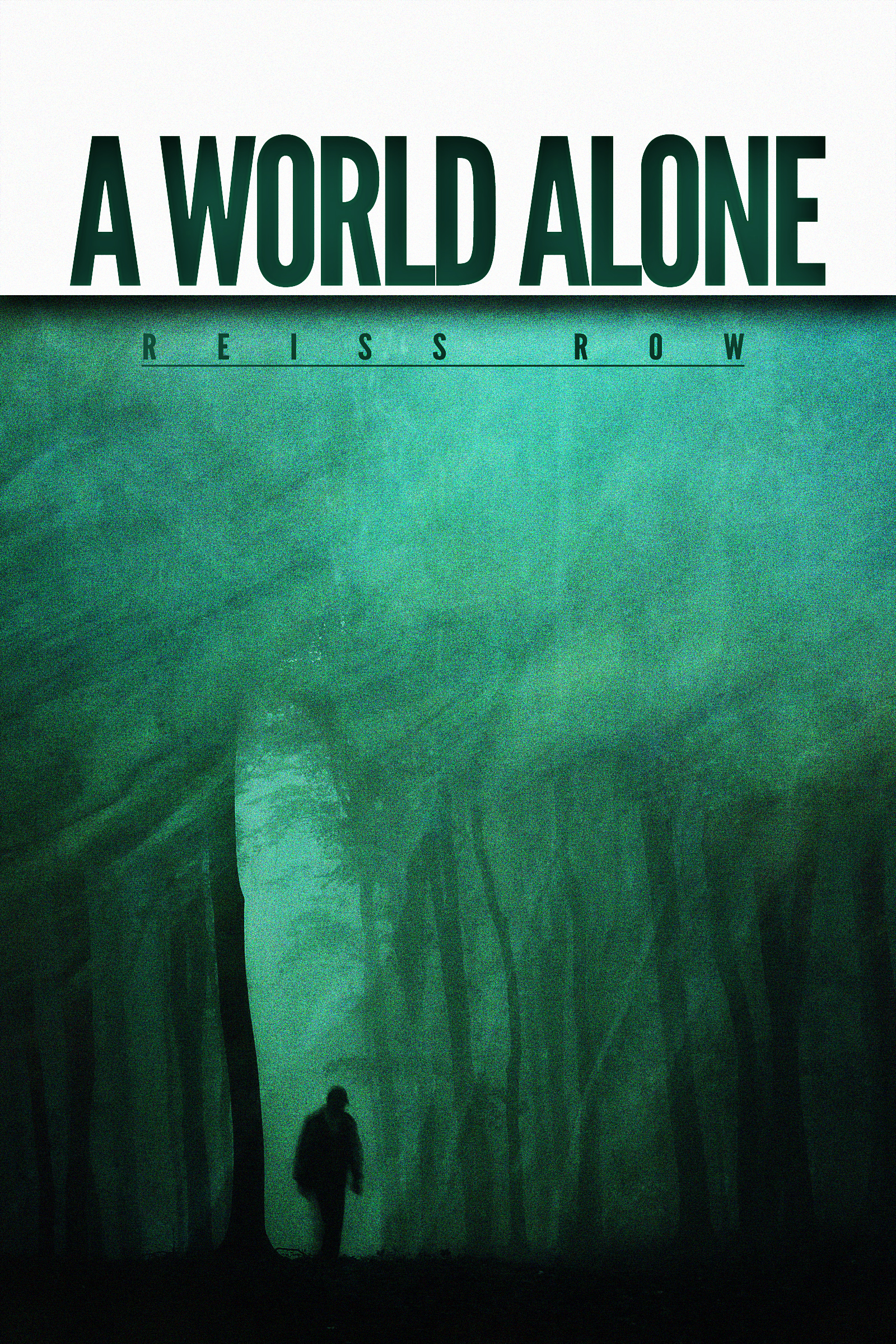
Synopsis: Stella Carlisle is a thousand miles from her destination, and she’s willing to do anything to get there. Whether that means manipulating fellow survivors, or killing them, nothing is going to deter her. While infected lurk around every corner and bandits hide in every shadow, starvation and illness follow closely in their wake. In a world of personal demons, void of connection, Stella truly is living in a world alone.

Thank you so much for any criticism you can give me!

A World Alone Cover

A World Alone Cover

Nathan says:

First, a niggling little ebook design tip: When you’ve got white background to the edge of the page, add a very thin border to separate your cover from the (likely white) background of the page on which it’s sold. (Yes, I know that it’s off-white, but so subtly so that it’s still a problem.)

Now on to the cover itself:  It’s a very solid design, and you’ve done well with separating it from the blood/guts/etc. of most of the zombie genre… perhaps too well.  Nothing on this cover looks dangerous.  Nothing looks like the world is out of whack.  It looks almost completely introspective.

Also, the only person you mention in your synopsis is a woman who’s completely alone — but that’s a man’s silhouette.

I would add some “noise” to the picture — cracks, probably, not only showing that something is “crumbling,” but also giving me the opportunity to add hints of a contrasting color.

Heck, the file you sent me is large enough; I’ll show you what I mean.

A World Alone Cover w cracks

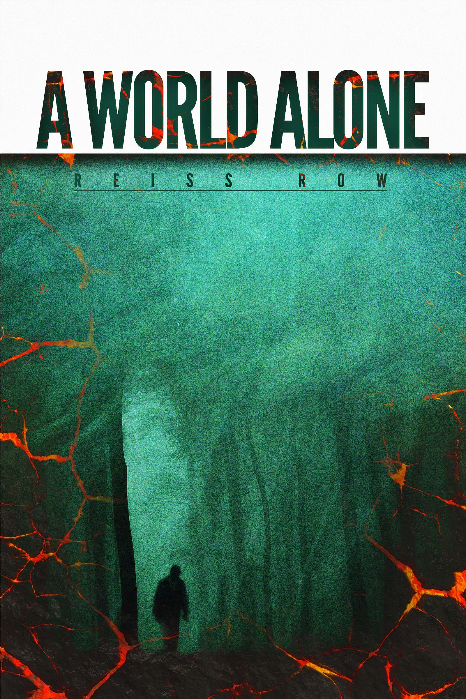
Not the best possible design solution, obviously; I just grabbed a lava texture out of my textures folder to show what I mean.  (Doesn’t everybody have a textures folders?) The point is that distressing the image can add some of the apocalyptic vibe that the current image doesn’t hold.

And fix that man.

Other comments?

A note about the posting schedule…

There’s been more interest in CoverCritics.com lately (largely spurred by a presentation I did on indie cover design at LTUE in February), with a corresponding rise in the number of submissions.

However, I don’t want to post more than three covers for critique per week, as I want commenters to have time to give thoughtful critiques without feeling that things are “piling up.”

The upshot is that the submissions themselves are piling up a bit.  There are currently five submissions in the hopper, or almost two weeks’ worth.

If you submitted and have not seen your cover here yet, please be patient.  (If, however, you’ve already submitted and don’t see your cover in two weeks’ time, feel free to drop me a line.  I have to rescue at least half of the submissions I receive from my spam folder.)

Echoes in the Cavern

The author says:

Book two in the middle grade Young Marian series. Deep in the serpentine caves beneath Nottingham, a plot unravels, its sinister tendrils threatening to ensnare Marian’s father in dark accusations of treachery. With her home under a blanket of suspicion and the long shadow of Prince John looming over them, fourteen year old Marian and her best friend Robin seek to uncover the true culprit behind the mysterious theft of the crown’s gold. Her quest to catch the thief and prove her father’s innocence leads Marian on a chase through the heart of Sherwood Forest to the bowels of Nottingham Castle. Events unfold rapidly and the villainous Lord Ranulf hovers ever in the background, whispers and lies at the ready. As he weaves his web of deceit, Marian begins to worry that her own impulsive actions may play a part in destroying her father and everything she loves.

YM2cover

YM2cover

Nathan says:

As this is the second volume in the series, I looked up the first one to see what elements were already established for branding.  My comments are divided into those specifically for Echoes in the Cavern, and for the series as a whole:

cover[1]

Comments specifically about Echoes in the Cavern:

It’s very professionally done.  I think the only things I would toy with changing are:

  1. Somehow, I don’t think the lighter color behind the title works as well.  Maybe it calls attention to the lack of illustration up there; I dunno.
  2. The title seems marginally harder to read.  That could be because of the overlap between E and C, confusing the order in which the words are to be read.  Again, I dunno.

Comments about the series branding:

I like all of your elements.  I wish the titles were larger (after all, it’s not like you’d be obscuring the illustration behind the title — it’s just dead space), and I especially wish your byline were larger.  Let your fans know it’s another Mandy Webster book!

Any other comments?

Dazzled by Darkness

The author says:

What happens when a book-smart Jewish girl who haunts museums falls for a street-smart Latino guy who creates radical in-your-face artwork? Author Erica Miles invites you to take a trip back in time to the 1960s art scene in Brooklyn, New York, to find out.

DazzledbyDarkness_EBOOK (1)

DazzledbyDarkness_EBOOK (1)

Nathan says:

If I were to see the cover without the description, I’d assume it was a paranormal romance.  (Not the kind with alpha wolves and shifter bears, but still.)  The color scheme and sparkle definitely buy into that otherworldly vibe that the “reincarnated psychics in love” novels cultivate.

Where’s the ’60s in this?  Yes, he’s got a peace sign around his neck, but it doesn’t really draw the eye, and it’s invisible in the thumbnail.  But you could do so much with the color scheme, the font choices… Heck, it’s a book about a radical artist.  Show me some radical artwork!

(Also: The guy’s hairline makes it look like his ‘fro wig is sliding off his head.)

Anyone think differently?

The Assassin’s Brink [resubmit]

The author says:

Reworked cover for my in-progress story. I’ve used better images that I think better convey the story’s title “The Assassin’s Brink.” I’ve changed a few things after a bit of time away from the project (gotta love writer’s block and hectic schedules). The two biggest differences to the story are the two main characters; Alexandra Granger is now Alexander Granger and Marcus Kane is now Amanda Kane. Other than that the story will remain roughly the same.

The Assassin’s Brink: An Alex Granger Thriller

Drummed out of the US Army after a dispute with his superiors, former Delta Force operator Alexander “Alex” Granger is recruited by the Central Intelligence Agency for an off-the-books mission in the Middle East to assassinate terrorist leader Abdul bin al Kamal—formerly Lt. Cdr. Kenneth Monroe, a Naval Intelligence officer. But nothing is what it seems when Alex is ambushed and nearly killed by a CIA strike team. Wounded and on the run from his own country, Alex calls upon the one person he can actually trust: Marine Force Recon sniper Gunnery Sergeant Amanda Kane. Off the reservation and hunted by the country they’ve faithfully served, the duo faces off against a shadowy cabal—who will stop at nothing to keep their existence secret—plotting a devastating attack against the United States.

The-Assassin's-Brink

The-Assassin's-Brink

[original submission and comments here]

Nathan says:

I like this very much more.  (That sounds wonky, but the grammar’s correct. Honest.)  The fonts are strong, the color scheme adds a bit of tension to the red/white/blue, and there’s more detail for readers to discover at full size.

My only suggestion would be for the figure himself; rather than a man with a mission, he looks like a man abandoning his mission and walking away.  If you squared up his shoulders and put a gun in his hands, he’d appear much more resolute and driven.

Other than that, I’m happy.  Anybody else?