
The author says:
Hannah Tree, ex crim Private Investigator gets kidnapped three times while investigating a kidnap case she thinks is con. She’s right. But the kidnappers hire her to find a gangster’s daughter whose fake kidnapping they also arranged. The only real kidnapping is Hannah’s.
Nathan says:
I hope that you were typing that on a phone and that it’s not indicative of the quality of prose.
Any time we look at a book later in a series, we have to balance improvements directly to that cover with the branding for the series as a whole (sometimes the ideal solution is simply to redo all of the covers at once, but that’s obviously a bigger undertaking). Here are the other covers in the Hannah Tree: Private Detective series:
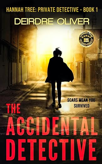
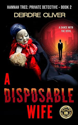
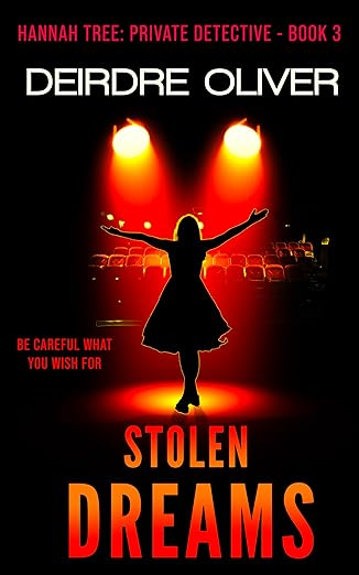
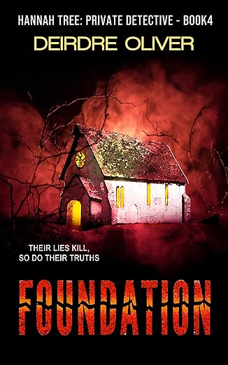
There’s good consistent branding across the series, without being so tight that it’s constrictive.
This fifth entry tries to follow the same elements, but… Have you changed designers? Or have you decided to ditch the designer and just do it yourself? Because there are a few things that stand out as differing in this fifth cover from the previous four:
- Byline is similar, but the font and (especially) size are different.
- Series title now follows the style of the byline instead of the book title.
- Book title isn’t as bold, nor is it rendered in shades of red.
- The artwork is less central, less colorful, and honestly less professional.
I think in this case, the changes you could make to improve the cover and the changes you could make to better follow the series branding are, fortunately, the same. Changes you make to help this cover look like the previous four are also changes which will improve the cover overall.
The biggest single problem I saw, even before I looked at the other covers in the series, is that the image used is too easy to ignore, especially in thumbnail. I understand that you were going for a feeling of stark loneliness; however, the image elements get lost in the sea of blackness, and it doesn’t make much of an impression on the casual browser on Amazon. Look at the ways that contrast and bold colors arrest the attention on the previous four covers; that’s what you need on the fifth.
Other comments?
I might only wish that the background behind the character were not so very dark. She looks as though she is floating in all that black space. A little more of the cell being visible would anchor her into the picture.
What if you made the girl larger and made a reddish light coming in through the window? Here is my very rudimentary mockup. https://www.dropbox.com/scl/fi/xux3oh7ot0xg7cvrl7v11/Snatched2.png?e=1 (Sorry for the mile long url!)
Yeah, I’m gonna have to go with what our esteemed host and my colleagues are saying: stick with what works. The gal in question needs to be front and center on the cover, and the basement dungeon where she’s evidently being kept needs a red and/or yellow color wash like the ones on your other books’ covers. On those other covers, those color washes bursting forth from the dark backgrounds provide them with the subtly sinister feel that this cover also needs, but is currently lacking.
The hierarchy with the “Love and Money” line is pulling the viewer’s focus making it seem like it is a title vs a call out. I recommend to follow the structure in the other series and have it near the main design elements.