The author says:
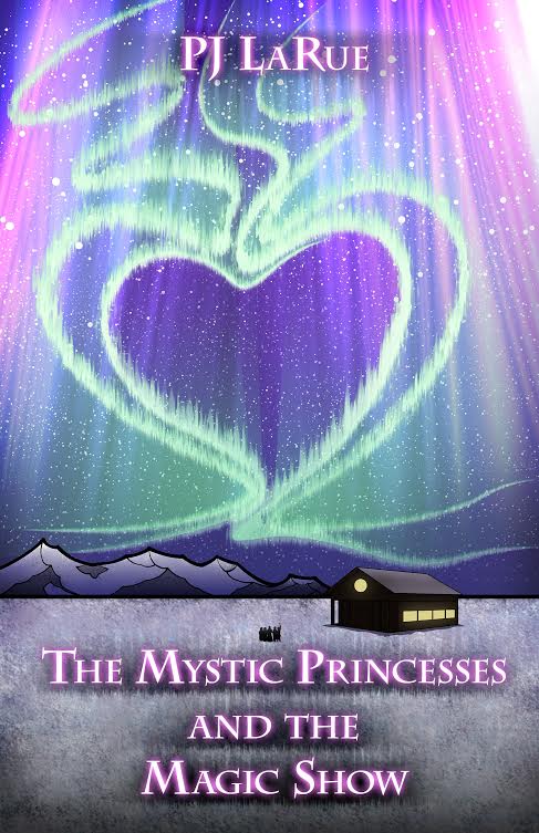
The Mystic Princesses hear about an oil spill in the Gulf of Alaska. They raise money to help clean the water and wildlife and are treated to a trip to Alaska to help with the clean up efforts. While there, they get to see the Aurora Borealis. The book is written for children aged 5 to 10 years old.
Nathan says:
I love all the elements. My only advice: Make the title bigger! Right now it looks hesitant. In fact, the only reason the snowy landscape exists is to have a place to put the title; instead, crop it so the cabin is right in the lower right corner, and boldly splash the title right across the heart aurora!
Anyone else think different?
Nathan’s advice is good. The only thing I would suggest is possibly switching the title font color to plain white. The current color seems to get lost some to me. White (or perhaps another very light color) would make the title stand out more I think.
I agree with Nathan and Adrian. The art is very nice, but is not being well served by the typography.
Nathan’s suggestion about enlarging the art until the cabin is in the lower right and most of the snowy foreground is lost is good except that I fear it would bring the edges of the aurora far too close to the edges of the cover. However, the fact remains that the eye goes immediately to the center of that heart shape…and there is nothing to see but empty space.
I would seriously consider losing the little figures, however. At all but the largest cover size, they are little more than a black blob.
I really like the art, but I don’t feel the text works at all. I don’t like the font, I don’t think it’s big enough, and I don’t think the text makes it stand out. Make the ‘and the’ smaller and the two lines above and below it bigger, and try different fonts and effects. There’s no reason why the author name needs to be so small either.
The art looks to have good potential to attract the target age group. Don’t lose the impact of the art in any redesigns. Good luck.
Agree with the others that everything is great except the typography. I think you could find fonts that would more strongly identify this with your age category.