The author says:
I’m resubmitting a new cover for my Young-Adult Science Fiction novel. Although the cover design doesn’t suggest science fiction, I feel that it captures the spirit of the novel more closely than my attempts at a more SciFi oriented cover. The Magician’s Horses is a time travel story, but the underlying theme involves shedding material possessions and returning to nature. It is a story about coping with death and being alone. It is a story about survival, friendship, and new love. How I’m going to word that in a blurb, I have yet to determine.
Nathan says:
Note: You can see the two previous iterations of this cover here and here.
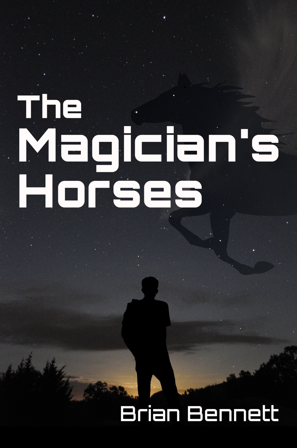
The typeface chosen here definitely sells the “sf” vibe better than the original. I would call this a good sketch for what you want to do. Now you need to roll up your sleeves and bring the magic.
– Look at the thumbnail. The horse silhouette gets lost, and the placement of type and other elements against the dark background seems arbitrary. Perhaps a top-to-bottom fade of color in the horse silhouette (maybe the red from the second cover?) would give it some visual distinction. The thumbnail comes across as monolithic gray. Coule upping the color and saturation in the sunset (sunrise?) add some appeal?
– What detail can you add to the large version which doesn’t distract from the clarity at thumbnail size, but rewards the browser for looking at it larger? (That’s one of the loose principles I’m seeing coalesce out of my exploration of good cover design: The full size version should give the viewer something beyond what can be seen in the thumbnail.) Could a slight bevel, glow, or shadow on the type make it more interesting (without reducing readability, especially in the thumbnail)? How about a subtle texture or pattern in the blacks and darks?
Other ideas?
Nice design overall, but there are serious problems with clarity. The horse is virtually invisible at best and completely vanishes in thumbnail size.
And even if the horse were clearer, you would still have the problem of having largely buried it under the title.
Perhaps you might take a cue from pictorial star maps of the constellation Pegasus. A Google image search for “Pegasus constellation” will provide you with some good ideas and directions to go. Something along those lines might also give a little more visual rationale to the silhouette of the horse against the night sky.
There seems to be no reason to crowd your name into the bottom corner: it looks like an afterthought.
Now, having said all that, I read your blurb. The story may be “a time travel story…[whose] underlying theme involves shedding material possessions and returning to nature. It is a story about coping with death and being alone. It is a story about survival, friendship, and new love,” but I don’t think the cover conveys any of those things. It might if, perhaps, your figure wasn’t an anonymous silhouette but was instead shown with enough detail to get across some of the emotions you are trying to write about.
I suspect that you feel the cover captures the spirit of the novel largely because you are already intimately familiar with the book. To someone seeing the cover cold, I don’t think the connections are going to be nearly so obvious.
I’m not a fan of silhouette people. If the person is important, I want to see him; if not, I don’t want to know about him. The horse is interesting, but that’s the only thing on the cover that catches my attention, and it’s far too subtle to do it in the thumbnail. It’s so dark and b&w; some use of color could grab attention. I get the sci-fi part clearly, which is half the battle, but the other half is drawing the audience into your product page.
I feel like the title should be higher up, with the horse silhouette underneath it
As the author and cover designer, I thank you all for your comments, from the original post until now.
I truly take every recommendation into consideration!
(Special thanks to Adrian who saw potential in the original cover idea)
I understand the problems of clarity in the latest design, especially on mobile devices, smaller screens, or LCD monitors. It looks great on my monitor when I look at it straight on, but when I move around in the room, the horse disappears. That’s a problem! I’m looking into how I can remedy that.
Adding color to the horse isn’t a preferred option since it’s supposed to be a black horse. (What was I thinking? Trying to put a black horse into a starry sky?)
But, my biggest concern is Ron’s comment that the image may not reflect the spirit of the novel.
My question to myself is this: is the disconnect a problem with my description in the blurb or in my depiction in the cover image? (Or is Ron just being difficult?) (Just teasing)
So, I ask you faithful covercritic followers, “What emotions and feelings do you get from this cover?”
First of all, the sky doesn’t have to be black at night to have stars. If the sky is a blue or purple it could add to the sci-fi feel, and then, zing! The horse stands out.
My real problem? Since the first time I saw this book? The title. Sorry.
This is supposed to be a sci-fi book, but the title has ‘Magician’ in it. Magician to me (Even horse to a lesser degree) instantly means Fantasy. So much does this resemble a fantasy book title, and have a fantasy feel to the cover, that if I saw this in the store in the Sci-Fi section, I would very helpfully move it back to the fantasy section thinking someone lazy didn’t put the book back properly.
Is this a space magician, or is it an abstract concept of magic? Are the horses mechanical in any way? Robot horses? Time displacement horses? I don’t know enough about either to help properly I am afraid.
Here though, I found these in a quick search for some inspiration:
http://wall.alphacoders.com/big.php?i=183473
http://s2.goodfon.su/wallpaper/previews-middle/579243.jpg
Just getting home from travel and looking at this and the 2 prior versions. I think v.3 is very close. My suggestions:
1. Move the title closer to the top; make the font a tad thinner (it’s currently bigger than it needs to be). Reason: to clear a space for the horse’s head to show against a somewhat lighter background on top.
2. Move your name to the left, stacked (Brian on top of Bennett) and make it a bit larger/thicker so it shows better in the thumbnail.
3. Write your blurb and include it with the next iteration. Tell us (not necessarily in this order) the young man’s name, what times he is traveling to/from and why, who died and why he’s alone, why he returns to nature and struggles to survive (Thoreau walked home from Walden for lunch). Give us a hint about the new friendship, new love, and what the magician and horses have to do with it.
The cover and blurb/description should work together. With v.3 you suggest fantasy (magician, flying horse)/sci-fi (font) without being trite. The young guy (even in silhouette), the magician, the horse: makes me think you could add “young adult” to your key words and pull in those horse-crazy tweens and their older sisters and moms.