The author says:
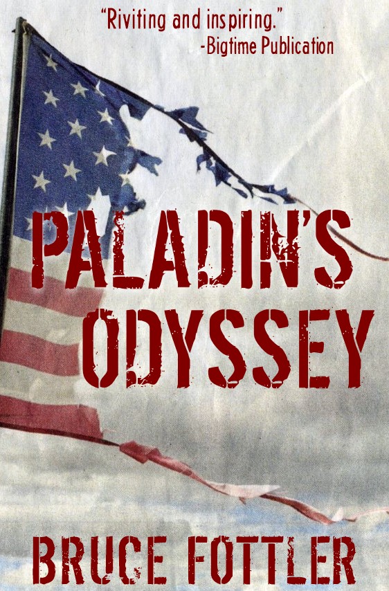
A dystopian thriller. Joesph Paladin is a national hero everyone thought they knew: A former major in the United States Army, retired colonel in the Maine Republic Militia, and one of the key founders of the New American Confederation. His exploits to reunify a fractured nation in the grim aftermath of a global catastrophe are legendary. But only a handful of people knew his real story. History books will be rewritten as his long awaited memoir discloses a jaw-dropping secret that he’s harbored for decades, along with other untold stories of his past. (PS: No, I don’t really have an endorsement from a big-time publication. I was just curious to see how it would look on this cover. Maybe, someday…)
Nathan says:
It’s a well-designed cover in terms of aesthetics. I don’t know if it conveys the near-future, semi-post-apocalyptic setting of the novel; if I were to guess from the cover alone, I might expect a WWII or Vietnam-era battle epic or memoir.
For some reason, orange-red or brick-red seems to convey a near-future political dystopia well; you might experiment with adding that color to the background and tinting the ripped flag with it. (And if that makes the colors to uniform, try switching the type to white to stand out).
Other ideas?
I agree with Nathan that I’m uncertain whether or not it conveys a near future/post apocalyptic setting. However, it doesn’t strike me as WW2 epic, more like contemporary military-political thriller. But that isn’t a bad thing.
Honestly, I don’t see a need to change the cover unless you need it to appear more apocalyptic.
If so, I would think a ruined building or city skyline would work. But I’ll leave that to the pros here to decide if that suggestion is feasible without ruining this cover.
The last thing you want is a typo on the top of the cover, even if it’s inside a quote. (Riveting vs. riviting)
That’s a very professional-looking cover! Congratulations!
I have to add my vote to the previous comments that it’s not immediately clear that your story isn’t set in, say World War II or the Civil War. It needs some additional element to get across the idea of near future dystopia.
I think your cover could work fine as it is, but making what your book is about clearer to potential readers would not be a bad thing.
Hello Cover Critics!
A little while ago I posted a cover for critique here and got some great feedback. So, I came back for another try, and once again you guys didn’t disappoint.
I have to admit that this cover was spitballing something I wasn’t too confident about to begin with, and your consensus of genera confusion confirmed my main concern.
It’s been a challenge to find imagery for this cover, but when I came across this picture, there seemed to be something about it that symbolized my story – a ravaged American flag representing a country gutted by a catastrophe. Or maybe I was just getting a little too desperate to find something that worked?
Regardless, and as you’ve pointed out, it also conveys too many other types of stories. I can see how readers could get a strong “old war story memoirs” vibe out out it.
Another thing I was concerned about was the near-white background, although I suppose it could be darkened with more menacing storm clouds or Nathan’s idea of tinting.
GP – Nice catch. I guess that quote came from a bigtime publication with a poor editor. 😉
You all gave me a lot to think over. Thanks again for your helpful feedback.
Why is this cover even here? Looks fine to me.
It’s here because the author wanted feedback. This is the site where authors send their stuff in for an honest critique. LousyBookCovers is where Nathan and others pull stuff from the marketplace.
But it was still nice feedback. 🙂