The author says:
Setting: Los Angeles and other dimensions. Genre: speculative fantasy with detective and dystopian elements. Audience: adults who are comfortable crossing genres, able to enjoy Chandler *and* Tolkien, Douglas Adams *and* Dashiell Hammett. Thumbnail: When rookie private eye Nica takes on a mysterious case, she enters a world of multiple dimensions called Frames, where buildings and lawn chairs can be sentient, where a stray cat has great powers, where books can be killers, and clouds can be spies. At home, Nica tackles missing persons cases, while in the larger reality of the Frames she is swept into an escalating battle between good and evil.
Nathan says:
There are two groups of problems here which we can loosely group under “what the cover says,” and “how the cover says it.”
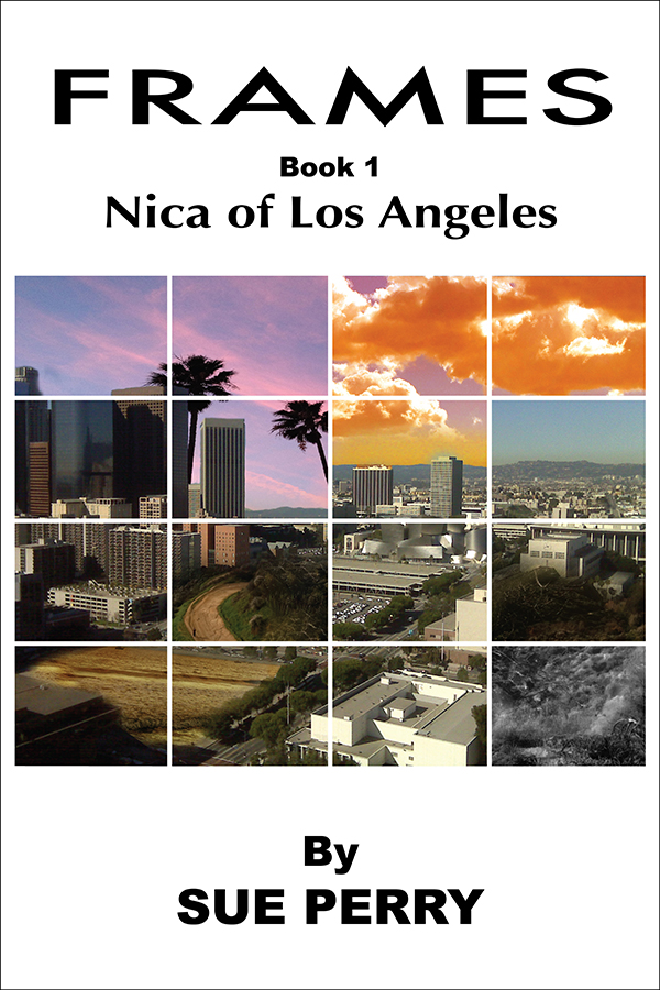
The biggest by far are under “what the cover says.” I get Los Angeles from what I see, but I get nothing that hints that this book contains either detective or fantasy elements — there’s no Chandler or Tolkien in evidence. If you’re committed to the grid outline (which has its own drawbacks — see the next paragraph), couldn’t you use some of the squares for something other than skyline and aerial shots? How about evocative back streets at night? Noir silhouettes with glowing eyes? Something other than postcard imagery?
Under “how the cover says it,” the biggest problem is the grid itself. I’m guessing that you went with that because of the “Frames” idea, but the grid prevents the cover from having any single noteworthy image as its center of attention. As you can see from the thumbnail version above, the postcard images in the grid are rendered even more generic.
Another problem under “how the cover says it” are the fonts. There are at least three (I’m guessing that “Book 1” and your byline are the same font), they don’t work well with each other, and — again — not a one of them evokes either detective or fantasy fiction.
And a third problem is the white space on the cover. White space can be very effective when it looks like part of the intentional design (usually, though not always, in nonfiction books). Here, it just looks like you didn’t know what to do with it.
If the covers posted here are salvageable, I like to suggest ways in which that can be accomplished. In this case, however, I think that starting over with a new visual concept is the way to go.
Anyone think differently?
The frame concept isn’t necessarily a bad one, but there are just too many. Some are very similar, but don’t actually match. Which is hard to figure out in my mind. (B3, B4 in spreadsheet language is my biggest problem, it is the same sky, but one isn’t at sunset?)
If you stick with the frames idea, they need to be distinct. To show the difference between the normal beginning setting and the outrageous sections of later chapters that have magical alley cats.
But that doesn’t mean they need to be different. As I said, some matches are unsettling because they look like accidents, but if they were on purpose it would be unsettling in the correct way. Having an image of a city skyline, all the same image, but certain frame are different, unique, magical even. Is there a castle or a crazy location in your book, make a skyscraper covered in vines for one frame, make it obviously different, but make it fit with the rest. Happy frames with dark sinister ones of the same image. That may convey more of a jumping around the same place but it is different vibe.
That might be an interesting idea to try out. If you do, then I’d make the lines black and not white. As there are spies and mystery in your book, black would be more mysterious.
Side Notes:
You really don’t need ‘by’ on the book. It’s a book, the name on there is assumed to be the author.
Nathan is right, none of those fonts are appropriate for this book. http://www.fontsquirrel.com Try some of those!
Are all of the books in the series called ‘Frames’? Or is this one called Nica of Los Angeles and Frames is the series name?
If Frames is the series name, I think it should say Book 1 of the Frames series. Although ‘Frames’ is a more interesting title. I don’t know actually, thinking about it isn’t working out. Something is off about it, but it may just be me.
I looked at this cover for a few seconds before reading the author’s notes, and assumed this was a book of photographs of Los Angeles. The title “Frames” fits that sort of a book, and I figured Nica was the name of the photographer.
So imagine my surprise…
IMO, the cover needs to be re-thought from scratch. If this were a book of photographs of Los Angeles, this wouldn’t be a bad cover. But to fit the actual content, you need something totally, totally different.
This cover is a good idea poorly executed. The “frames” could work if any of the images conveyed fantasy or detective, which they don’t. My first impression was “a photographic history of Los Angeles”.
I would suggest using a single photograph, with 2-3 different sections of the photograph altered, rather than trying to stitch together so many different photos.
Hey, folks, “Nica” author here. I’m not sure what the protocol is for authors jumping into the comment mix, but wanted to thank you for weighing in. I see what you mean!
I can only second all the other comments. The cover is simply inappropriate for the book it is on.
One problem many authors have is being able to be objective. It’s hard to remember that while you know everything there is to know about your book, the potential reader has never seen it before. This means that the cover needs to convey something meaningful about the book–its subject, its genre, etc.–without the viewer having any prior knowledge. So one question that is always useful to ask is: “Would someone seeing this book for the very first time have any idea what it might be about or what sort of book it might be?” If the answer is “no,” then this means the cover needs to be reconsidered.