The author says:
A Sci-Fi Fantasy Horror Western. Initially set in the old west, the story follows time travelling special forces commando Jack as he hunts down the Black Book. An ancient ledger that can save humanity’s future. Dark forces conspire to put an end to Jack’s mission even before it begins and Jack’s personal demons are dangerously close by.
Nathan says:
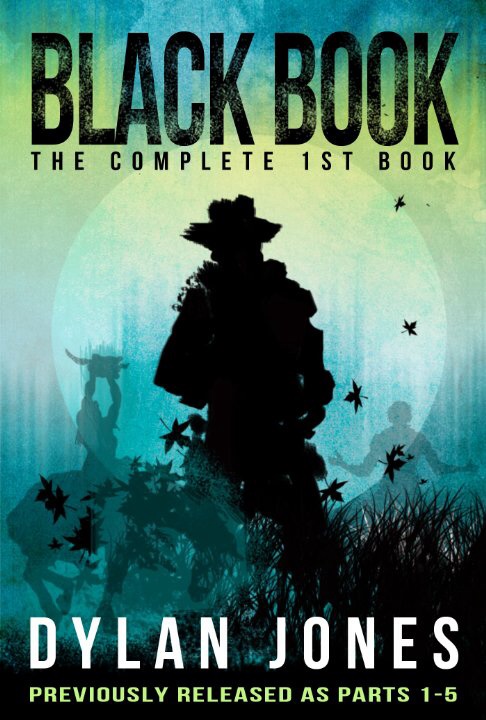
From a design standpoint, there are no egregious errors here. But I think we can fine-tune it to better attract the eyes of the right people.
First, I don’t know that the cover scheme is right for a SF/horror/western — it seems too soothing for me. Especially for westerns, I think one expects “dry” or “dusty” colors on the orange-through-scarlet spectrum. I think that would work for the horror part, too.
Second, the leaf silhouettes look like something more commonly seen in a romantic drama. Maybe it’s just the fact that they’re maple leaves (not really associated with the West).
Third, the way the silhouette of the Indian on the left overlaps the cowboy silhouette is visually confusing. I know you didn’t want to hide the horse entirely, but I think you might want to sacrifice it for visual cohesion.
Fourth, while the illustration captures the “western” part of the story, there’s not much indication of the SF/fantasy/horror parts (the existing color scheme may be an attempt to indicate SF instead of pure western, but I think all it really does is detract from the western appeal). Maybe a riveted border? Maybe a texture of ominous ancient writing over the lower shadowed parts? Obviously one doesn’t want it to get too busy, but I think this cover would be missing out by only emphasizing the western elements.
Finally, for the description under your name, rather than “previously released as,” you might try “collecting parts 1-5” or “parts 1-5 complete.”
Anyone else?
I’d probably get rid of the transparent silhouettes. They’re kind of taking the focus out of the main image. And I don’t like what it does to the cowboy’s leg either.
The “previously released as” can go too. Just make it clear in your blurb.
Apart from that, like Nathan said, we don’t get the horror/scifi vibe. But if I didn’t know it was in that genre? Really great cover.
This cover looked respectable to me when I first saw it in the thumbnail. Probably the biggest question is grabbing the intended audience, and Nathan offered some suggestions regarding this. The title isn’t helping with the target audience, I think, since I expect Black Book to be a guy’s collection of phone numbers, incongruous to a cowboy on the front cover (and if that’s a cowgirl in the background, in the thumbnail it won’t matter).
I don’t like the Complete First Book or Previously Released As text. It makes me wonder about things I didn’t need to know, instead of letting me focus on clicking on the book to learn more on the product page. Maybe you’re worried about the customer who isn’t paying attention and purchases what he or she already has (you can’t make it foolproof against said person anyway). I’d announce on my blog or author page to let fans know; and when they see Parts 1 to 5 in the contents, it should ring a bell. I wouldn’t want to lose sales from new customers.
How long are Parts 1 thru 5? If you could call them books or novellas, you could just call this the omnibus, which sounds like a good deal. A combination of Part 1 thru 5 sounds like you had been trying to sell them as short stories, but since it didn’t work out, now you’re trying to sell it as one book. (True or not, doesn’t matter. It’s the perception that matters, not the reality.)
This definitely looks professional-quality. I like the fonts and background textures; they are aesthetically pleasing without being overly distracting.
I’d lose the silhouetted background figures and the circle/moon. They don’t add much and for me, simplicity always wins out.
Agreed with everyone else to lose “previously released as parts 1-5;” aside from the other objections, the current placement looks like the author was previously in five pieces.
We reviewed Volume One. You can see the cover for that one there. It goes with a dark red/brown color. You can get an idea as to the whole parts 1 through 5 bit there.
I also do not like all three silhouettes at once like this.
It looks better in the Link DED supplied.
I say you ditch the other two, but save them for book 2+3. Then you already have a unified theme through the covers (if there is a book 2 +3).
It does look better in the dirty reds as well. But you could have subtle greens and blues left in to hint at the sci-fi elements of the book.
Dissenting opinion here. I really like this one and I wouldn’t change a thing. Not even the ‘Previously released as’.
This color scheme works well, I think — better than the more obvious red/orange and the more solid silhouettes on the cover of parts 1-3 — and those leaves are creepy as fuck. Even if they are maple 🙂
The author (and cover designer) here. 🙂 Thank you for the great feedback, I will honestly take this on board and re-design it a little. Incidentally, the book is currently free if you are interested – thanks once again! Oh, here’s the book :
At first glance it’s a strong design…but it’s confusing. It’s unclear what the silhouettes represent (the best I can make out is that there is someone on a horse with a chainsaw). I presume those who have already read the books separately would recognize the references…but you can’t sell a book solely to people who are already familiar with it.
Even if it were clearer what the central figure was it would still be a large hole in the middle of the cover. It draws the potential reader’s attention…and gives them nothing. A pair of eyes, for instance, would make all the difference.
That’s cool! But I would get rid of the translucent silhouettes as it’s not that clear what they are, and make more of a focus on the cowboy shape and maybe put a bit more detail into it to emphasise the Western in the book. I think it looks very professional just as it is, though.
Good cover as an icon but a little wierd full size. Usually its opposite.
Needs something that hints at the theme of the book like “time travelling commando Jack is back at it again…in1860.”