The author says:
This is a historical novel about the Night Witches, an all-female night bomber regiment that served in the Soviet Union during World War II, flying obsolete wood and canvas biplanes.
Nathan says:
So, if I’m understanding your description right, this is a fictionalized account of a true story. Yes?
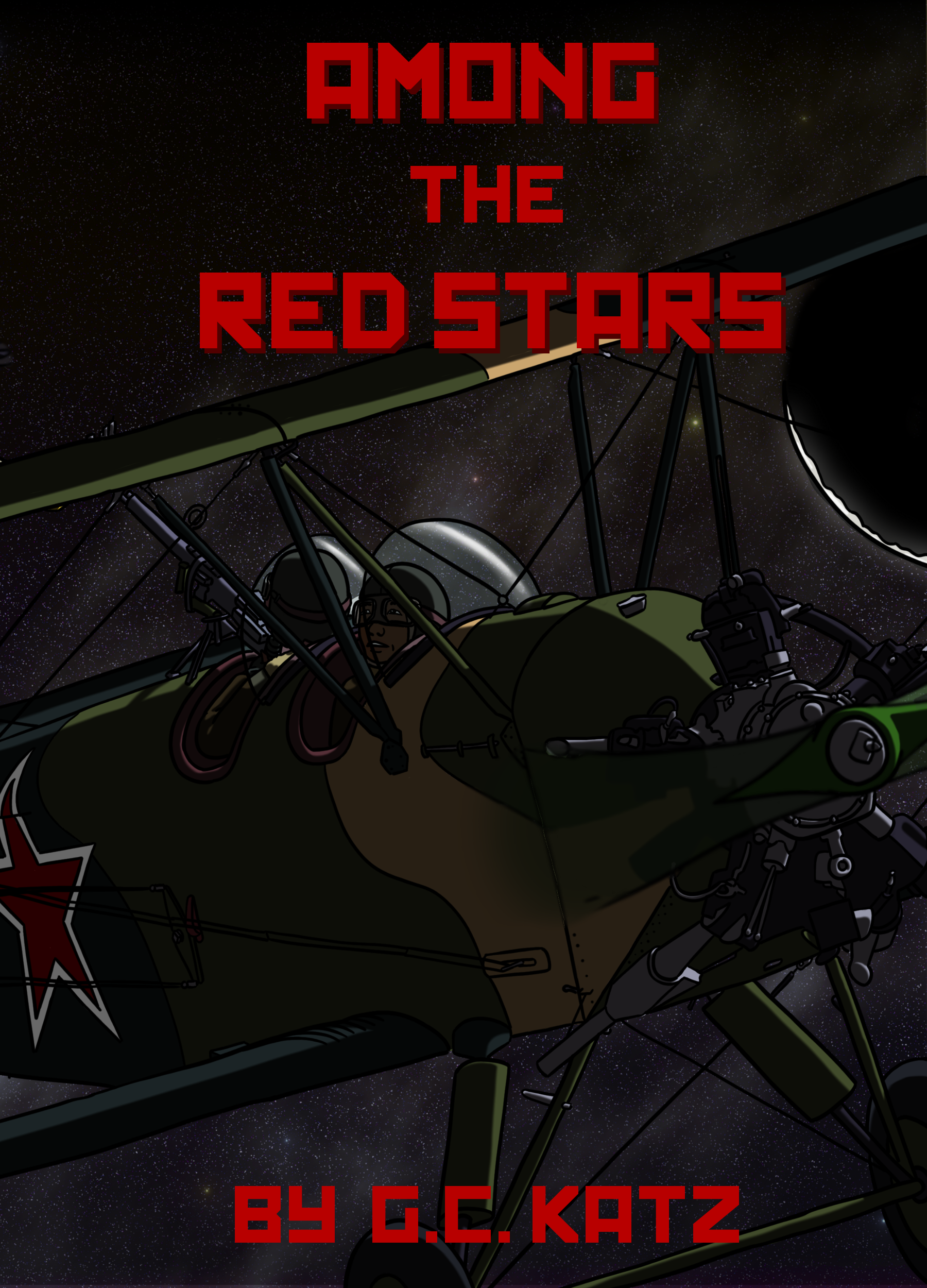
I like the idea behind it, but I see whole bunches of things I’d tweak. Most of it becomes apparent in the thumbnail: The cover is dominated by something I just can’t make out. In the larger version I can see that it’s a plane, but I can also see that it looks oddly comic-bookish. That may be what you’re going for — it’s a story which lends itself to a knowing pulp flavor of derring-do — but in that case, the comic illustration should look older.
Here’s what I’d do:
- Make the title larger. And give it a little more character, like the grungy paint texture one would see with stencils.
- Remove the “by” from the byline. If readers see a title and a name on a cover, they’re smart enough to understand that the name belongs to the author.
- Add a simple tagline that gives more context. “Soviet Bomber Babes vs. Nazis!” (Again, I don’t know the full vibe of the novel, so my tagline may be completely inappropriate for this book. But you want as many of those essential elements as you can fit into one line: Soviet, female, bombers, WWII.)
- Lighten the artwork so you can at least get a glimpse of it in the thumbnail. I know they’re night bombers, but you can still get that across if you leave the background dark and lighten the plane itself.
- If you were going for a knowing comic-book feel with the artwork, I’d play that up by adding “Ben-Day” printing dots and maybe some paper fold marks.
Other ideas?
I suppose he’s flying an airplane in the atmosphere at night, but that wasn’t my first reaction. My first reaction was, “You can’t fly a plane through outer space.” The title reinforced my initial reaction. (Maybe if I saw some hills or something in the bottom of the background…) Though if most people don’t react the way I did, this part is probably okay.
The cover is much too dark. I can’t make out anything in the thumbnail. This is the main problem I would work on.
Ditto here about the cover being too dark. I realize the book is about pilots who flew at night, but I don’t think that prohibits showing the plane in a dusk light. An additional thought would be to use an image where you can see the whole plane, perhaps in a dusk sky with a moon visible. The entire plane would be 100 times more recognizable in a thumbnail image. If you do show the whole plane from a distance, be sure to apply some kind of haze filter to suggest the mistiness of the air between the viewer and the plane. Right now the plane looks too sharp even for a closeup; I suspect it’s a 3D-rendered image.
There’s a black circle-segment partially rimmed with white at the left side of the image, and I can’t make out what that is or is supposed to be.
I agree also that the title could be bigger, and I’d also increase the spacing between “Red” and “Stars.” They look almost like one word now.
And by “left,” I mean “right,” of course.
I thought that for once, a cover I like, except for being too overall dark, no hope of seeing a plane in the thumbnail. But then Karl pointed out the, err, I guess new moon? on the pic, and yeah, I see it now, it crowds the space too much and adds no info. It’s night. Dark sky, stars, yes, it is night, we don’t need the oversized moon. A normal size moon might have a place somewhere, but I would try it as moonless first.
I like the clean cel-drawn style myself, but yes, could experiment with some way of making it look hand-drawn, or printed on old paper, it could work. Maybe even try for a Soviet propaganda poster look (Google image search?) Many of those were printed with a limited colour scheme, often black and red only, or red-yellow-black, or red-blue with or without black. Simplified and with more white the plane would stand out more, or so I would hope?
It all depends a bit on what sort of a book it is of course, if that is appropriate or a more comic-book like look. Not that USSR was devoid of those either… http://englishrussia.com/2009/09/03/the-unknown-russian-comics-books/
I love the concept — this is the sort of thing I would actually read! I like the title too, and the soviet font (although it should be bigger), and there’s a lot to like about the cover overall, but yeah, to echo and expand on previous comments —
I agree that the artwork needs to be better lit. I’d suggest backlighting it with moonlight, either by ‘cheating’ (by using a light source that isn’t actually there) or else by bumping up the moon to a crescent (even if that might be historically inaccurate) to produce at least an outline that’s recognizable as a plane. Visible human female heads in the cockpit would be great too! Also, much as I like this cel-style artwork per se, I think a cartoon creates the wrong feel for what is presumably a serious/gritty novel about a WWII soviet female night-bomber. I’d suggest using more realistic, gritty artwork.
Plus I’d prefer a more dynamic/dramatic image. To me the present image doesn’t really evoke either action or sneaking through the night skies; it just looks like a plane that’s flying through a dark night. Without going full-on lurid, you might perhaps add searchlights, barrage balloons, etc and/or give the plane a more dramatic attitude/angle of flight. And perhaps a glint of moonlight on the bomb that this thing is presumably carrying!
Alternatively, if you want to stick with stylized cartoon art, I really like Tuula’s idea of going for that blocky, soviet propaganda style. That’s a cartoon style that comes with all the right connotations and emotional baggage!
I like the concept.
It is impossibly dark though, even for it being night, which has been mentioned. Here are some ways to fix that to consider.
The sky: The background sky looks like outer space and not like the sky at night from earth. It may also be too realistic compared to the comic style. You can make it blueish at night and still convey night and help to lighten this up. I am not sure of your photoshop capabilities, but there are some great ‘star’ brushes and tutorials out there. I just made a super star background the other day for something in about 5 minutes using one.
The Moon: That could easily be made the light source, as well as add danger. Moon highlights would lighten up this art significantly, especially in thumbnail. Many people know that bombing with the moon out is more dangerous, and this could increase the suspense of the cover.
Otherwise, I know that Red is a soviet colour, and even in the title, but red on black is so bad for contrast purposes. Anything to help make that pop out of there would help. (blue sky) for example.
Good luck!
I have to add my vote to the consensus of the cover being much too dark. At thumbnail size, the art is impossible to read and it’s not much better larger.
The crescent moon doesn’t read well, either. In fact, I wasn’t sure what it was until I read some of the comments.
Red on black is always very tricky since red and black have almost the same value on the grey scale.
The title could certainly be larger…and take up not much more space than it does now by reducing the line spacing.
The “by” is not really necessary.
Here is a revised version of this cover based on your comments.
Certainly better.
One thing is sticking out to me. One end of the propeller is blurred out, which I expect because it’s in high speed motion. I was expecting the other side to be symmetrically blurred, but it’s solid to the edge of the cover.
Too dark, and consider a little blurb like
“The lufthafwe controlled the day, but the night belonged to the witches”
The nazis used to call them night witches.