The author says:
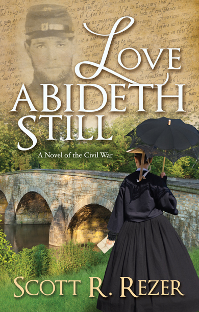
March, 1863. The War Between the States has raged for nearly two years. Five months after his death, the body of Sarah’s estranged husband, a Union soldier, finally comes home for burial in Philadelphia. Taylor’s burial, though, rather than putting her unresolved grief to rest, begins a journey that will not just test her faith, but will plumb the depths of her devotion to her dead husband. When anger and sorrow push her to the edge of despair, Sarah turns to the few letters sent to her by Taylor from the front lines in a desperate need to understand the guilt she feels over his death. But, as the war continues to tear the nation asunder and rumors of a Confederate invasion threaten the North, Sarah’s own sense of patriotic duty begins to awaken. And with that newfound obligation, she discovers in the letters she once dismissed as weak attempts to convince her of his duty to the nation, that Taylor’s voice has the power to soften a heart grown bitter and cold from beyond the grave. Taylor’s letters, though, do not tell the full story of his life as a soldier, a story Sarah will never know…
Nathan says:
Everything here is professionally done, but the final result seems unfocused. As you can see from the thumbnail, there’s not a single engaging image which the reader can grab onto at that size, and when it’s enlarged, there are just more details thrown at his eyes.
One idea might be to enlarge the black-clad woman so she takes up most of the right margin (say, up to the top line of the “OVE” of “LOVE”) then put title to her left, with the handwriting texture on top of the bridge in the background. (I think that with the handwriting all over the cover, the letter in the woman’s hand is overkill. The same with the soldier’s face; if we’ve got a love-related title, a woman, and handwriting all visible on the cover, the presence of a man in the relationship is assumed and doesn’t need to be spelled out.)
I’d also change the font, or at least the font treatment, for the byline; I immediately thought of the Lord of the Rings posters, which is not the vibe you’re going for here.
Now, what I was sent was actually the full back-and-front cover:
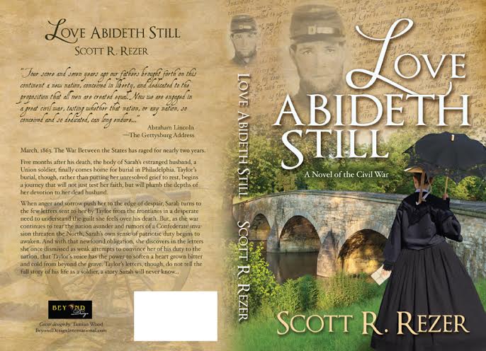
…so I’ll give a few comments on the back cover, as well. The handwriting font for the quote from the Gettysburg Address is discouraging; you’d be much better off using a period print font, such as one might see in a newspaper of the time period. And the book description is such a dense block of text that I doubt many people would read it when glancing at the book. Less text, broken into smaller paragraphs, would serve the purpose better.
Any other comments?
I like the man’s face and handwriting on the front cover for the main reason that it immediately registered in my mind that this book relates to the Civil War. There probably is a large audience that will be attracted to the Civil War or historical part of the book, and you need something on the cover to attract them. If you remove this part, what remains is in color and looks nice, but to me wouldn’t say anything visually about historical or Civil War.
I agree with Nathan that there are too many parts, with none standing out. Something needs to dominate the front cover. Your cover will be competing against dozens of other thumbnails when shopping, and against the marketing endeavors of many other authors. Something to focus on will help it get attention and make it more memorable. The cover looks professional, so it’s worth the effort to improve this.
Indeed, that script doesn’t seem right on the back cover.
I agree with Nathan, enlarge the female figure so that it takes up most of the right side. However, I would leave the man’s face and the expand the handwriting onto the lower left instead of the hill and bridge that are competing with the man and woman for attention. The man’s face and the handwriting definitely set the novel in the civil war; the bridge and hillside do not do anything to place the time period.
Funny, I thought the photobombing Civil War ghost sort of brings the cover down, stylistically. I do like the handwriting, even if it rather tired design element, and so is the woman photographed from the back. Seems to be in every cover, if not, a headless woman. All in all not bad but a bit boring.
My first glimpse of this cover was as a link on the LousyBookCovers site, where all I could see was the top left corner, which I found compelling and evocative — the face of a civil war soldier, poignant and fading, with the handwritten letter in the background, all rendered in appropriate sepia tones, and with the title in a restrained romantic font. But I’m afraid that once I saw the whole thing, it was quite a challenge to parse visually. Imo there’s nothing wrong with the life/death contrast between the living greenery and the faded sepia, but unfortunately the eyelines don’t match up, the focal point of the cover seems to be somewhere behind the subtitle, and strangest of all, I can’t figure out why — or how — the bridge is sun-dappled. Meanwhile the most compelling element (for me) ie the soldier’s face, has been relegated to a distraction that’s jostling for space with the words of the title.
I’m afraid I had a hard time following the blurb too. I get that it’s a civil war novel about a soldier who dies and the letters he wrote to his wife, but that’s a long, dense paragraph with a lot of words that don’t seem to add up. For instance, if they were estranged, it’s not clear why she feels his death so deeply.
And then there’s the Gettysburg address — I like the handwritten font btw — which to me suggests this novel might be something like The King’s Speech, where Taylor had some hand in drafting the piece, but in fact it seems to have no particular connection to the story, and it only seems to be there to add ‘color’. The result though is a loss of focus — which takes us back to Nathan’s original comments.
I definitely think that this whole package needs to be simplified and more focused. There are many ways to do that, but personally I like the restraint and simplicity of the soldier’s face and the handwritten letter in the background. Those images alone are powerful and more than sufficient to evoke the right mood. They also tell us to expect some kind of sober, wistful, long-distance, civil war romance. The subtitle could then easily be omitted.
Similarly for the blurb. I googled the title, and based on a line I found on one of the amazon sites, I’d suggest something like: “From the bloody battlefields of Winchester and Bull Run to the quiet streets of Philadelphia comes a story based upon the lives of the author’s Civil War ancestors. A tale of sacrifice and redemption — and of a love rekindled from beyond the grave.” On the principle of less is more, I think something like that is all you really need.
I also have to mention that I can’t help being bothered by the redundancy in the title. Simply ‘Love Abides’ would work better for me.
Anyway, HTH. Good luck!
The ideas Take Cover has here sound good and very doable. It’s a nicely done cover. The only thing I wonder about is the lack of color if the author goes the Civil War soldier/handwriting/sepia route. Not that I’m saying I think there should be bright blues and pinks ;-), but shouldn’t there be a little bit of color on the cover? I say this only because, as a non designer, I think there should be some sort of color other than a light beige and white. OTOH, I may be completely wrong about that. I would definitely try what Take Cover suggests and see if it looks good/stands out.
As for the blurb – I’m not going anywhere near that. I suck at blurbs. I can steer the author to KBoards (http://www.kboards.com), to the Writers Cafe, where there are some people who are pretty good at hashing out blurbs.
I think with the religiosity mentioned in the blurb, the author probably wants to keep the title sounding Biblical, even though I agree that Love Abides works better for me, too, Take Cover. 🙂 (The author already has it up for sale on Amazon, so it might not be worth it to rename the book and re-do the cover.)
Good luck, and let us know how it goes. 🙂
I think that part of the problem is that there are too many elements telling the story: The background text, the soldier’s face, the bridge, the woman and whatever that is the woman is holding.
The figure of the woman is problematical. It’s a nice image, but at anything other than full size it becomes a black pyramid. Making the woman more prominent, as Nathan suggests, would help resolve this problem.
In all, it is not remotely a bad cover…it just needs a little more clarity and focus.
I really like it overall, but I agree about the heavy block of text on the back and that something needs to stand out on the front. How about toning down the grass and bridge image component so that it blends into the sepia background more and looks less green, and allows the woman to stand out? Making the woman bigger as was suggested might work, but as it is now I quite like how the text fits between the man’s face and the woman.
Just a thought, but what if a more neutral image was chosen than the bridge? The bright green is a nice contrast, but the bridge is distracting. Perhaps a more simple landscape picture would be better.
Thanks all, for taking time to give your helpful feedback on this cover. The author is my client.
Good things to ponder. The woman could be a bit larger, but not so much that I have to make the title smaller. That’s never a good thing when the thumbnail has to be considered.
The photobombing guy is an actual civil war soldier image from the national archive, and gives the cover it’s civil war element. Some of you liked it and some not, but most of you got the reference. Which is great.
I toyed with the idea of clubbing the readers over the head with the letters in her hand… is it a given?… should they stay, could they go?… It would be slightly less busy… Something to think about.
The bridge image is from an actual civil war site, and also symbolically represents the gap between them. I toyed with the idea of making the whole scene sepia, but went with the green to give it some colour and to represent past (sepia) and present (vivid colour) (death/life)
The quote on the back in the handwriting font, I did for mood. If you read the first 5 words you know what the whole thing says, so readability wasn’t strictly necessary, although it is readable. And the title is from an already established book so it can’t be changed. The cover was a re-design.
Thanks again for giving us something to think about.