The author says:
Taiga Chavez is an imperfect person in an OCD world. A loyal soldier, she longs to leave Earth behind. But on her 1st Outbound mission, she soon learns that being the good soldier can have an ugly meaning. On a planet filled with aliens that give new meaning to the term “wild life” she must choose sides. At stake? Simply the fate of two worlds, including her own. No pressure. The year – 2415, The places – Earth and space. Science Fiction for adult or YA.
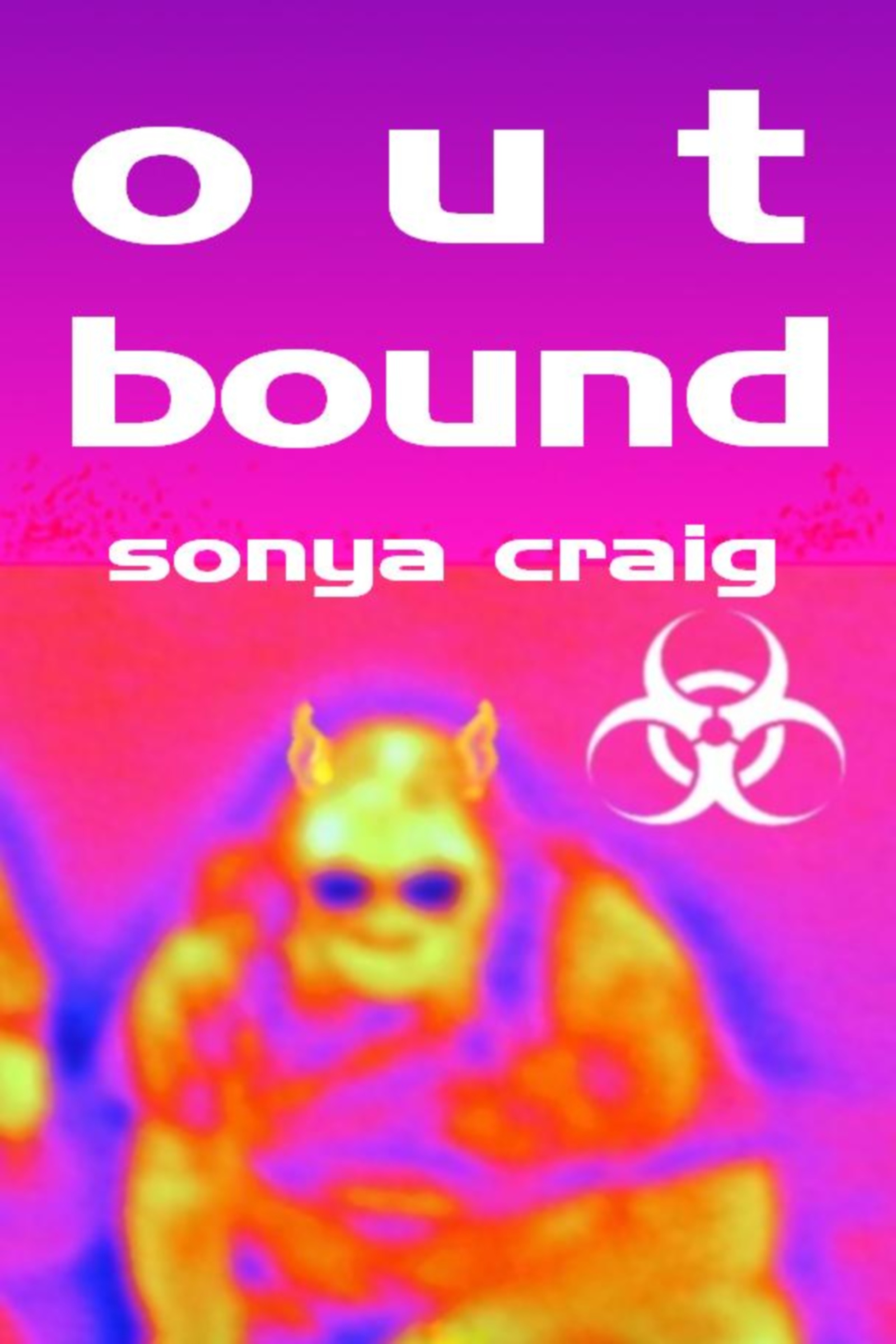
Nathan says:
Um…
I think I see what you were going for here, sort of a Predator-esque heat-signature portrait of the alien creature. Yes?
However. I really don’t think it works. The color scheme, combined with the blurriness of the graphic, doesn’t say “space” or “SF” or “military action” or anything like that to me. At best, it says “My Little Pony.”
In a similar vein, I can see what you were trying to do with the title spacing, but this really isn’t a font that is forgiving to that kind of deliberate spacing.
And the biohazard symbol seems like a completely random addition.
It might be easier just to start over with a different cover concept, but if you want to work with this one, here’s what I’d do:
- Posterize, filterize and texturize the hell out of that image so that it looks like the computer-enhanced image of something barely seen. Add some other readouts and telltales around it to emphasize that.
- The parts of the cover that aren’t the actual alien, change them from pink/purple into something darker for contrast. If you fade to black at the top, you can add stars to give some kind of outer-space feel.
- I’d pick a different font, and then texture-fill it with burnished metal or something else that gives it a hard-edged, military feel.
Anyone else?
These colors don’t suit the target audience. Having the only image on the cover be blurry is a bad idea. Nobody will assume that it was intentional. This needs a sharp image, a different color scheme, a different font, and to lose the radioactive symbol (used a lot on covers, probably not attracting the audience). Sometimes, a better cover can come from a restart and this may be one of those times. Good luck.
Sometimes we try so much to make a cover work that it’s better to take a deep breath and start over. I’m also afraid that if you don’t have the rights to this image, filterizing it to death is not really a good option. If that’s the case, go simpler: a starry field maybe, or even plain black or a dark marine, with a militarized font like Nathan suggested.
The lettering could become the focal point if well done. It would also work well for a series, keep everything uniform. You would have a hard time and come to hate this choice when creating other covers to match this one. And the radioactive symbol has been overused, it’s not attracitve anymore.
Sorry, but this cover hurts my eyes. I don’t think it’s salvageable. If you were going for a first person perspective, heat signature view doesn’t work for humans as its translated to our eyes as blurry, garish colors from the visible spectrum.
If you want to capture some suspense and keep this alien, may I suggest going with a pre-action scene. You can have the protagonist hiding behind a rock in the foreground with her weapon at the ready while the aliens are out on patrol looking for trespassers.
The font is dull and flat. I wish I was more knowledgeable about fonts to make a recommendation.
And the biohazard stamp should go too.
“Less is More” is probably more important in book cover design than any other axiom. Which is to say, I agree with the others that the biohazard symbol should be eliminated.
The idea of the heat-signature image of the creature is a good one…and the art itself really isn’t all that bad. The biggest problem is that the cover overwhelms it.
Here’s a suggestion…
Enlarge the creature image until it fills virtually the entire cover. Against this place a figure of your main character–essentially silhouetted by the intense colors of the background–reacting in some way to the alien facing her. This would enhance the alienness of the creature as well as make it look more threatening.
The title reads as two distinct, unrelated words:
Out.
Bound.
You need to reduce the space between them. I would also remove the extra spacing in the word “out.”
One good test for the effectiveness of a cover is to imagine it without the type or, better yet, with the title in a foreign language. Would you still be able to tell what the book is about or what sort of book it is? If the answer is anything other than “yes” then the cover needs to be rethought.
I’m not too sure if this cover would pass that test.
Hmmm, I didn’t get “heat signature” till I read Nathan’s comments, and then it helped to explain the colour scheme… But even assuming that explanation, it’s still a bit of an assault on the eyes. A tad like 60’s psychedelic.
I have some nail polish in a shade of that and my darling husband always teases that you can see my nails from space. (I don’t think it’s a compliment.) But, it does jump out at you.
So… yea or nay? I’m on the fence.
Setting that aside, I agree with Ron, in that I think the title is more troublesome than the colour scheme or imagery. I don’t mind the font for the author name. It’s kerned well enough, and reads well in all lower case. But I agree that OUT and BOUND are reading like two separate, unrelated words. The loose line spacing (leading) between the words and the loose letter spacing (kerning) on OUT just doesn’t work. And wait, isn’t OUTBOUND one word?
I don’t think you need to loose the symbol if it’s important to the story, but perhaps use it in a more integrated way. Rather than having it sit there on the side like an extraneous element filling space, maybe make it larger, and ghost it behind the title. So it’s there, but more subtle. But only if it’s crucial.