The author says:
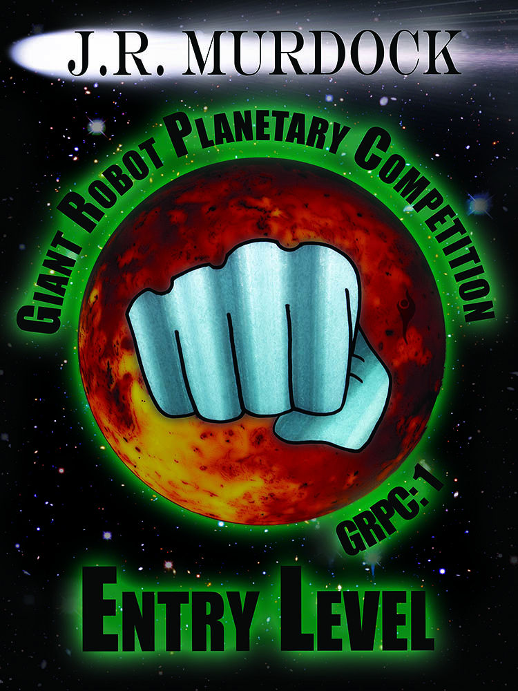
Giant robots battle for the mineral rights to an entire planet. An aspiring competitor and his support team enter into a brutal competition where not every robot pilot survives.
Nathan says:
Nice layout. Very clear, and makes a good thumbnail.
I would play with your fonts. Impact started out as a great typeface, but after having become the preferred font of lolcats and other graphic memes, it’s gotten tired. Perhaps something that is even more square, to reinforce the whole robotyness.
Also, at full size, the robot fist looks fairly primitive next to the rest othe image elements, and it’s not something that could be fixed by just adding more textures; I think it needs to be replaced/redrawn.
Other thoughts? Anyone?
I’ll second Nathan’s comments. Fonts and fist: both need updating. If it’s a robot’s fist, make it look like robot’s fist, provide more detail. This one looks too smooth, too organic.
I like the planet, starry background, and the comet with the author’s name on top.
I don’t think it’s at all clear at thumbnail size. The only words that are remotely legible(other than the author’s name) is “Entry Level.”
“GRPC:1” is either meaningless or redundant, take your pick. “Volume 1” or “Book 1” or something of that sort would be more immediately to the point.
One test of a cover is to imagine the text–title, etc.–in a foreign language. Would you still have some idea of what the book is about? what it’s genre is?
I think this cover fails that test.
Nathan refers to the giant “robot fist,” but it’s really just an assumption that that’s what that is. And even if it is the fist of a robot, what does it tell us? Very little, indeed. In fact, I only assume it’s the fist of a robot because Nathan assures me it is. Frankly, it didn’t occur to me on just looking at the cover art. Perhaps the illustration needs to be worked on further, making it clearer that the fist is, indeed, mechanical.
And why a comet behind the author’s name? Is that relevant in any way?
In short, I would strongly advise simplifying the text and imagery (don’t include anything that doesn’t add to the potential reader’s appreciation of what the book might be about) and look for an image that will convey something about what the book is independently of the title or blurb.
One more thing: I’m not even sure what the title of the book is. “Giant Robot Planetary Competition” or “Entry Level”? Is one the title and the other a subtitle? Or is one of these merely a description? You need to be clearer about this.
The fist is the centerpiece. As such, I noticed it more than anything else right off the bat. Redo the fist and it could really improve the first impression. It’s the only thing on the cover that looks hand-drawn, and while the contrast is good, is there a hint of blue? The color doesn’t match the scheme.
It feels a bit like a WWF poster to me, but that may be the exactly what you were looking for. I really like what you did with your name.
The circular part of the design reminds me of a badge, such as on a uniform or t-shirt. So why not make it one? Texture it perhaps, with a hard edge all round (not the fuzzy green stuff)so it looks like a badge (I’m sure all robots wear one) Then tone it down a bit and make it subordinate, possibly slightly underlapping, the main title, which I assume is ENTRY LEVEL – and make the title larger and bolder. I’d suggest white text and remove the green outer glow. Same for author name and comet.