The author says:
I recently published this book on KDP. It’s a fantasy novel in which the three main characters each have their own story lines. There’s a soldier, a Witch, and an assassin. Slowly, the three stories converge, which is why I wanted to include the three images (each is loosely related to each of the three characters).
Nathan says:
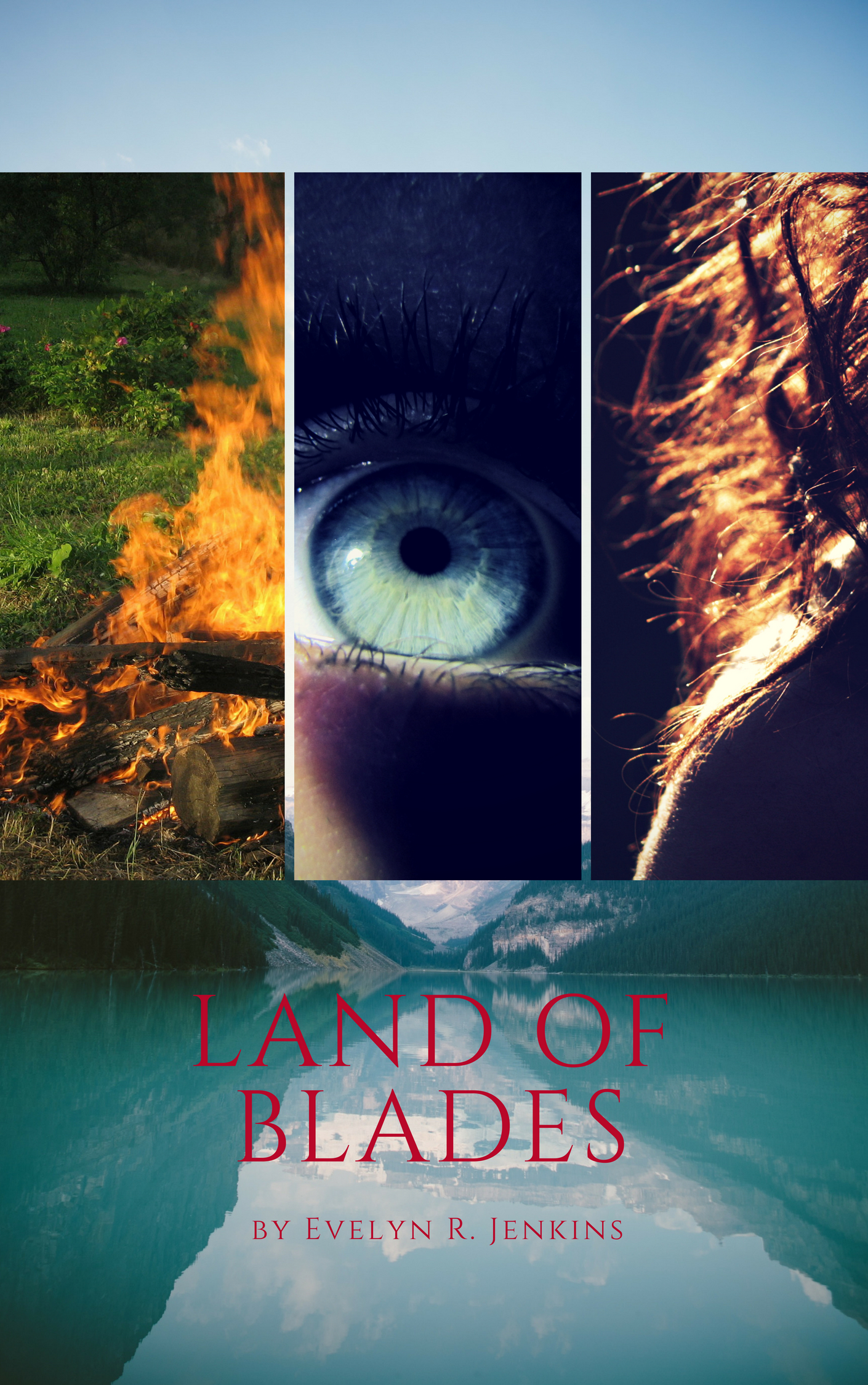
I think the idea of a triptych cover could work, but you need to make sure that each of the images is instantly identifiable, even trimmed down, even in thumbnail. Looking at at the thumbnail here, you can see that the eye is the only image that can immediately be recognized as what it is, maybe.
However, you’re making your work harder for yourself by giving even less real estate for the triptych images to occupy. The landscape serves little purpose at the bottom, and the accompanying sky serves even less purpose at the top. It’s just wasted space.
Your small title (and teeny byline) become nigh-on invisible against that background, both because of the thin letters against an image with texture, and because of the lack of value contrast (light/dark) with the image behind the type.
It’s a cover that makes the potential reader work to get anything out of it, and since said potential reader will likely see this with other book covers to the left and right, you can’t afford not to engage the reader as quickly and as clearly as you can.
Other comments?
Using the entire page for the triptych, but separating them in diagonal bands from right to left, would let you enlarge each image and show more of both the x and y axes of each. Both will tend to make the images easier to recognize. Dividing the images with some sort of border art, but styalized in a clearly ‘fantasy’ manner is also a chance to reinforce the branding, which is somewhat weak as is. Stereotypical illuminated spell lines or Tolkeinesque lines if script are good examples. Regardless, the text needs a more readable color and weight, one can tell little more than it is present as is. I can’t comment on fonts much, very bad at them myself. Great title by the way.
I’m sorry to say this doesn’t work for me on any level. It’s too disjointed to pull meaning from. I have no idea what sort of book this is, what the disparate elements are supposed to be conveying, fire, an eye, hair, a lake… what is the tone you’re going for? I think you need to step back and figure out what you’re trying to convey and then you can pick graphics that convey it.
I recommend choosing 3 pictures in the same tones to start with, perhaps the 3 aforementioned characters although it would likely be easier/less expensive to use silhouettes, silohette really isn’t a strong fantasy graphic. So, finding 3 pictures that suit each other AND portray your vision of the characters will be difficult. Tone of picture can be tweaked with lighting and overlays but it takes some expertise.
The easiest thing to do would be to find one strong picture. You need something that says fantasy but also something that gives a hint of the TYPE of fantasy. Is this romantic? Or an epic journey type thing? Or are they fighting or just learning to be themselves? In other words, what picture can encapsulate the feeling of the book? A woman fighting with magic? A man wearing a hooded cloak sneaking into a window? A man helping a woman?
If I were trying to recreate this exact cover but in a more cohesive way, I have an idea, gained from your cover, of three mountain tops each with a figure on it, basically colored silhouettes as if the picture was taken from very far away, a woman casting magic, a man in a cloak, and a man with sword and shield. I’d maybe have the mountain turn into a fjord near the bottom and use a gradient to darken it so the writing pops. Use a strong fantasy font and you could even use the white lines to break it into 3 sections, make each mountain distinctly its own. Just make sure the part of the figure you show is clearly a figure.
You could use 3 separate modes of transportation, like a man on a horse, a woman in a boat, and a solder in a wagon, but that seems like super difficult pics to find. Just try to keep the pictures matching, a theme if you will. Not random.
Okay, quickest crudest example ever…
https://imgur.com/a/TRX7H6K
This style wouldn’t be that hard to make. You’d need 3 figures ( I picked mine at random) and 2 backgrounds (picked to match yours, you need one with higher mountains than the other or you could use the same image just one lower then the other)to sandwich them between. Add in the decorative divider, some magic, and text and a simple color overlay and bam…lol
PS. It might be awesome to use sword blades as the divider, I’m just not certain it would work, they might be too wide.
1000% Better
Awesome mockup! You’re on to something, s m savoy!
I agree. S. M.’s approach is far more eye catching, and still gives the author’s 3 separate characters idea.
Looks like a travel book, when you figure out the images
Where to begin?
The title is unreadable. Even at full size it is difficult.
The idea of the three (or, actually, four) is fine design-wise…but the choice of images is not very good. In fact, I had to look closely to even figure out what the right-hand panel depicted.
The biggest problem working against the cover, however, is that old bugaboo of objectivity. All of these images are meaningful to you—because you wrote the book and you are intimately familiar with it. But someone coming in cold, who has no idea what your book is about, is going to be mystified. It is a good thing to intrigue a potential reader but you should not puzzle them.
If you want to use images that represent three different characters, try to find ones that are clearly “a soldier, a Witch, and an assassin.” At the moment, I do not see anything at all that even remotely makes me think of any of these.
Savoy’s suggested remake is (as B.L. puts it) 1000% better…and it works because there is no ambiguity.
I quite simply assumed it was a book of poetry, from the cover. The title, which I’d love for a fantasy novel, simply made me think, taken in conjunction with those images, that I’d get the reference once I’d read the poetry. Or, perhaps, a book of literary fiction.
This novel might be brilliant, but please believe me when I tell you that this cover will cause it to sink out of sight like the Titanic. Fantasy, even across various sub-genres, has a fairly standardized set of “rules” for covers. Interesting fonts, oftentimes, even to the point of being questionable, in terms of readability, and oftentimes, pure custom artwork, displaying the characters and some sort of magical/sword & sorcery/whatever object. Runes, lights, glowy stuff, whatever. This is too modern, too crisp, too plain.
I normally put in my $.02 about fonts, but at this point, there’s really no point. This needs a rework, and I have a good, strong reaction to SM Savoy’s suggested cover. I’d definitely go in that direction.
I generally do not think the three-image layout is the way to go, even if you have three narrators. “This book has three narrators” is not essential information for the cover to convey; I’d pick one plotline and use a single image based on that. (Or use a scene where all three are together.)
If you do want to go with three images, Savoy’s mockup is the way to go.
Like Katz says, I think you need to rally consider whether the three narrators thing is the thing that’s going to get readers on board.
For instance the most famous example of multi-narrator fantasy is probably A Song Of Ice and Fire, and the covers of those books don’t represent that at all.
Another case study might be Cloud Atlas. Here are two covers, one which does the kind of thing you’re going for and one which does not: http://sitzmanabc.com/wp-content/uploads/2013/11/cloud-atlas.jpg
I know which one I think stronger and more evocative – and that’s more a ‘literary’ novel where you can get away with more abstract imagery.
I wouldn’t say referenceing the tri-part nature of the narrative is a no-no. Just really think about whether that is the best possible visual you could be leaning into for attracting interest.
If you do, it certainly needs to be more ‘artful’ in its representation.
For one thing, photographs pretty much don’t belong on the front of fantasy novels – you’re going to lose a lot of readers whose eyes slide right past a photograph-based covers assuming this isn’t their kind of book. You might not want to conform to the most traditional of fantasy looks but you also don’t want to lose a sense of what genre you’re oprating in.
For another, you haven’t represented what is interesting about these three perspectives. When you say it in words, it sounds intersting: a soldier, a witch and an assassin are three interestingly different persepctives. What I see visually doesn’t interest me because it doesn’t say ‘soldier, witch, assassin’. The imagery refers to parts of the characters I don’t yet care about because I don’t yet know them.
If you’re going to reference the three parts of this story, think about how you can do so in a way that looks stylish and really makes clear what the basic interesting thing about each is.
You’ve got a great title that would look great given a lovely big stylish typographic treatment. Personally I would make that the centrepiece of your cover. It serves a practical purpose – the current trend in book design for big, brilliant typography comes from the rise of online selling where the title needs to be clear at thumbnail size.
But it’s also kind of a boon for people designing their own covers as while none of this s easy, it’s far more achievable to get some professional-looking title treatment than to create a bespoke illustration!
In addition to the other complaints, I believe this is what we call a bulletin board layout on Lousy Book Covers. Theoretically, I suppose it’s possible for a decent book cover to be divided into panels in such a manner, but that’s probably not going to work for your book in this case. Moreover, the most successful uses of such a “split screen” approach I’ve seen (usually on movie posters and for video game attraction screens) have always focused on concrete characters rather than focusing on abstract concepts the way your cover seems to be doing; nobody knows knows the significance of the fire, the eye, and the hair until after reading your book, which is putting the cart before the horse as Ron Miller here likes to say.
The approach I generally recommend when doing a story with three or more main characters is to show them all standing together in one shot the way the box cover artwork for Nintendo’s port of Gauntlet did, even if there isn’t actually any scene quite like that in the book. (Believe me, you’ll get away with it; I’ve seen successful movies that got away with outright lying about their contents in the artwork on their posters, and you know movies are a much more visual medium than books.) Alternatively, if you know how to make “photobombing” (another category on Lousy Book Covers, incidentally) look good, you can try stacking your characters’ faces vertically the way the poster for Batman Returns did. The latter approach also tends to make especially good use of the portrait-shaped book cover’s real estate.
Whichever way you play it, for your character ensemble evidently consisting of two males and a female, the woman should go in the middle in order to balance the imagery (just as she does on that Batman poster, you may note). Also, as others have noted, you’ll want to use a more visible and more fantastic-looking font for your title and byline. For a little nuance, you may also want to add a brief tagline: I’m thinking that along the lines of some versions of that movie poster, it might simply say “The Soldier. The Witch. The Assassin.”
Basically, your cover doesn’t have to tell the readers everything up front, but it does need to let them know what’s so special about this book that they should pick up a copy for themselves. What you’ve got right now is just random imagery that (so far as anyone who hasn’t read the story knows) doesn’t mean anything. Let your prospective readers know from the start that you’ve got three intriguing characters you’d like them to meet, and the rest of the sales process should proceed naturally and smoothly.
Thanks to everyone who provided feedback, it was really helpful! I think getting an outside opinion was very useful because outsiders aren’t as attached to my work as I am. I ultimately just bit the bullet and paid to have the cover done on Fiverr because I knew my design skills weren’t good enough to take my book cover to the next level by myself.
This one is probably far from perfect, but I do think the designer did an awesome job and I really like it a lot. Thank you again for the help!
https://www.dropbox.com/s/9i3hosf4yaytkyw/Creativexlive.psd?dl=0
I like that a lot, Evelyn!