The author says:
Claire has lived most of her life enslaved by a dark mage and his monstrous creatures. As a special skill slave, Claire is frequently put into life or death situations with only her wit to keep her alive. In secret, she is given a mystical necklace with unusual properties, a necklace that is one of six and together it is said they have the power to free her people. But first, she has to escape her prison. Claire’s journey begins before she even knows it’s started and her path is flanked by dangers and mysteries. She will discover things about herself and her world that she would never have believed possible. A mysterious light, A fight for freedom, And a journey to change her world.
Nathan says:
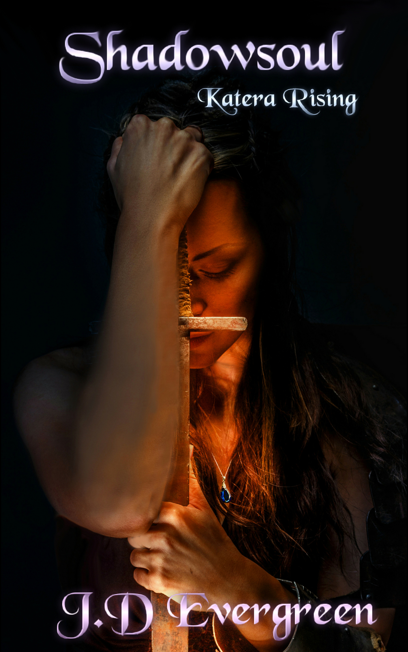
The description makes clear that it’s fantasy, but doesn’t really tell us about the setting (the fact that the name “Claire” is in modern usage compounds the problem); I can only assume from elements in the image that it’s a vaguely pre-modern second-world fantasy setting.
First up, I have some complaints with the image; it’s fairly well done, but that right arm does a lot of damage; it seems out of proportion to the rest of the female model (to the point of seeming male), the forearm has obviously been painted in Photoshop, and it almost completely hides the sword, which is the only element which would say “fantasy” on first glance. Given that it looks like the right arm was added to the image after the fact, I’d love to see how the image looks with the arm removed.
I think you’ve also got a lot of margin going to waste; the black empty space seems not so much an intentional design choice as simply an unwillingness to have any more overlap than necessary. You could easily cut the illustration down this much:
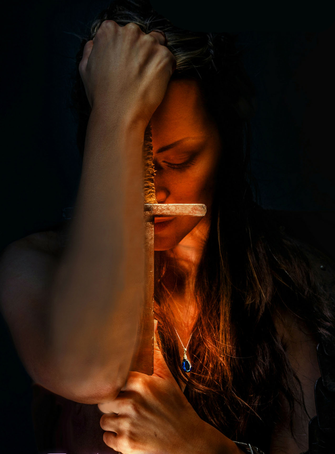 …and still be able to put the title and subtitle across the top and the byline across the bottom without obscuring any central detail. We don’t really need to see her hands clearly to know they’re there, after all.
And I don’t love that font; it seems to take up lots of space without giving a good return in impact, and seems like the kind of font that would be chosen by convenience (or desperation) than by positive appeal.
Other comments?
The hand is way to big for the girl. The sword is too small unless it’s supposed to be a dagger. And is that a watch on her wrist? the jewelry looks too modern for a fantasy book because the chain is so thin. The fonts are off both size position and color but fix the picture first. I think you need a brand new one.
It’s hard to recommend specific ideas because the blurb itself is so vague. Does she even use a sword? If so you might want to change the only her wit part.
you might find one of these pics useful
https://www.shutterstock.com/g/boiko%20olha?searchterm=armor
https://www.shutterstock.com/image-photo/beautiful-red-haired-girl-green-medieval-530904457?src=vRED_TGaQ4Ffv-23IUBA4w-1-51
this one could be tweaked to remove the hourglass and put a spell between her hands.
This seems to be one of those cases where found art was either not originally designed to be a book cover or the artist simply didn’t bother to consider the necessity of leaving space for type (typically, 1/3 of the cover space should be).
The result is that the title and your name has to be crowded into the top and bottom in order to avoid either covering up anything significant in the art or winding up with a clumsy placement within the illustration.
I agree with Nathan that the right arm of the figure is distractingly terrible…so much so that I would strongly suggest finding different art entirely—which might also enable you to find something that is better suited for the design requirements of a book cover.
Hint: Always before selecting an image for a cover, consider where the title and author name will go. If there is not room to display these effectively, move on to another image.
No disagreement with most of what is said, but I find the black space on the sides kind of effective at suggesting mystery. The orange colour is evocative of a fire, so if you could see more of the jewelry and especially the sword, my impression is it would suggest a pre-industrial world. The black space kind of helps there, too. Fix the arm, the fonts and the composition, I think this could work.
For real, are the arms from a man? Because those hands are very knuckly, the arms are very beefy, and it looks like you shopped out a lot of arm hair. Whether they are or not, obviously this Photoshop job isn’t coming together quite well enough. Go with one of Savoy’s pictures, or it shouldn’t be too hard to find another fantasy-looking girl with sword and/or necklace.
As for the font, that’s Black Chancery. If I can name it just by looking at it, it’s too overused.
Pretty much what everyone else says. This has a fair amount going for it as an image but the forearm is spoiling it.
I think it clearly IS the woman’s own arm. It’s just persepctive and being outside the lighting state the rest of her is in that makes it look disconnected and too large for her. Maybe the photoshopping has flatted out the colour/light on it making it look bigger than it is too.
Unfortunatley it’s a dealbreaker. It’s too central a flaw in the artwork to be worked around.
To be honest, though, I think even if this image wasn’t spoiled by this element, you could definitely find more evocative artwork for your book. This has some strong points but doesn’t give much away about the specific appeal of your book. I don’t mean character, plot etc (those are exactly the specifics not really worth referencing on a cover!) I mean an indication of genre and setting.
I’d PROBABLY guess fantasy for the current artwork but (though it could just as eaily be historical) but I wouldn’t know anything beyond that. With so many fantasy books on the market your cover will have to work a little harder to cath the eye of the right reader!
As for the treatment of title and byline, it’s definitely not there yet, but improving that can wait till you’ve got artwork that’s working better. Though like Ron says, always bear in mind when selecting artwork if there’s space for the cover furniture to fit.
When you get to the lettering stage you may find this useful – it’s a look at fixing the same issue for another cover:
https://www.kathrynrosamiller.com/single-post/2018/05/05/The-Tainted-Shrine