Definitely the best of the three. I’m going to let those who were heavily invested in commenting on the previous two iterations do the heavy lifting here. Have at it!
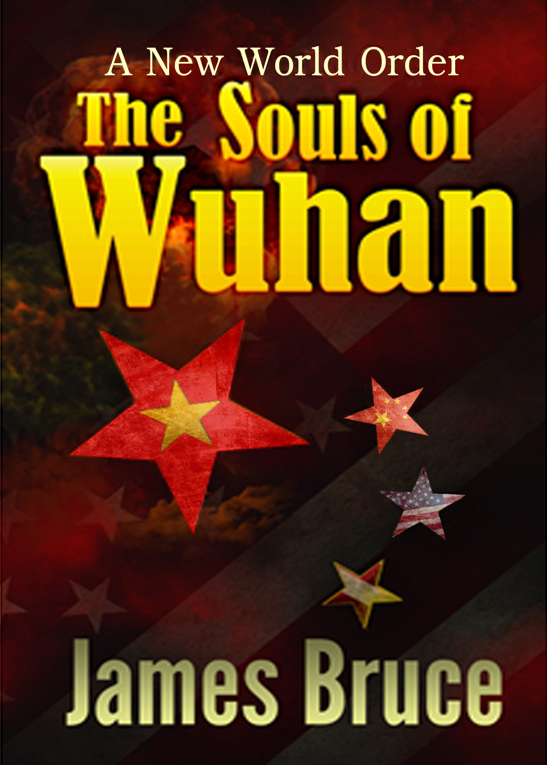
Yes, a great improvement. Using the stars, a common theme on all three flags, as a way to separate and differentiate them is inspired.
By way of critique, the full scale image is a touch blurry.
I’m also unsure why the American flag appears three times. The ghost of the flag in the background and the middle star, showing the flag in recognizable completeness, both seem fine. I can’t figure out what the lower star, showing a couple of stripes, is supposed to add. The stripe placement also makes that one a touch hard to see in the thumbnail. You might consider a fourth, small star with a second Chinese flag. This would allow you to arrange all 5 stars in the shape they are present on the flag of China and thereby yield x3 iterations of both the US and Chinese imagery surrounding a lone Vietnam. Few would likely notice, but the symbolism may add something for some.
Putting Vietnam in the big star is a good choice, it’s simpler design as a flag makes it the one most easily able to be recognized in thumbnail anyway.
The cover was meant as a mockup, it wasn’t finished quality. There’s lots of spacing issues. If the author would like me to make him a finished quality one just drop me a note, here,or Acelyonbooks.com or Imagur where you got the image. I’d be willing to tweak it to suit, make changes more in line with your vision. (For Free unless you need some stock photos added…lol)
The stars were meant to mimic the Chinese pattern of stars on their flag, but I got the initial premise of the book wrong. I thought it was China/America against Vietnam. The entire star thing needs to be rethought. I’m not sure how deep the alliance is in the book. Are America and Vietnam just allies or have they merged nations?
My first impression, though, was of murkiness. The background is pretty much impenetrable…and even more so in thumbnail size. The colors of the stars especially are a little too dark and unsaturated…especially the lower two of the small stars. They all but disappear in the thumbnail.
I don’t know whether the cover accurately reflects the story—it may not, as Savoy suggests—but I think it’s a pretty strong graphic image that only needs a little brightening up to really work. (By “work” I mean as a design. I’m not 100% convinced that potential readers are going to universally recognize the bits and pieces of national flags, or make the connection with the pattern of stars on the Chinese flag. I would not count heavily on this for the success of the cover.)
Hmmm… It’s a lot more abstract than I’d like, but this is an improvement over the previous covers. That said, I just don’t think it has quite the right feel to it. This cover definitely says “politics” and one might fairly easily be able to infer “several nations ‘mixing it up’ with each other” from all the national symbols (even if one doesn’t know much about the Chinese and Vietnamese flags), but it still doesn’t have the one element that’s likely to be the big draw for most of your target audience, which is something indicating that in this book the USA and Vietnam forge an alliance with each other in order to take out a Chinese invasion force.
The whole “former enemies become fire-forged friends when they ally with each other against a new enemy” plot works very well in any kind of fiction with a political angle; Star Trek: Deep Space Nine used this plot extensively in its final seasons and rousing finale, and the Star Wars franchise (before Disney and J.J. Abrams decided to discard the old extended universe) had the novel The Truce at Bakura, in which the Rebel Alliance (fresh from the battle of Endor) had to help the local government of the Imperial planet Bakura defend the planet from an intergalactic invasion fleet. Basically, it’s a very popular plot, and one likely to be even more popular in a story featuring familiar nations right here on this planet. So why aren’t we seeing something of that plot up there on the cover?
The difficulty as I see it lies in how to show an alliance between America and Vietnam in the imagery on the cover rather than merely telling prospective readers about it in a tagline. As it happens, however, the cover for that Truce at Bakura novel I linked above combined with some imagery I happened to notice while looking up the Vietnamese flag on a search engine gave me a great idea: one very common way of showing an alliance being forged is to show people shaking hands; see that handshake between an Imperial and someone from the Alliance (probably Leia) on the cover of The Truce at Bakura? Well, what if you could show the USA and Vietnam shaking hands the same way?
You may wonder how exactly to indicate that the hands shaking are American and Vietnamese; well, that’s where my research on the Vietnamese flag turned up something rather interesting in an image search: a hand made up to look like a Vietnamese flag making a “thumbs up” gesture. While that image was not quite the right one for this book, it gave me an idea for how to manipulate another simple stock image showing a common handshake in order to make it look like the American and Vietnamese flags were shaking hands! I think my advanced image editing program did an excellent job with just a picture of a handshake and a couple of flags, don’t you?
So far as I know, nobody was asking any royalties for that picture of a handshake, and flat depictions of national flags are (also so far as I know) in the public domain. I have no other particular use for it myself, so feel free to use my little ten-minute masterpiece on your cover if you want. If you were to put the handshake image up on top of your cover like the artist on that Truce at Bakura cover did, and then maybe show a war-torn-looking Chinese flag or something like that underneath it in the background, that would probably show your readers everything they need to know.
Whatever you do, though, make sure to draw your cover artwork from images larger than the cover itself: this cover mock-up looks nice in thumbnail and in its posting here, but a closer look at it reveals the background, byline, and title all to be rather blurry and pixelated as is typical of imagery expanded from much smaller images while the tagline is sharp and crisp enough to indicate that it was tacked on after everything else was expanded to fit the full-sized cover. My “flags shaking hands” image is much wider than this cover at full size, so your prospective readers shouldn’t have any trouble seeing it should you decide to use it. Just make sure any other imagery and text you use is likewise large enough to be nice and crisp, and use either lossless compression (like PNG compression) or very high-quality lossy compression (like JPG with the quality rating turned up to 100% in your image editor) for your finished cover to keep any noticeable artifacts from showing up on it.
One other thing: whatever imagery you choose, don’t try to merge two images into each other the way you’ve merged the fluttering American flag in the foreground with the atomic mushroom cloud in the background; on Lousy Book Covers, that’s what we call layers upon layers, and it’ll get you in trouble with more than just mockery sites like ours. If you have a foreground image and background image, e.g. a war-torn Chinese flag and an atomic mushroom cloud, either just go with one and discard the other, or (if you’re really good at cutting and pasting using transparency tools on your editor) try to overlay e.g. that flag on that mushroom cloud. (Come to think of it, showing a nuclear bomb going off behind a war-torn flag would go a long way toward explaining why that flag is so tattered!)
In short, you’re getting where you’re going bit by bit, but you’re still not quite there. Keep at it, though: if your next cover is as much of an improvement over this one as this one was over the ones preceding it, it should be ready for prime time.
https://imgur.com/a/xGxv9um
( Made with creative commons pictures) I’m wondering if it has too much of a superhero vibe?
I do really love that handshake! What program do you use to make it?
But I have to disagree you with layering images, it’s a valid style choice and can be very effective. (whether it was in the sample is a different argument)Limiting yourself because ‘it’s not done’ is, well, limiting. Lots of artists use the technique. Like any technique, if done badly, the picture will suck but just saying don’t use it doesn’t make any more sense then saying don’t cut and paste.
I don’t know about a “superhero” vibe, but looking at your full cover mock-up does have me hearing the introductory theme of Command & Conquer: Red Alert playing; which is probably a good thing for the subject at hand. (Of course, you’d still have to smooth the sharp edges on that front cover manually to get everything properly anti-aliased.) The programs I used to make it were an old version of Paint Shop Pro (which is especially good for manually fine-tuning images) and a newer version of GIMP (which is good for working with layering and transparencies). To get the handshake, you basically split the hands from each other, make them transparent so you can overlay them on the flags, and then reintegrate the flag-themed hands back into a single image.
Concerning layering of images, certain situations might call for merging the edges of two images into each other (such as a cover for a story in which the protagonist is leading a double life and you want to show both parts of it), but merging two whole completely different images half-and-half with each other as in this cover’s example almost never works very well, especially in the thumbnail image. It looks indecisive, and the various elements of each image tend to muddle with each other to make both images incomprehensible to the casual browser. (Did you even see that mushroom cloud before I pointed it out to you?) We don’t say not to merge images that way just because “nobody else does that” but because the reason nobody else does that (at least nobody successful; plenty of bad designers whose covers end up on Lousy Book Covers do it) is that it simply doesn’t work; hence the layers upon layers tag at Lousy Book Covers.
As with some other tags on Lousy Book Covers, there might theoretically be an occasional exception to the rules against doing such things (e.g. pseudohumans might work very well on the cover of book telling a story about people getting trapped in their virtual avatars in a video game world). About the only exception coming to mind for the “don’t use layers upon layers” rule, however, is for ghost stories; which is definitely not this book’s genre.
I guess we’ll just have to agree to disagree. I can think of lots of times you might want a more transparent image, smoke- as in this cover- being one of them. I have a friend who makes amazing covers using layers and overlays with unusual graphics that you wouldn’t expect to see atop each other, but it works. Art is subjective with no place for never. But I like adverbs too…lol
(And, yes, I saw the blast, but I designed the cover, so I can’t really say if others would see it as clearly as I do. The blast was meant to be subtle but as I said earlier, I got the story premise wrong. The mock-up was just supposed to show a simpler idea than his original one, which was layers on layers.)
But I agree that this image isn’t quite right, fixing the stars won’t really fix the issue. I do think your handclasp might be just what he needs. Maybe the addition of a sinking Chinese boat in the water might work but I’m doubting many people would be able to tell a Chinese boat from an American one. But a sinking boat would get the thriller war story point across, and that’s the ultimate goal. What he really needs is a killer tagline, not necessarily for the cover but for the seller site. Something that makes the reader want to read on after the cover makes them pause that second and take a deeper look.
Of course, one of the problems is that both the Chinese and the Vietnamese flags feature a golden yellow star against a red background (and several of them in China’s case), so it’s a bit difficult to tell their motifs apart. As long as you establish that America and Vietnam are going to be allies in this story, though, you can probably leave the detail about China being the aggressor in this war for when the prospective reader examines the back cover/gets to the sales page. Your “stuff blowing up” mock-up showing the explosion behind the handshake would probably be sufficient for this once it was refined to anti-alias everything together properly.
As for a killer tagline, the only one occurring to me at the moment is “America and Vietnam have finally decided to bury the hatchet… in China.”
finding an image of two hands grasping an ax and making each a different flag.. I think it would rock…lol But I might skip the tagline and let the image speak for it. it depends on the picture and what space is left. Then you could use the tagline as the blurb. Its a really great line.
Yes, a great improvement. Using the stars, a common theme on all three flags, as a way to separate and differentiate them is inspired.
By way of critique, the full scale image is a touch blurry.
I’m also unsure why the American flag appears three times. The ghost of the flag in the background and the middle star, showing the flag in recognizable completeness, both seem fine. I can’t figure out what the lower star, showing a couple of stripes, is supposed to add. The stripe placement also makes that one a touch hard to see in the thumbnail. You might consider a fourth, small star with a second Chinese flag. This would allow you to arrange all 5 stars in the shape they are present on the flag of China and thereby yield x3 iterations of both the US and Chinese imagery surrounding a lone Vietnam. Few would likely notice, but the symbolism may add something for some.
Putting Vietnam in the big star is a good choice, it’s simpler design as a flag makes it the one most easily able to be recognized in thumbnail anyway.
The kerning between the W and u in Wuhan is rather poor and distracting.
The cover was meant as a mockup, it wasn’t finished quality. There’s lots of spacing issues. If the author would like me to make him a finished quality one just drop me a note, here,or Acelyonbooks.com or Imagur where you got the image. I’d be willing to tweak it to suit, make changes more in line with your vision. (For Free unless you need some stock photos added…lol)
The stars were meant to mimic the Chinese pattern of stars on their flag, but I got the initial premise of the book wrong. I thought it was China/America against Vietnam. The entire star thing needs to be rethought. I’m not sure how deep the alliance is in the book. Are America and Vietnam just allies or have they merged nations?
Hi S M. I went to your website and could find no place providing an address to contact you.
You can use the contact form there (On the contact page), or the one on the covers page, or the email listed there.
Very much an improvement!
My first impression, though, was of murkiness. The background is pretty much impenetrable…and even more so in thumbnail size. The colors of the stars especially are a little too dark and unsaturated…especially the lower two of the small stars. They all but disappear in the thumbnail.
I don’t know whether the cover accurately reflects the story—it may not, as Savoy suggests—but I think it’s a pretty strong graphic image that only needs a little brightening up to really work. (By “work” I mean as a design. I’m not 100% convinced that potential readers are going to universally recognize the bits and pieces of national flags, or make the connection with the pattern of stars on the Chinese flag. I would not count heavily on this for the success of the cover.)
PS
I would certainly accept S.M. Savoy’s generous offer!
I concur that this is a good mock-up design and will look great once the kerning and resolution issues are worked out.
What Katz says.
Hmmm… It’s a lot more abstract than I’d like, but this is an improvement over the previous covers. That said, I just don’t think it has quite the right feel to it. This cover definitely says “politics” and one might fairly easily be able to infer “several nations ‘mixing it up’ with each other” from all the national symbols (even if one doesn’t know much about the Chinese and Vietnamese flags), but it still doesn’t have the one element that’s likely to be the big draw for most of your target audience, which is something indicating that in this book the USA and Vietnam forge an alliance with each other in order to take out a Chinese invasion force.
The whole “former enemies become fire-forged friends when they ally with each other against a new enemy” plot works very well in any kind of fiction with a political angle; Star Trek: Deep Space Nine used this plot extensively in its final seasons and rousing finale, and the Star Wars franchise (before Disney and J.J. Abrams decided to discard the old extended universe) had the novel The Truce at Bakura, in which the Rebel Alliance (fresh from the battle of Endor) had to help the local government of the Imperial planet Bakura defend the planet from an intergalactic invasion fleet. Basically, it’s a very popular plot, and one likely to be even more popular in a story featuring familiar nations right here on this planet. So why aren’t we seeing something of that plot up there on the cover?
The difficulty as I see it lies in how to show an alliance between America and Vietnam in the imagery on the cover rather than merely telling prospective readers about it in a tagline. As it happens, however, the cover for that Truce at Bakura novel I linked above combined with some imagery I happened to notice while looking up the Vietnamese flag on a search engine gave me a great idea: one very common way of showing an alliance being forged is to show people shaking hands; see that handshake between an Imperial and someone from the Alliance (probably Leia) on the cover of The Truce at Bakura? Well, what if you could show the USA and Vietnam shaking hands the same way?
You may wonder how exactly to indicate that the hands shaking are American and Vietnamese; well, that’s where my research on the Vietnamese flag turned up something rather interesting in an image search: a hand made up to look like a Vietnamese flag making a “thumbs up” gesture. While that image was not quite the right one for this book, it gave me an idea for how to manipulate another simple stock image showing a common handshake in order to make it look like the American and Vietnamese flags were shaking hands! I think my advanced image editing program did an excellent job with just a picture of a handshake and a couple of flags, don’t you?
So far as I know, nobody was asking any royalties for that picture of a handshake, and flat depictions of national flags are (also so far as I know) in the public domain. I have no other particular use for it myself, so feel free to use my little ten-minute masterpiece on your cover if you want. If you were to put the handshake image up on top of your cover like the artist on that Truce at Bakura cover did, and then maybe show a war-torn-looking Chinese flag or something like that underneath it in the background, that would probably show your readers everything they need to know.
Whatever you do, though, make sure to draw your cover artwork from images larger than the cover itself: this cover mock-up looks nice in thumbnail and in its posting here, but a closer look at it reveals the background, byline, and title all to be rather blurry and pixelated as is typical of imagery expanded from much smaller images while the tagline is sharp and crisp enough to indicate that it was tacked on after everything else was expanded to fit the full-sized cover. My “flags shaking hands” image is much wider than this cover at full size, so your prospective readers shouldn’t have any trouble seeing it should you decide to use it. Just make sure any other imagery and text you use is likewise large enough to be nice and crisp, and use either lossless compression (like PNG compression) or very high-quality lossy compression (like JPG with the quality rating turned up to 100% in your image editor) for your finished cover to keep any noticeable artifacts from showing up on it.
One other thing: whatever imagery you choose, don’t try to merge two images into each other the way you’ve merged the fluttering American flag in the foreground with the atomic mushroom cloud in the background; on Lousy Book Covers, that’s what we call layers upon layers, and it’ll get you in trouble with more than just mockery sites like ours. If you have a foreground image and background image, e.g. a war-torn Chinese flag and an atomic mushroom cloud, either just go with one and discard the other, or (if you’re really good at cutting and pasting using transparency tools on your editor) try to overlay e.g. that flag on that mushroom cloud. (Come to think of it, showing a nuclear bomb going off behind a war-torn flag would go a long way toward explaining why that flag is so tattered!)
In short, you’re getting where you’re going bit by bit, but you’re still not quite there. Keep at it, though: if your next cover is as much of an improvement over this one as this one was over the ones preceding it, it should be ready for prime time.
https://imgur.com/a/xGxv9um
( Made with creative commons pictures) I’m wondering if it has too much of a superhero vibe?
I do really love that handshake! What program do you use to make it?
But I have to disagree you with layering images, it’s a valid style choice and can be very effective. (whether it was in the sample is a different argument)Limiting yourself because ‘it’s not done’ is, well, limiting. Lots of artists use the technique. Like any technique, if done badly, the picture will suck but just saying don’t use it doesn’t make any more sense then saying don’t cut and paste.
I don’t know about a “superhero” vibe, but looking at your full cover mock-up does have me hearing the introductory theme of Command & Conquer: Red Alert playing; which is probably a good thing for the subject at hand. (Of course, you’d still have to smooth the sharp edges on that front cover manually to get everything properly anti-aliased.) The programs I used to make it were an old version of Paint Shop Pro (which is especially good for manually fine-tuning images) and a newer version of GIMP (which is good for working with layering and transparencies). To get the handshake, you basically split the hands from each other, make them transparent so you can overlay them on the flags, and then reintegrate the flag-themed hands back into a single image.
Concerning layering of images, certain situations might call for merging the edges of two images into each other (such as a cover for a story in which the protagonist is leading a double life and you want to show both parts of it), but merging two whole completely different images half-and-half with each other as in this cover’s example almost never works very well, especially in the thumbnail image. It looks indecisive, and the various elements of each image tend to muddle with each other to make both images incomprehensible to the casual browser. (Did you even see that mushroom cloud before I pointed it out to you?) We don’t say not to merge images that way just because “nobody else does that” but because the reason nobody else does that (at least nobody successful; plenty of bad designers whose covers end up on Lousy Book Covers do it) is that it simply doesn’t work; hence the layers upon layers tag at Lousy Book Covers.
As with some other tags on Lousy Book Covers, there might theoretically be an occasional exception to the rules against doing such things (e.g. pseudohumans might work very well on the cover of book telling a story about people getting trapped in their virtual avatars in a video game world). About the only exception coming to mind for the “don’t use layers upon layers” rule, however, is for ghost stories; which is definitely not this book’s genre.
One small note: That third star looks like the Austrian flag to me. If it’s another American flag, better zoom out a smidge.
I guess we’ll just have to agree to disagree. I can think of lots of times you might want a more transparent image, smoke- as in this cover- being one of them. I have a friend who makes amazing covers using layers and overlays with unusual graphics that you wouldn’t expect to see atop each other, but it works. Art is subjective with no place for never. But I like adverbs too…lol
(And, yes, I saw the blast, but I designed the cover, so I can’t really say if others would see it as clearly as I do. The blast was meant to be subtle but as I said earlier, I got the story premise wrong. The mock-up was just supposed to show a simpler idea than his original one, which was layers on layers.)
But I agree that this image isn’t quite right, fixing the stars won’t really fix the issue. I do think your handclasp might be just what he needs. Maybe the addition of a sinking Chinese boat in the water might work but I’m doubting many people would be able to tell a Chinese boat from an American one. But a sinking boat would get the thriller war story point across, and that’s the ultimate goal. What he really needs is a killer tagline, not necessarily for the cover but for the seller site. Something that makes the reader want to read on after the cover makes them pause that second and take a deeper look.
(Somehow, it seems your reply got misplaced.)
Of course, one of the problems is that both the Chinese and the Vietnamese flags feature a golden yellow star against a red background (and several of them in China’s case), so it’s a bit difficult to tell their motifs apart. As long as you establish that America and Vietnam are going to be allies in this story, though, you can probably leave the detail about China being the aggressor in this war for when the prospective reader examines the back cover/gets to the sales page. Your “stuff blowing up” mock-up showing the explosion behind the handshake would probably be sufficient for this once it was refined to anti-alias everything together properly.
As for a killer tagline, the only one occurring to me at the moment is “America and Vietnam have finally decided to bury the hatchet… in China.”
Lol I love that tagline! It also gave me a great idea for a graphic. An axe cutting into a chinese flag and blood splattering.
I suppose one could do that, but making the tagline’s metaphor that literal in an image might be a little too on-the-nose for this particular cover.
finding an image of two hands grasping an ax and making each a different flag.. I think it would rock…lol But I might skip the tagline and let the image speak for it. it depends on the picture and what space is left. Then you could use the tagline as the blurb. Its a really great line.