The author says:
Immaculate Days is my debut poetry collection
Nathan says:
“Poetry” doesn’t give us much to go off — that’s a form, but it doesn’t really tell us much about the content. That said, I’ve noticed that most poetry collections published today share a lot of sensibilities with lit fic collections, in that the covers don’t want to be too attractive or enticing, lest they be seen as “pandering.”
But still, it wouldn’t hurt to put the word “poetry” on the cover, right?
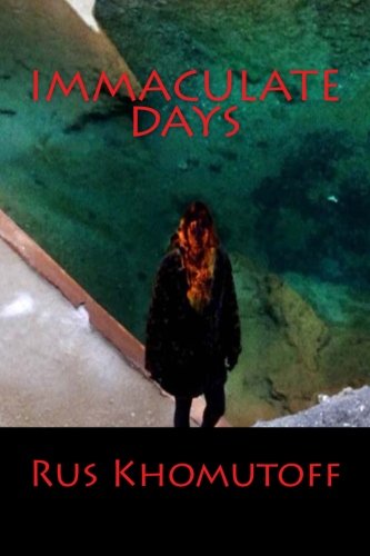
Simply in terms of visual aesthetics, the biggest problem — and if you can’t see it in the larger image, you can definitely see it in the thumbnail — is that there’s not enough tonal contrast (dark vs. light) between your title text and your image. Even though it’s red letters against a green background, the text still doesn’t stand out. You can really see it if you desaturate the colors:
Other comments?
Or even a subtitle that says “Poems of…” whatever kind of poems they are. I like the colors and the watercolory look of the picture, but I agree that there isn’t enough contrast between the title and background. My vision is terrible and I need high contrast to read things.
Well…
What Nathan said. But it is always worth repeating that red is always a very iffy thing to put against black (in fact, any colors of the same value are always problematic when used together).
Perhaps I am being dense, but I have no idea at all what the image is supposed to be. I have little problem with a book of poetry being illustrated by an image that may be more abstract than illustrative…but this image just doesn’t work on any level. The color palette is nice, though it could certainly be a little more saturated.
Nathan does bring up a relative point: Do the poems in this book have any sort of common theme or thread? Does this cover reflect that? Is the title derived from one of the poems? Does the cover relate to it in any way?
I agree the colors are nice but the picture itself is not. Even squinting I can’t make it out. I think it might be a girl but the background is a mystery. You need a picture that grabs the eye and makes one think in the way you desire for the poems inside, oh how sweet, oh how romantic, oh how scary, etc but the art needs to be admirable so the browser stops to admire it. I do love the idea of an illustration for poetry though, I think that’s right on the money. Once you have a clearer idea of the tone, I’m sure Hitch could recommend an amazing font.
Agreed with “Poems” being somewhere on the cover, I see that in almost all poetry books published. Title, author’s name and “poems” placed usually beneath or near the book’s title.
Also agreed with the red against green background, it’s a bit too much for my eye.
However, I see nothing wrong with red and black paired together–I think of the NBA team, the Portland Trailblazers’ team colors or various paintings I’ve seen with red and black that work really well together.
“Do the poems in this book have any sort of common theme or thread? Does this cover reflect that?”
A quick Amazon search indicates this is a book of surrealist poetry, so I feel the image works well with the book’s genera. A person with their hair/upper body aflame is powerful imagery (it reminds me of the iconic photographs of the monk on fire while meditating in Vietnam) and it perhaps speaks to the feeling(s) one may have when reading the book? I don’t know, just a guess.
Overall it definitely could have used some improvements but it is an evocative cover.
Well…
“I see nothing wrong with red and black paired together–I think of the NBA team, the Portland Trailblazers’ team colors or various paintings I’ve seen with red and black that work really well together.”
True enough, but these are not book covers, which have their own inherent problems.
“A quick Amazon search indicates this is a book of surrealist poetry, so I feel the image works well with the book’s genera. A person with their hair/upper body aflame is powerful imagery….”
Also true enough…but it wasn’t until I read your description that I had any idea what the image was. It needs to be handled much better. A good idea done badly is not much better than no idea at all. Such a powerful, evocative image would have had immense impact if it were the focus of the cover.
And I should mention that it apparently was only after you discovered that the book was a collection of surrealist poetry that you realized that the cover might be appropriate. This was putting the cart before the horse: the cover should not have required you to do that research.
I certainly agree with you in that the cover “definitely could have used some improvements…”
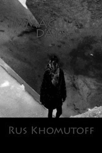
Take a look at the cover in thumbnail, which is the way I first saw it, and you’ll immediately see what the problem is: sure, the dark figure in the middle is discernible as human, but everything else is all muddy and muddled together. The title might be legible in thumbnail, were that thumbnail not against a bright background, but you know most sales sites insist on putting everything against a white or off-white background. That’s before you put things in gray scale, as about half the devices prospective readers will be using for the electronic version will be doing.
With poetry, the cover art can be more impressionistic (i.e. it’s about stirring the viewer’s feelings rather than thoughts) and doesn’t always have to be too specific, but whatever you’re showing should be discernible. Even if it’s just a still life painting of a bowl of fruit, the various pieces of fruit and the bowl in which they’re resting should be distinct from each other and immediately identifiable. Likewise, if you’re going to have a gal in a cowl walking the crumbling sidewalks of a ghetto street with a lot of heavily polluted standing water on it, fine; but make sure we can immediately identify which of these things is which.
Likewise, make sure your title and byline legible; don’t use such a spidery font, and make sure whatever color(s) you’re using for your lettering will provide enough contrast to make it legible in thumbnail. If prospective readers have to squint to make out anything on your cover, your prospects of making the sale to them immediately take a terminal dip.
Lose the black box. Find an image that you can put text over and let it fill the whole cover.