The author says:
Safety and Liability Analyst Craig Shannon finds himself investigating the deaths of two people on the water-filled world called Teardrop. But the deaths were no accident, and all evidence points to a conspiracy against the peaceful alien natives known as the kell. Craig must search for the truth behind the plan to terraform Teardrop to not only save his own life, but the life of an entire planet.
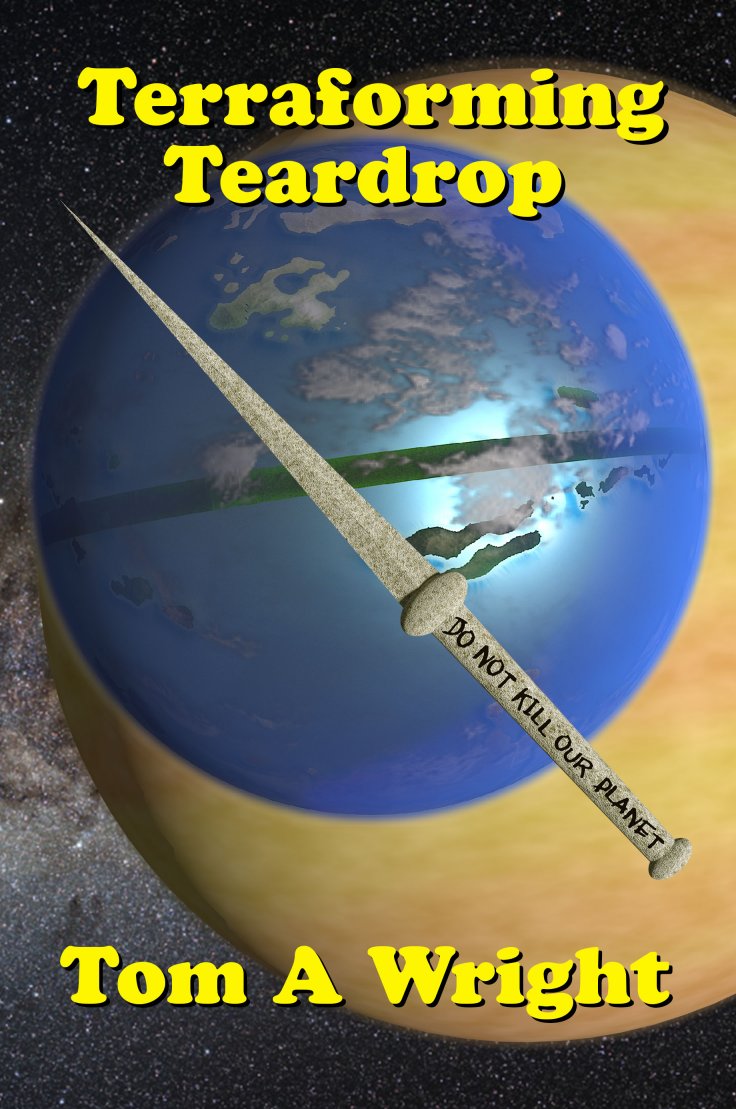
This is a replacement cover to my existing novel. It is science fiction with elements of mystery and adventure. This is the finished cover. Because of the mixture of genres, I’m not sure which author’s readers it would appeal to.
Nathan says:
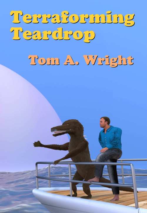
Because it’s a replacement, I decided that looking at the current cover would be instructive:
You’ve made changes, but I don’t think you’ve made improvements.
What you describe above is “SF” and “suspense.” So what are the elements common to each? What are the visual cues that let readers of suspense and science fiction (and especially suspenseful SF) know at a glance that this is a book for them?
Suspense: Dark, shadowy settings with high contrast. People in shadow, or similarly lit in high contrast. The subtext of danger and flight.
Science fiction: Technology, space, alien fauna, SOMETHING that tells us we’re not in Kansas.
Both: Strong type.
So here’s the problem with your revised cover: You have none of that, except the “space” part — and even that isn’t easily discernible; in thumbnail, the planet could as easily be a rubber ball.
So: Pick a strong, clean font (probably sans serif). Let it dominate the cover, as opposed to sliding into the layout innocuously where it won’t intrude. Use an image with stark contrast. If you want to play up the novelty of the water-planet setting, make it a “wet” image. (Drowning imagery works well for “being in over your head.”)
Other comments?
Never use Cooper. It’s about as bad as Comic Sans.
The two planets are a cool idea but should be better framed. Are they accurately representing the story? (A blue water planet near a yellow gas giant)
What is the stripe across the blue planet?
What is the object floating in the foreground with the writing?
To answer your questions, B.L., yes the worlds are accurate to the story, a water-filled moon orbiting a gas giant. The stripe on the moon is a phenomenon unique to Teardrop, a giant, ocean-based mostly floating forest that can only survive around a narrow band on the equator. (FYI, on my original cover, that forest was shown on the back as a continuation of the image. That part looked great to me, but I had serious issues with the front due to technical issues. That’s why I’m trying to replace it.) The object in the foreground is supposed to be a hand-carved, bone knife. I obviously failed miserably since you couldn’t tell. I’ll dump the Cooper font since I obviously have to go back to the drawing board on the new cover. Thanks for the input.
I’ve been trying to get in touch with you via your website, but the security Captcha is not cooperating, no matter how many times I try…
You don’t need to put a representation of every element in your story on your cover.
Instead, find a combination of powerful image and fonts that evoke an emotional feeling of the book.
Here’s some examples of covers which do that.
https://www.dropbox.com/sh/pg6iu8ik5t9sqt1/AABi07iuW7QY4jw-Ln1novZia?dl=0
Love the concepts for this.
This is my take on it…lol
https://imgur.com/a/d0EzG
Something like this maybe?
https://thumbs.dreamstime.com/z/silhouette-freediver-24838977.jpg
Or
https://i.imgur.com/Qf2Zxx8.jpg
https://i.imgur.com/TcCJ37I.jpg
I like the font you used here. What is it?
It’s called D3 Euronism by DigitalDreamDesign. Bicubik by Abstrukt is similar. Both are available at Fontspace
It’s not a mix of genres. It is patently SF and should reflect that fact.
The cover does that…but is otherwise both uninformative and confusing. There are simply too many visual elements that would seem to have meaning only to someone already intimately familiar with the details of the story. A cover should intrigue but not puzzle or confuse.
Most of the alternatives suggested by others are better…but still don’t really convey what you describe as the primary themes of the novel. One thing that would make the cover both relevant and visually interesting would be to include the threatened natives of Teardrop, the Kell.
Maybe something a little, how shall I say this?
Darker
https://i.imgur.com/QyqgiRb.png
Here’s my twenty minute version
Love that! If you added a kell behind the guy like Ron suggested, that would be really awesome
I think that all of the cover ideas that are focusing on an image of a diver are missing something of the point of the book. There is nothing at all in these that suggests science fiction let alone the fact that the book is set on an alien world. Only the word “terraforming” gives any hint as to what the book might be about—but nothing of the themes, conflicts or characters that the author describes. The one fact alone that the book is apparently—at least in part—about an alien race in peril should suggest some really imaginative, attractive visuals. The original cover, as awful as it was—at least tried to accomplish these things.
My example was meant to illustrate the style more so than the diver specifically. Clean and simple.
Respectfully, I have to disagree. I think most of the boxes were checked in my example (whether they could have been addressed in better/different ways is another story) but the cover clearly shows an ancient civilization under the water and a man exploring it. The ruins along with the UFO in the sky puts it not on earth.(although the addition/substitution of two faded moons/planets would work too) There’s a tail of a creature showing in the ruins (that could be played with to show a hand and eye, make it clear it is intelligent) but the theme of a mystery on a different planet is clear from those elements. I do agree just having a diver tells nothing, it needs ruins or intelligent creatures, but adding in the Kell to Vee’s example would be a great cinematic type cover.
The problem is the Kell. Not only does no one know what one looks like so adding one tells nothing really, but finding a creature already made that matches the authors vision will be very hard. But hinting at a creature with intelligence would be MUCH easier. A scaly/furry hand grasping any tool or weapon would do it. So, if the author takes those elements and meshes them, it should work very nicely. It wouldn’t be that hard to make such a creature appear to be peaking from a dwelling/behind a rock or whatever.
The detail as in my example could all be tweaked to match the authors vision. The ruins could be actual dwellings or high tech. the water color itself could be anything he wished. The type of craft in the sky could change or even a boat added but with that he’d have to be very careful to be sure it couldn’t be taken for a scene on earth at first glance.
The trick is to get across the idea of the mystery. That there would be aliens on a alien planet seems self explanatory. So I’m not sure it is necessary he shows them. If he could somehow show the idea of a corporation willing to kill a native population that would rock. Unfortunately, that will be a hard concept to get across. But going with a mystery on a different planet should be enough to get potential interested readers to read the blurb.
As a completely alternative idea, maybe have a ring of alien eyes underwater examine something dangerous left by the corporation. Seaweed and stuff could be used to obscure the bodies but they could be holding crude weapons and examining something high-tech. The problem with that idea is, it makes them seem like the Main Character when I believe it is the human man. But I think it could work to get readers to read the blurb, which is the goal.
I hope I’m not breaking any site rules here, but I think it is important to point out a few things that may help future posts about my book cover. First, I am not a 2D artist and have to rely on a 3D graphics program to create my images (Can’t afford to pay a real artist, so I am forced to do it myself.) As suggested by a few, I would love to include a Kell, but the limitations of my PC stopped me dead once I added hair to my model for the original, so I couldn’t properly comb or color the hair, pose my model the way I originally intended, nor even add weathered details to the boat. Just to get the image I used, I had to pay an outside 3D artist to render the existing image for me. The Kell and the human models were just too much for my machine to handle, so that leaves out any attempts for me to include a Kell in any future cover, which is a shame because the Kell model is actually better looking then the furred rendered version. In any event, I welcome all ideas on what to try. Many thanks to all.
I am in the exact same boat, having to use basic 2d layers combined with 3d renderings to create complete images. If you can’t render characters well it’s best to avoid them or keep them small, focusing on a larger scene. You can look at any of my covers to see what can be done, even with an old computer and free software.
I’m always happy to help fellow authors with limited budgets. They may no be professional, but they are a step above cut and paste.
I didn’t mean to step on anyone’s toes regarding my comments about the covers with underwater images…especially since Savoy’s example is really, really nicely done! And, as Savoy rightly points out, their cover is really a proof of concept and that all of the different visual elements need to be made to read “alien world.” Ruins that are definitely alien, a creature that is definitely alien, etc.
The novel evidently takes place entirely on a different planet. I think that is the very first thing that needs to be gotten across unambiguously. Including a spacecraft is a very good idea—but would the potential reader realize right away that it’s a spaceship that belongs to another world rather than one visiting our own?
Including some sort of patently alien creature would be great, too…though, like the spacecraft, the first thing would be to establish that the thing is on its home planet and not something invading the earth.
So, in short, things like alien spacecraft and alien creatures are great for getting the basic idea across that the book is SF–but they are still all things that might be found here on the earth. So we need to get across the idea that the book is taking place on an entirely alien world before anything else matters.
I think this could be very easily done—and is probably the only real change that Savoy’s otherwise superb cover concept really needs. Just add a couple of large planets and/or moons in the sky and, bingo!, that would immediately tell the potential reader that the scene is on an alien world. A ringed planet would be even more perfect, just because.
It’s a shame that one of the author’s aliens couldn’t be included (I’d like to know what one looks like, just to satisfy my own curiosity!).
Happy to satisfy your curiosity, Ron. A Kell would look roughly like an alligator standing upright on two legs, with a thick, muscled tail. They have smooth bodies (no scales) covered in fur like that sported by an otter. They are mammals that function equally well on land and in water, but live on the land. The creature on the boat in my original cover is a Kell, but as I stated earlier, I couldn’t do it justice because the fur crashed my 3D program by exceeding my RAM and graphics card capabilities. 🙁
If I may:
I don’t try to do mockups, because unlike the rest of the folks here, I’m not a graphic designer. I can tweak together a cover–I have the technical skills–but not the ability to create a creature, or any of that hoohah.
I believe that while Vee’s cover is absolutely cinematic, (nice!) it does fall down on the whole “this takes place on an alien world” thing.
I don’t agree with SM Savoy (this is rare; I almost always agree with him/her) that his/her cover “clearly” shows an alien environment, etc., because to my eyes, those ruins could be in the Med. The only quasi-alien thing is the terraformer–and that could easily be attacking Earth. (However–if you could add two suns, or what-have-you, going down over the ocean, or rising, or whatever…). The body part/fin that’s showing, to my way of thinking, isn’t enough to convey “alien,” much less “sentient alien.” As s/he noted, though, yes, you could add more, and make that part clearer.
What I’m getting at, here, is this: sometimes, you have to completely chuck your design ideas, and give up the concept of telling your story on the cover. Oftentimes, a single, strong graphic element will do a better (far better!) job, than trying to put your story’s specific elements on the cover.
In your case, Tom, you’re limited by a) budget and b) your PC’s age/capabilities. As you’ve already learned, proto-humans or pseudohumans=bad. They do not sell covers. And they are almost always the result of an author determined to tell the story, on the cover, or show the hero(ine), etc.
Take the magical equatorial floaty forest. That is absolutely, positively, an idea that works much better in the imagination than on the cover. I’d demur from showing that. The sword implement, most likely, ditto.
So..what CAN you show? You can show water. You can maybe show a planet. You can show space; you can find spaceships galore, floating around (yes, yes, folks, that was deliberate) that you can use, in a photomanipulation environment. (Before we go further, I don’t know if you’ve read any of Derek Murphy’s articles: http://www.creativindie.com/8-cover-design-secrets-publishers-use-to-manipulate-readers-into-buying-books/ , but if you haven’t, please read that next.)
Then, given the abilities, or lack thereof, of your computer, I’m going to suggest that maybe, you try to make this using Word. Now, before my fellow Critics have a cow, (I can hear you all screaming!), Derek (Murphy) set up a site, DIYBookCovers.com, and basically, he teaches people how to do their own covers, using Word. Yup, you heard me, kids: Word. I kid thee not.
And here’s the bizarre thing–I’ve done it, and it works. (Before I recommend something to any client, I try it out. I take the whole course, or I do the entire job, or whatever.) I downloaded Derek’s Word-based templates, read his very thorough instructions, and byGod, I’ve made about 5 ebook covers that work. They’re not masterpieces; you guys that can actually draw and all that would likely laugh, but they are perfectly respectable, and the books they are on sell–which, let’s face it, matters more than laughter.
Now, being as I am not a graphic designer, I can tell you that if I can do it, anyone can. You’ll need to spend some time, scrounging around the net for the “right” images; you’ll have some trial-and-error–but, Tom, unless you really screw the pooch, your end result will be a lot, lot better than what you’ve got now. (If you don’t have Word, keep reading…)
If you don’t have Word, it’s possible that you can use Derek’s online tool, instead. This ALSO works, and it works like a cross between Word and Photoshop. I’ve also used this, and it also works.
So: you need a blue planet; a spaceship or a “terraforming” ship/thing/device; and strong font. Those are the essentials. Go forth to Pixabay (that’s where SM got the underwater ruins, and there’s one here that I rather like: https://pixabay.com/en/island-sea-underwater-mood-1557480/ (although it may not be “quite right”). Or this: https://pixabay.com/en/island-castle-substantiate-city-842073/ and anyway, so on and so on. You can also do some boneyarding at DeviantArt (if you haven’t been there, it’s NOT what it sounds like).
Using what you learn from Derek’s materials, I honestly think you could put together a perfectly respectable, and nice cover. No–it won’t have a Kell. It may not have a human. But you’ll have an alien sky or artifact; you’ll have a lot of water, and you’ll have dark imagery (to scream SUSPENSE and SCI-FI), and you won’t be tied down with pseudo-humans and your 3D program’s limitations.
I don’t know if that helps, but I sincerely hope that it does. I’ve never seen so many folks comment and do mockups, so it’s obvious that your idea has sparked their imaginations. So, let’s live up to it, yeah? Expand your horizons. See if you can use Derek’s stuff. Forget your old cover ideas. Embrace something new–or, ask one of the guys/gals here if you can use one of their mockups.
Good luck.
I don’t want to give the impression that I have zero skills/tools in which to draw from. I do have an older version of Photoshop, which I am getting better at using with practice and instructional YouTube videos, and am constantly improving with Blender, my 3D program (also thanks to YouTube.) This is a link to an image I created utilizing both programs.
It is a render of the spacecraft I used on the cover of my novel Temporal Feedback. It was combined with an image I found online of Earth from orbit. You can see I adjusted the lighting of my 3D model to match that found on the space image. I use this combined image as my PC’s wallpaper.
The big issue for me and my Teardrop cover is coming up with the best idea of what to actually show, that is in my capabilities to produce. I do have a huge pet peeve with covers that are misleading. If it is on the cover, it better be an image that came from the elements of the story. In this regard, there are no underwater ruins in the story, so I couldn’t include them on the cover. There is, however, an underwater hotel. I contemplated showing that, but I’m not sure such an image would really set the right tone. At the moment, I’m utilizing the cover ideas suggested by Tracy to make a rough proof of concept cover showing a view from the edge of the Belt Forest, showing the ocean, with the sun close to the horizon, and the gas giant planet above it, creating a golden-clouded sky, with harsh shadows in the foreground alien trees. My thinking is that the dark trees roughly picture framing the alien world sunset would definitely say science fiction, and hopefully create a much moodier atmosphere. None of this should tax my PC’s limits. Any thoughts on this idea?
Not sure why, but the link to the image on my last post didn’t work. Here is the direct address. You’ll have to cut and paste if you wish to see it. Sorry. http://i209.photobucket.com/albums/bb16/yazawa_photo/Pileeta%20Timeship.jpg
I’m not sure that will be enough. It sounds like a good background but you need some action in the shot. It doesn’t need to be a person or creature but the scene needs to be active to be engaging. A simple test is to ask yourself what is happening in the picture. If the answer is nothing, add an element that adds the action. It could be something exploding, a disaster striking, or some other thing happening to the scene itself or the more common person acting in the scene, someone driving, swimming, fighting, kissing, the more interesting the action the better. If your descriptive word is standing, get a new picture. While standing is an action, it’s a boring one. So you need some action that says mystery story.
Maybe you could add a partially destroyed native home/tools or something with a man examining the wreckage? That should be relatively easy elements to find or make and put on a beach scene. A guy squatting or on one knee, maybe with a high-tech looking device in hand or beside him, and he’s overlooking some primitive artifacts partially buried. something that says something happened here and is being covered up. Keep the setting itself sci-fi and that would work.
Hi, @Tom:
You know…as I mentioned, in my post, sometimes, trying to include elements from the story is actually the completely wrong way to go. I suspect–can’t be sure until I see it, of course–that the floating forest thing is probably one of those. Without a custom piece of artwork, it’s highly likely that whatever you try is going to look either shlocky or just bad. I’m not criticizing you, or your work; I’m just saying that some things scream for custom artwork, and something as out-there as a forest that floats around the equator, movably, well. I mean…how do you even depict that? If you show the forest, where it meets the ocean…well, you have a forest. If you show it at any angle that would show the equator, well, nobody can tell it’s a forest, b/c you’d be at Space Station distance away.
See what I mean? It’s almost impossible to convey, graphically. Certainly without some artist’s magic work, it is.
I honestly think you’d be better off with one strong graphic element. A terraforming vehicle, looking like it’s sucking up the ocean. Or one skimming the surface of the ocean, like SM’s rendering. Maybe you could do something with the second “portion” of the cover, the one where s/he has the underwater ruins.
Tracy actually said something similar to what I did–you don’t need all your story elements, or even most, etc., on your cover. The original cover for “The Martian” had a guy in an EVA suit, jumping on a pile of dust, basically. Many great sci-fi novels have nothing more than a planet and a spaceship on their cover. That works, for the reasons we’ve discussed here on CC.com before. Maybe you can convey a LOT by photo-manipulating the image of a planet into a nearly-all-water planet, and the ubiquitous spaceship. Sure, your plot is not spaceship driven–but the natives and the human have to have gotten there somehow, or at least, the human did.
Good luck.
I might have the winner for simplicity while still featuring something. Arbor Day is nothing but a single ‘arrow’ in a plain landscape, yet that lone object drives the entire story.
Yeah, BL: I remember that, and that did fly through my noggin when I was writing that very post. 😉 Oh, BTW, if I didn’t say this earlier–welcome to CC.com.
I have never been able to make a word art project high enough dpi for print. How do you do that?!!!(every time I inserted a picture it would shrink the dpi. The end result was always lower than the original pics.)
When I first started, I used word because I was used to the program so it was easy but nothing I created there was accepted by printers because of the dpi. Does it even get to 300 dpi? I belive mine were all 72, which is barley adequate for an online ebook cover. The most commonly recommended ebook cover size is 1600×24000 350 dpi. Even for creatspace, if you submitt under 300 pixels they warn it might look bad.
The above comment was supposed to be a reply to Hitch. Sorry for the confusion
Hi!
I knew that you were “talking” to me, SM. You know what I did? (n.b.: this may be dependent upon having a commercial version of Adobe Acrobat Pro. I haven’t tested it with Adobe Acrobat Reader.)
I followed Derek’s instructions, and exported the content…to PDF. Not “print to,” I exported it. And then, I opened the PDF in Acrobat Pro, and saved as JPG. Kablammo, 300dpi/ppi.
I may be omitting something like, I changed my “save as” settings in Acrobat to 300, or whatever, but…that’s the whole big “secret.” Word–>PDF–>JPG. Serious bidness.
I hope that helps. I was bloody gobsmacked when I managed to make a damn cover that wasn’t godawful. How on earth Derek figured all that out, I’m damned if I know, but…he’s right. No, you can’t make the Sistine Chapel, but you can make a perfectly acceptable photo-manipulation cover.
(SM, feel free, seriously, to email me if you can’t make it work. I may be overlooking something, yadda. I’ll cheerfully go test it again, if I have.)
OH! Also: if you use Word 2013-16, for PC, then you have to turn OFF the Word compression that’s automatically applied to images. Um….I think I can link this, here: https://db.tt/viG4iv3IA2
Let me know if a) you can’t see/download that PDF, b) it doesn’t work (what? Inconceivable!), or c) you can’t make the Word–>PDF–>Jpeg/PNG thing work.
HTH
That’s great information! I’m familiar with printing to adobe from word to make interior book files and it never occured to me to try that with a cover,so pass me the stupid hat…lol
Thanks so much. I always learn things here!
Oh, heck. I’d love to take credit, but, t’was all good old necessity, really, I think. We are constantly getting covers in Word files, sometimes, even made in word (and, brother/sister, NOT like Derek’s!), so we had to scrounge up ways to do that. I’m happy if it helps you, truly.
I’m wondering how an island floats yet the water doesn’t?
But that’s just a personal issue, nothing to do with the cover.
I think Hitch’s linked island picture would make an amazing cover.
I’ll admit I hardly ever ‘get’ the more simple abstract covers like Twilight with a girl holding an apple. What’s that even supposed to mean? But I digress. I think those sorts of covers rely more on author recognition but even then, the graphic chosen needs to be very strong and eye catching. The problem is thinking up that simple meaningful graphic.
PS. I attempted to leave you a note on your website but it kept giving me a security code error even though I was entering the letters/number as shown.
My note was as follows: Hi, we’ve been ‘conversing’ on covercritics. If you need help putting graphic elements together stop by scribophile https://www.scribophile.com/authors/s-m-savoy/ and look me up. I can talk you through it, or do it for you if your comp isn’t up to it. Covers are just a hobby of mine. I don’t do this commercially although I do have some I made out in the world…lol. My help is offered with no strings attached. I find your idea very intriguing, and it’s fun to work on. Best of luck to you with this project,
S.
S.M., Ron had the same issue about my Contact Page. I’m in the process of tracking the error down so I can fix it. Sorry about that.
Took a bit of effort and time, but finally got the newest reCaptcha working with the Contact page of my site. Just an FYI for those who are interested.
Each of your covers brings something to the table to indicate that this is science fiction, but they both seem awfully generic beyond that. If prospective readers look at your original cover, they’re likely to think something like “Oh, so the humans and gorns from Star Trek (or something like them) are finally getting along. OK, but what’s the story here?” If they look at your new cover, they’re likely to think “Well, I can see why they might call this planet Teardrop, especially since it looks just the pupil of an eye… but what’s the story?”
In short, the science fiction’s showing, but not much else about the story. Alien species and alien planets give your prospective readers an idea of the setting, but not so much what’s going to be taking place in it. You say it’s got mystery and adventure in it and it’s about unraveling some kind of conspiracy against a whole planet’s sentient species; sort of The Pelican Brief… IN SPACE!!! maybe? If that’s the case, I’d say mystery is the primary sub-genre, and you ought to be playing up a “detective noir” theme on your cover.
For that, having your human investigator protagonist and one of those crocodile-or-alligator-like kell on the cover is fine, but they ought to be meeting in a seedy detective’s office or a sleazy dive or (at least) a shady corporate office. If there’s something unusual about these settings, e.g. the dive or the office is underwater, so much the better: you establish that although this is going to be playing out like a contemporary detective story, it’s definitely taking place in a futuristic setting. The main point is to make the viewer think immediately of detective fiction; fedoras and trench coats are optional.
That the entire population of an entire planet is at stake does not need to be established on the cover, just in the story itself. No matter how great the stakes may be by the climax of the story, even the greatest epics generally start on a personal level: Homer’s account of the Trojan War begins with the private wrath of Achilles, for instance, and the original trilogy in the Star Wars saga immediately focuses in on the personal boredom and restlessness of its young farm boy protagonist Luke Skywalker shortly after its vaguely political prologue. So too, even if the climax of your story will have millions of witnesses (human or kell), you should start with just one human and one kell at most.
Basically, what you want is either the scene where your protagonist gets hired or (if humans were the ones who sent him to investigate and you want to show a kell) the scene in which he first arrives on the job. For the former, showing his new client arriving as the protagonist is sitting at a bar or behind a desk usually does the trick. For the latter, showing a kell helping him down as he steps off e.g. a helicopter or a drop ship or whatever kind of transport he used to get to the job should indicate everything the cover’s viewers initially need to know.
In short, think what kind of picture would have you immediately imagining a character saying “Rookie, I’ve got a job for you…” or “So you’re the one they sent to investigate, eh, human?” and get that on your cover.