The author says:
Steamy Suspense Romance – not for kids or teens ‘Vanilla’ man saves D/s woman from attack in dark alley, they become lovers while fending off the revenge of gangsters. They teach other about their type of pleasures while falling in love. First in series of the couple building philanthropic empire against all odds.
Nathan says:
Now, I’m not the target audience (and I have no idea what “D/s” means), so I hope other can corroborate what I say.
You say this is a “steamy suspense romance.” What I see is a just plain romance. The steamier subgenre usually puts more of a focus on bodies than on lips (thus giving rise to the “headless torso” phenomenon), and suspense… well, some indication of danger is usually included.
Who are the books that you would expect to see in the arms (or on the Kindle) of the reader who would enjoy your book? What are the commonalities between those covers? How is your target reader used to being marketed to?
I can say that I DO know what it means and you don’t seem like the target audience
Well, it either means “drugstore” (that’s what DS or d/s means, on makeup, etc., forums), or it means “Dominant/Submissive” or “Dom/Sub.”
And, assuming that the latter is right, well…I don’t see anything in this that would appeal to that audience. Nathan is right, this screams “true love/romance,” not “erotic encounter with dom/sub protagonists.” (Although, “philanthropic empire” Dom/subs is a whole new sub-sub-sub-genre.)
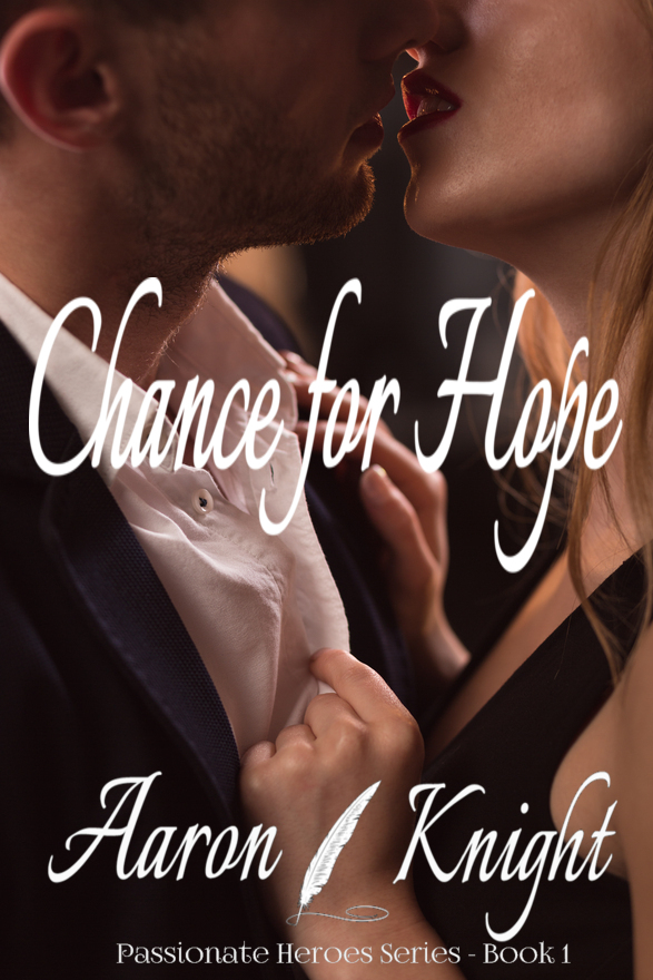
As nicely as I can put it, I truly hate the title font. I don’t like that it’s used for both the title and the byline, and then another relatively unreadable font is used for the series title. Your reader needs a break; you should try to distinguish the title and byline,and use a nice, highly readble sans for the series name, so that it’s readable without being enlarged/zoomed. Bear in mind that 99% of your viewers will only ever see this cover at thumbnail size; possibly as large as 150px wide and 200-250px tall–that’s all. They certainly shan’t be able to read the series name at that size.
Nor is the title all that readable, at thumbnail size. It also has white lettering getting lost against the male’s white shirt. I understand that you are trying to convey “steam” with the slanty, decorative font, but I think you could do a LOT better. (if it were me, I’d lose the quill. It feels a bit…well. I’d lose it.)
I will also add this, unsolicited and possibly inappropriate, but…”Chance for Hope” seems like a wildly tame and Harlequin Books romance-y name for a dom/sub tale. It really sounds like a traditional, m/f, straight girl-meets-boy, trouble ensues, HEA novel, or even a traditional or Christian romance/drama title, not the next “50 Shades.” Honestly, I think you’ll struggle with the titling fonts, no matter how many you go through, with that title, because it doesn’t lend itself to heat.
About the background image–while you’ve done a good job in not falling prey to the whole “let’s cut-and-paste this person into this background” mindset of cover design, and I congratulate you for that, I do think that what Nathan is saying to you is true–the advent of the “torso-only” cover is a pretty direct result of hotter sub-genres in romance/erotica. This image looks a bit like the usual poster image you’d see for a “hot” daytime soap, not the leather-and-straps crowd.
I don’t know if that helps, but I would take another run at it. Free your inner demon, and let him/her/it loose.
Good luck.
I don’t know anything much about dominant, submissive, bdsm, and such, so I may be totally off-base. Would “Hoping for Pain” be going too far as a title? More to the point, does a title that goes too far re-contextualize the imagery sufficiently so that this cover art could work?
I don’t know, Kris. Maybe is the best I can say. It would need a new font, surely; maybe if the quill were supplanted by a whip, or spurs, or something that you can put on the cover (e.g., c*ckrings are probably out). Maybe, but honestly, I don’t think so. I think that in this instance, you need more trope, more banal imagery that says “this is what I am.” (As a book cover, I mean.)
It’s a generic cover with absolutely nothing that sets it apart from thousands of similar books. There is certainly nothing whatsoever that even suggests any of the themes you talk about in the description. Beyond that there is not much I can add to what Hitch suggested other than that you might be best off rethinking the cover from scratch.
The way I’ve heard it, the “D” and “s” in “D/s” stand for “Domination” and “submission” (with the capitalization of the former suggesting the woman stands mainly on the “dominant” side of the equation) unless it stands for the “Discipline” and “Sadism” in BDSM. Anyway, she’s apparently into the kinky stuff, while said “‘Vanilla’ man” isn’t. That naturally opens up the question of how she ended up being a damsel in distress while he ended up being her white knight; evidently (like many people who engage in these kinds of kinks), her fantasies in the bedroom are the direct opposite of her situation outside of it—but I digress.
As the others have noted, despite the description, the cover itself looks like a generic case of “vanilla meets vanilla” more than anything else; the “Steamy” and “Romance” parts are pretty self-evident, but none of the other parts. While the cover needs not be cluttered with everything from the story—that would be what Ron Miller disdains as the “kitchen sink” school of cover design—the central idea that the gal’s with the leather-and-straps crowd and the guy isn’t needs to be on there in some immediately obvious form. Just having her wearing black the way she is now won’t quite do it; plenty of perfectly ordinary “vanilla” women wear black dresses—and even black leather jackets—when they’re out nightclubbing.
For the desired effect, a generic handsome guy in a T-shirt and jeans embracing a gal in more formal clothing holding a whip or some such implement of “domination” between them would make their romantic arrangement a bit more obvious. If the point of the story is to contrast the power dynamics in sexual fantasies with those of real life, you could also have the guy holding a pistol between them; apart from the occasional odd “ravished by the home invader” fantasy, guns are not commonly considered much of a fetish in the bedroom, but certainly tend to shift the balance of power in one’s favor outside of it. The rest of the story—the stuff about their being under attack by gangsters or whatever—doesn’t have to be on the cover, just the part about their being lovers with contrasting approaches to what they consider to be romantic.