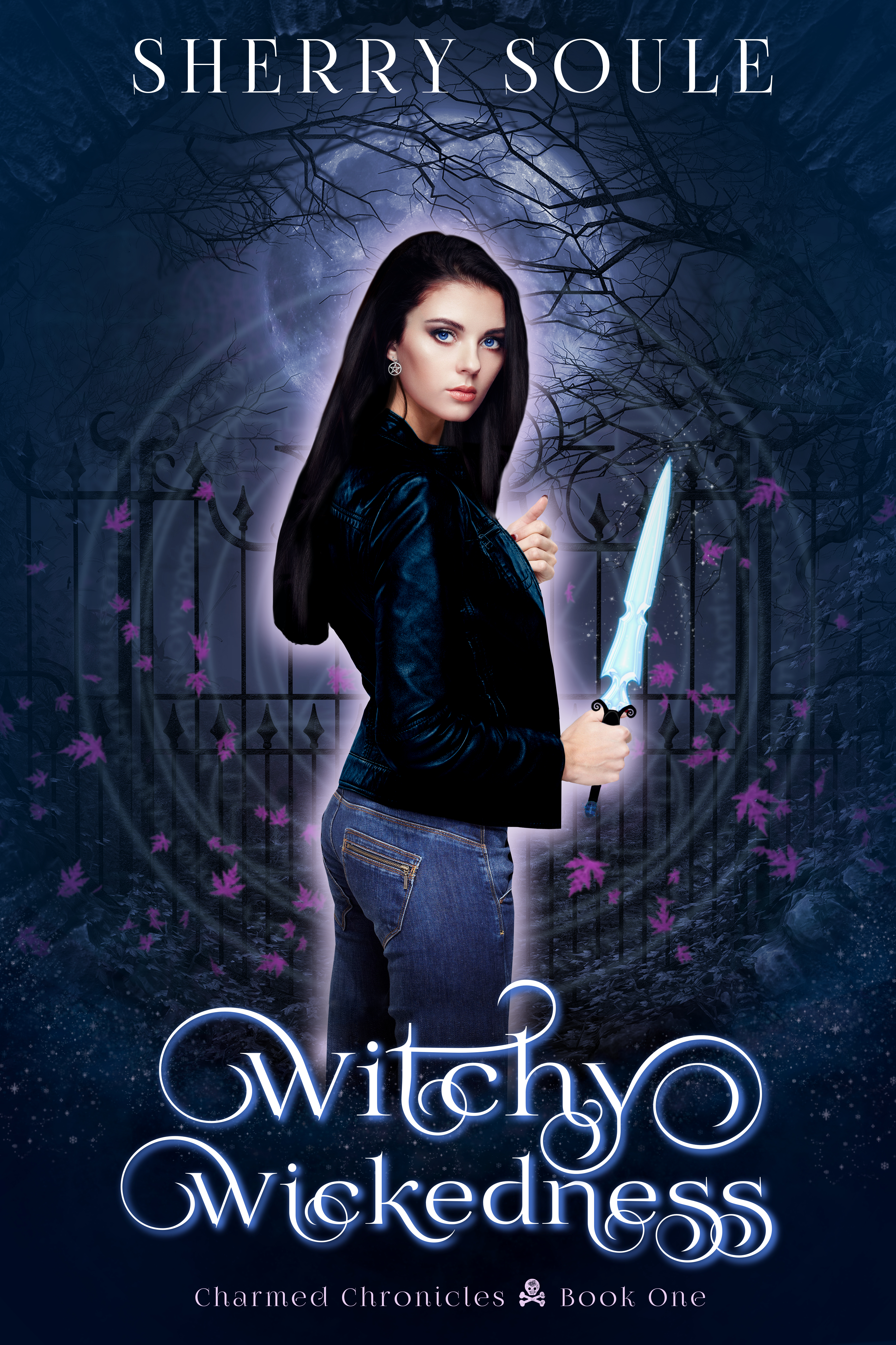
The author says:
Genre: YA Urban Fantasy
Designed by SwoonWorthy Book Covers
About: Ravenwood, California isn’t like other coastal towns. It’s a mystical place built over a gateway into Hell, with some extremely unusual residents. And Shiloh Trudell isn’t like other girls—she’s a teen witch who can sense the things that go bump in the night.
[original submission and comments here]
Nathan says:
Some advice taken, some not. I don’t consider myself 100% infallible in these things, but I think this is a case where the advice taken improved the cover and the advice not taken didn’t.
- At least she’s hold a recognizable object now! (Not to nitpick, but she looks like she’s holding it curled in her fingers, instead of back against her palm and the ball of her thumb.)
- Byline bigger: Good. Title smaller: Bad.
- The glow still looks more artificial than magical.
Other comments?
It’s kinda the same as before, only different.
The hand holding the sword looks pasted on, and looks like it might even be a man’s hand.
That’s funny because it is the hand that came with model and I didn’t change it.
It is an improvement!
I agree about the glow: it should look more “magical.” It might also be nice to have some sort of glow associated with the knife. Whether that would be realistic or not in the context of the story, I don’t know. The more important thing would be its contribution to the overall effect of conveying the nature of the book to the potential reader.
Here is one example of a more “magical” glow…
https://www.photoshelter.com/mem/img-get/I0000DgpCQ_zkK6c/s/1000?1386639562
The hand does look a little unnatural—or rather, the knife looks pasted into it. A little cast shadow would help that.
The title is nice but could be scaled up a little more. That would make it read better in thumbnail form. And there is no special reason to see as much of the girl’s leg as there is—and you would only lose about half an inch of it.
One more small thing. You might want to consider feathering the end of that mass of hair with a few stray strands so it doesn’t look quite so much like a solid lump.
I confess, I’m struggling with this cover. I didn’t love it before, and I’m not wild about it this time. But, that being said:
I would definitely enlarge the title, making less of her butt visible. It’s oddly-shaped as if she has her ass clenched, or she’s wearing not-very-good shapers (not spanx) beneath the jeans. Making the title larger, to cover some of that up would help divert the eye away from the oddity of her butt shape.
I agree with the others that it doesn’t look like a magical glow. I agree that perhaps it would be better to include the athame (presumably, that’s what it is), or perhaps, just the athame should be glowing. Perhaps, a glow string setup, behind her, would be more effective than limning her with a highlighter? Maybe–not saying this is perfect, mind you–something like this? https://www.renderosity.com/mod/bcs/magical-glow-strings-and-sparkles-photoshop-cs-brushes/45132
I further agree (I’m so agreeable today!) that the blunt ending of the hair is jarring. It would be less so, sans the limning glow.
I have another comment–which is only indirectly related to the cover, but people who read urban fantasy will probably have the same thoughts that I did, upon reading your description and viewing the cover–you’re (or your client is) mixing two very popular, well-known TV shows, in close proxmity to each other. You have a teenager girl, living over a hellmouth in California (Buffy!) and you have Charmed on the cover, in the series name (3 other girls, one’s a teen when it starts, the Halliwells, in California, who are WITCHES who can sense things that go “bump in the night”). My immediate reaction was…well, I’m just thinking that perhaps you could revamp the series name, or something, to have fewer instant-recognition/pop-culture references in such close proximity to each other on your sales page. People see the description and the cover, right next to each other. I’m not trying to criticize, but if I saw that, I’d turn to another book. It would feel a little too…”homage-y,” to me. Not to mention, while the fonts are different, the poster image for Charmed had the girls, the series name–and a glowy foggy thing, behind them. It’s just an awful lot of references.
I realize that you didn’t ask for that last bit of critique, but as the “Charmed” bit was on the cover, I thought that someone should mention the obvious possible issue.
As Hitch points out, it’s awfully similar to Charmed and Buffy The Vampire Slayer in a lot of respects; and as I’m pointing out, the cutting and pasting are still far too obvious, maybe even more so than before. All those wild curls in the title font coupled with the minimal anti-aliasing make it difficult to read in thumbnail, as does the rather spidery-thin and similarly over-sharpened font of the byline. Other than that, the picture’s fairly clear in thumbnail, but all kinds of subtle flaws (such as the disproportionate size of the hand that Ron Miller noticed) start popping out at the viewer when seeing the cover at closer to fuller size.
If you want to refine your technique, I’d recommend focusing mainly on improving the blending of your artwork. The girl’s hair is the biggest giveaway to her being cut-and-pasted, but the sharp edges on all of her clothing are pretty revealing too. Softening those edges with one of your image editor’s airbrushing tools might help a little, but would still be a bit too noticeable at a larger size.
Mainly, I think you’re using the wrong tools for the job: no matter how you fine-tune the trimming and “magic wand” tools on your program, they can never capture all the strands of a girl’s hair and all the fluff of her clothes properly when transferring her from one picture to another. My secret, when working with any kind of stock image model, is to look for models set against a blank white background, and then use the program’s selection tools to select all that white space up to and into where it borders the model. Once you’ve got it selected, it’s pretty easy (especially with a dark-haired model whose hair completely surrounds her face as in your case) to use the “color to transparency” function on your editor (if yours doesn’t have it, get one that does; GIMP has it, and is free) to wipe out all the white while preserving all the fuzzy hair strands and ragged edges to the clothing for transfer.
As for the “nimbus” around the girl (I seem to recall that’s what we were calling such things a few covers ago), it does seem a bit lackluster right now as the other critics have noted. While you certainly should extend it out to the athame or any other object you want to portray your model holding as others have suggested, a simple even-sized glow around the model looks cheap and amateurish like those blue-screen lines fantasy movie makers had around too many of their characters in the 1980s until they finally figured out how to blend their moving images properly. For more professional-looking results, I recommend placing the silhouetted glow against a bunch of ragged swirly stuff the same color and mixing these together so that the glow looks like it’s flaring out more chaotically the way energy fields (and clouds and plasma and the like) typically do.
Finally, while it’s all right for fonts to be swirly, soften the edges a bit more before you go setting such solid edges against such a fluid background, and make both the title and byline big enough to fill their section of the cover. It’s not as if your prospective readers are going to care if they can’t see every last part of the Moon overhead or the girl’s jeans down below. As long as they can see what’s important (her face, some of her relatively modern clothing, the magical field around her, and any magical implements she’s holding/wearing), everything else on the cover is of only secondary importance at best.
Update: I found a copy of the stock image of the gal whose face you evidently used on this cover, and used some of the editing techniques I mentioned to make a version of her with the background blanked out. It’s not as good as I probably could have made it with more meticulous application of my techniques, but I think it’s a pretty good ten-minute example of how to preserve the fuzzy edges of a gal’s hair while cutting and pasting her from one shot to another the way you’ve been trying to do with your cover.
(Of course, if you want the ends of her hair which are out of the frame in this picture to look realistic, you’re going to have to transplant the ends of some other dark-haired model’s hair from some other shot onto your model, also using the color-to-transparency blending techniques I used here to conceal the cutting and pasting.)
Strange question, but how did you find her? Without a name I can’t think of how one would go about wording a search string that wouldn’t be mostly false positives.
Two places: if you crop the cover down to the gal’s face and submit it to http://www.tineye.com, you’ll get at least one match from a stock image site. Submit that result to TinEye again, and it’ll yield several copies, including some without watermarks. Submit one of those to images.google.com, and it should bring back several versions of it, including the largest one which I linked up above.
you can also use hair paintbrushes to fix hair. there are lots of free ones
another way to easily soften the edges is to duplicate the layer and run a Gaussian blur on the bottom layer, Start small and keep running it until the edges are as soft as you want them
In fact, if you look at this cover, you can see the author did plenty of blurring and softening of the edges around the gal’s hair already (albeit less consistently than your suggested technique would have done). The problem, as one can see from comparing this cover with the original model’s image, is that real hair isn’t clean and neat around the edges like that; even for gals with very straight hair like this one, it’s always a bit chaotic and ragged around the edges with individual stray strands of hair frizzing out away from the collective locks here and there. That’s why I prefer to use transparency tools while transferring pictures, and save the softening tools for afterward when touching up edges on the blended images that came out a little bit sharper than they should.
THANK YOU! These tips will help me to refine my covers.
Thank you for all the feedback! I appreciate everyone taking the time to comment and offer helpful suggestions. I’ve only been doing my own covers for about 6 months with Gimp and I know I still have a lot to learn. I think I’ve revised this cover at least 10 times already. LOL
Actually, I just finished another revision and while I’m not 100% happy with it, I think it’s fine for now. I’ll upload it later this week. My daughter said it’s time to get back to the writing and stop stressing the cover. And she’s right… 😀
Have a blessed day!