The author says:
I fiddled some more with the cover and hope I made some improvements using the critique given. 😉
[original submission and comments here]
Nathan says:
You did indeed, and the improvement definitely shows. There’s still room for more, though.
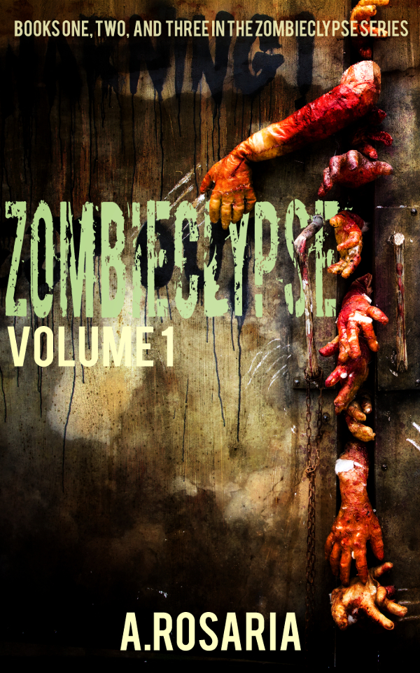
I was uncertain last time if “Zombieclypse” could easily fit on one line; you’ve demonstrated that it doesn’t, not without compressing the letters to the point that you sacrifice readability. I think one of my suggestions last time just got stronger: put the title on an angle, high on the left and low on the right. I would also put a slight dark glow or drop shadow around the title; with the font so textured against a background so textured, the text blends dangerously into the background.
Other notes: The spaces between the letters in the series description are so minimal that the words run together. Especially in all-caps, you need to make sure the words are distinct — if you need to, double-space between them.
And there should be a space after the period in the byline.
I think we’re close to a winner here! Other comments?
How about putting the title vertically, since the interesting parts of the image are all on one side?
You know, I pondered that, but with the title being so difficult–I mean, the typical person won’t recognize the word right off the bat–I’m not sure if that’s a great idea or not. I think we’d all need to see that. If he does, I’d strongly recommend using a bright color, like the green, and de-grunging it, unless the background over there on the left is darker/smoother than the middle/right-hand side.
It almost works. It’s certainly better than the original version but some of the same serious problems remain.
You should get rid of the lettering that exists within the artwork. It is simply confusing…especially where a word falls behind the title.
You still have the problem of the very large area in the lower left quarter of the cover. The eye tends to go to this space…and there is nothing there. The result is that the cover appears lopsided. There is nothing wrong with asymmetry—I am a strong believer in it when doing my own cover art—but there still needs to be a visual balance and there there really is none. You might want to give a shot at moving the blurb into the empty space below the title and moving your name up and to the left. There is no rule that requires an author’s name to be centered at the bottom of a cover.
Making the title vertical is certainly an interesting idea, but it is already difficult enough to read, I think.
The fingers twisted into the title are clever, but I’m not sure I like them for readability – I actually found the title easier to read in the thumbnail where they don’t show so much. (Bear in mind, I am not a designer and I am not a zombie book reader.)
To me, I think the author name is a little near the bottom and could move up a fraction. Again, not a designer.
I’d just center the title, overlapping the hands as needed and adding enough shadow behind the letters that need it to make it legible.
Or, I’d raise the title to the top, give myself a little more wall to work on and use the center space to put the info about the books. there is enough blank space there you might even be able to use the the full 3 titles something like: (I’m totally making these names up)
Zombie Attack
Zombie Dream
Zombie whatever
An Omnibus
using smaller print than the title and a subtler color as if it’s part of the wall.