The designer says:
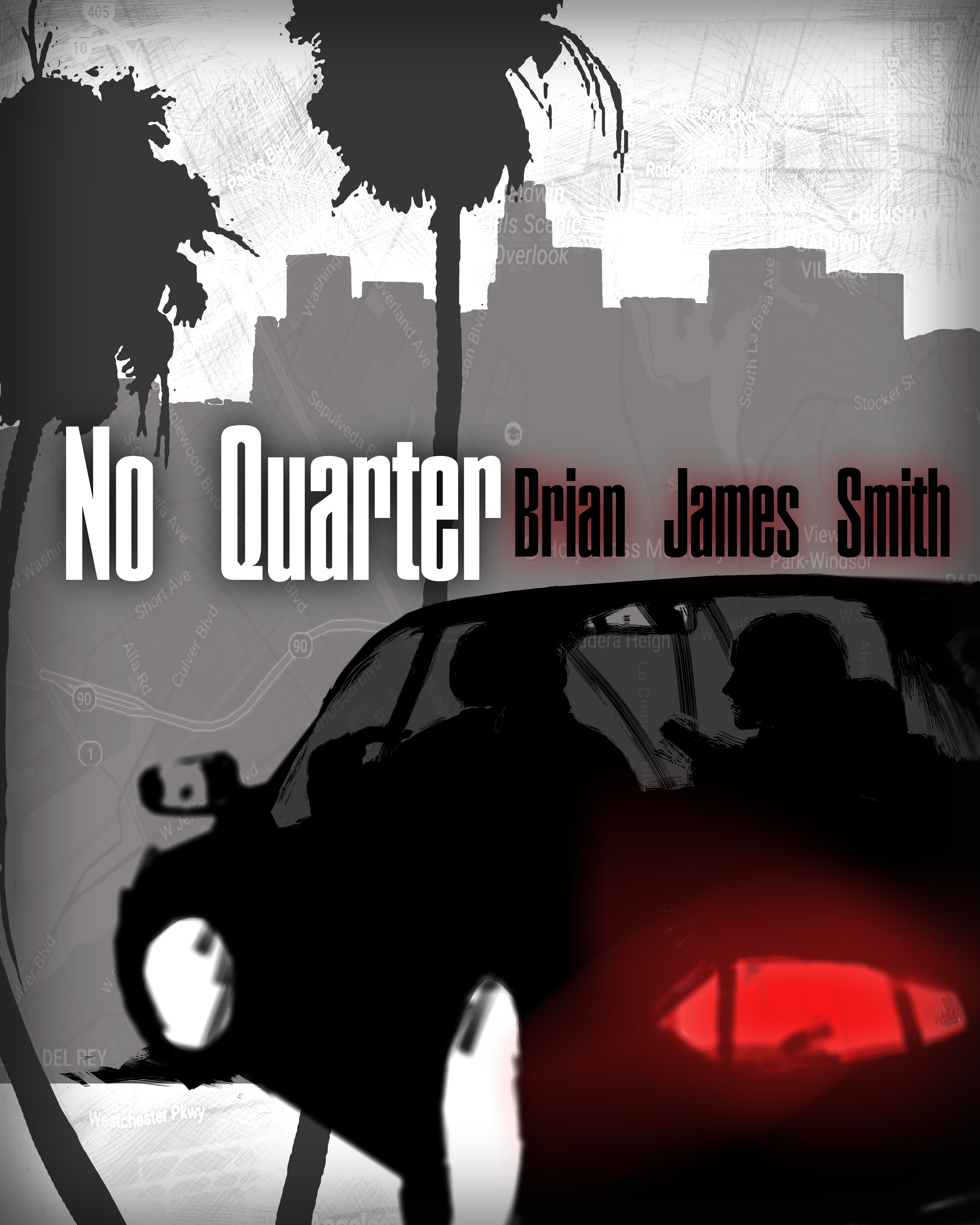
This is the cover I designed for my husband’s first book. No Quarter is a chase thriller set in LA in present time. People who like the Reacher novels or Bourne Identity might like No Quarter.
Nathan says:
Is this the final or a mockup? I’ll assume the latter, so I won’t dwell on things like odd resolution and inconsistent edges.
Obviously, the problem with designing a cover meant to appeal to fans of blockbuster authors like Lee Child and Robert Ludlum is that the most important cover elements for either of them are the names “Lee Child” and “Robert Ludlum.” However, their current covers are also firmly in the current tradition of covers for thriller novels: Bold type that fills the cover, with anything else as a secondary feature.
Here’s my five-minute redo, which also changes the proportion a bit (since Ludlum’s and Child’s books always seem to come as tall paperbacks). I also added the “Series Character” placeholder — since both of those authors are famous for their series characters, that’s probably the same thing you want to promote.
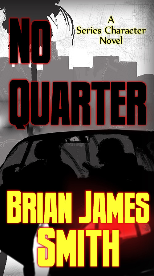
Now, this still has plenty of problems — I think the original gray-dominant color scheme probably causes more problems than it solves — but I think this gives you a good starting point.
(Also: Lose the map texture. It doesn’t really add anything, and it actually adds confusion.)
Other comments?
A couple of items:
Whatever that object is that is projecting from the person on the right at about shoulder height looks a bit X-rated. Is it supposed to be a gun?
The glowing outlining of all the text is too much.
“can ya punch that up a little?” as we usta say in cover meetings – nathan is on the right track – have never seen the title and author on one line, fwiw~
Well, about all I can say is, “Listen to Nathan.”
I do like the overall effect of greys with a splash of color…and the hard-edged graphic quality of the art is heading squarely in the right direction.
The only comments I might make about Nathan’s redo (and which also apply to your original) would be to increase the contrast between the figures in the car and the grey window area surrounding them.They are difficult to make out at any size.
I would either make it much more obvious that a map is part of the background design or drop the idea entirely. It is far, far too subtle to be visually useful in any way.
By the way, in your original version, the car appears to be either floating or shooting through the air directly at the center of the trunk of a palm tree.
I confess that I can’t seem to figure out what’s what with the car. No matter how many times I stare at it, thinking that those white blotches where the wheel-wells should be, will make themselves obvious–they don’t.
I don’t understand the weird slashes through the windshield, nor what happens with the trunk of the palm tree (is that supposed to be refraction???), so it’s all distraction. And, yes, I keep staring at the thing–gun?–that’s being held up, wondering what the weird vibrating lines are, around it.
I kind of like the matte grey idea. And the increased voltage of what Nathan did. But I’d clean up the odd bits, and I’d clarify what’s going on around the gun and the car’s lower half.
I am oddly undecided about the map. As I’ve lived (I call it “doing time”) in LA for a few years, I sort of like it. BUT, I think that the reality is, 99% of the buying public won’t see it, or know what to do about it, etc. I’d play around with Nathan’s ideas for font placement, BUT, I’d find less clunky fonts. (Sorry, Nathan, but of course, this was just your quickie.) Same feel, though–big, strong. Like your hero, of course. If you have another go at the cover, I’d love to put in my $.05 on a new set of fonts. But there are a large number of great candidates, for the right font.
And really–do something about the weird lower half of the car. You don’t want your prospective buyer doing what I did–spending the time trying to figure out what the hell that is, instead of looking at the LITB and cicking “buy now.” Right? Right.
The last thing I want to do is sound harsh, but looking at both iterations I believe your book would be better represented by the work of a more accomplished artist. It may mean spending some money, but if you want your book to sell, it’ll be well worth it.
Best of luck.
The artist is fine. If the writing wasn’t there and the map wasn’t there I would really love the imagery. The car, gun and grey housing blocks is imagery I love though to be frank I think it is a little ’60s. Nevertheless it conjurs spies, and, or underworld. Something needs to be right with respect to the text.
I’ll have to agree with Adrian, though note I’m not really part of the target audience so I am somewhat biased. The greys will likely not catch a viewer’s eye when lined up with other covers; the silhouettes make some elements confusing (most saw the dark grey silhouettes as palm trees – me included – but are they really? They have splatter all around, so I’m not sure when looking at their shape in full size); the gun should be an important element to hint at the action but it is barely visible.
I do feel bad for the very negative comment, it’s just a cover that is hard to “read” visually. I do think it’s cool how only the car lights are colored (though why emphasize the car’s lights? The characters or the gun should be in focus instead…?) and using a similar idea, perhaps without everything quite so grey, would be pretty neat.
It’s not impossible to make something fine with the current elements, but I think a different composition might be needed for a really eye-catching cover.
The concept is the right one for the genre, but the execution thus far is extremely crude; what this cover seriously needs is refinement. In addition to a good bright splash of color (the orange-and-teal arrangement so many movie posters are using these days would suit this cover rather nicely in my opinion) instead of the various shades of gray, the art needs to be crisp and clear rather than so crude and sketchy as it looks now. That car needs to look like a car rather than like a bunch of abstract blobs arranged in a barely recognizable car shape as it appears at present.
In addition to taking the others’ advice here about arranging the title and byline to be more prominent, I also recommend you lose the map “texture” you’ve got over the background; not just because it adds nothing to the cover, but because it actually detracts from it. When I first noticed that up close, I thought for a moment the symbols on that map were the watermarks stock image sites put on their previews to identify image thieves who use their images without paying. After processing what I was seeing for a moment, I realized that’s obviously not what they are, but casual browsers happening across your book aren’t going to spend quite as much time processing what they’re seeing on your cover as we critics do; if their first impression is that you’re using stolen stock images, they’re likely to think you’re a rank amateur, and move on without giving your cover that second glance that might otherwise set them straight about your image’s origins.
Other than that, well, I don’t see any other areas for improvement. Make all the refinements we’ve suggested, and your concept (currently buried beneath the crudity of the artwork) should come shining through the cover at your prospective readers and grab them by the eyeballs almost immediately. Once it does that, as Hitch points out, it doesn’t really need to do anything else.
Thank you, for your great feedback! I saw some people felt bad about giving a ‘harsh’ review so if you are one please don’t. This is all very valuable information. THANK YOU!!
I should point out that I am a painter and NOT a graphic designer. I knew this cover was not right. Now I really have some great feedback to work with. I feel very lucky to find this site.