The author says:
I have made this new version of Loveweaver to replace the previous cover I sent a couple of months ago. This cover is a still a wip.
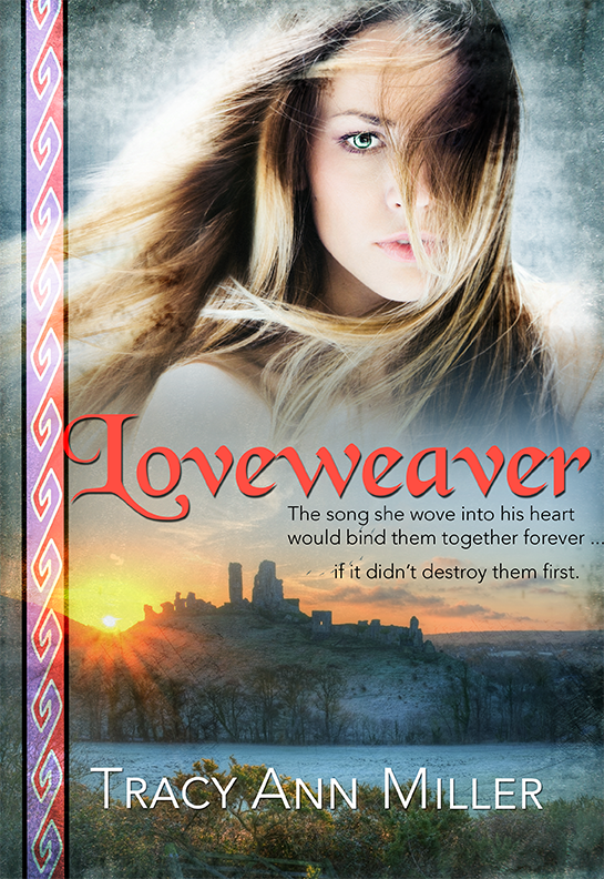
About the book: The year 895. Slayde’s job as an top military leader of Kent is to rid England of the last of the Viking raiders. But Llyrica is no ordinary Viking. She’s a beauty with a mysterious past … and a talent for weaving song spells. Even as Slayde saves her from drowning, he knows Llyrica will be a dangerous distraction. Llyrica is now a stranger in a strange land on a mission to fulfill a deathbed promise. But she must also find her missing brother. This man, Slayde, known as The StoneHeart in his country, seems determined to block her at every turn. And yet she can’t help but be drawn to the affectionate, loving side of him that awakens when he sleeps – The sleepwalker. Unknown to both Llyrica and Slayde, each will use the other to accomplish their quests. Both will also fall under the song spell that she wove into the braid of his tunic. Will her Lovespell ensure a happily ever after for them? Or condemn them to a love that was never meant to be?
[original submission and comments here]
Nathan says:
A much more respectable collection of elements this time out; good work! All my comments are tweaks to this design.
- I would make the model’s head larger, so that the title overlaps onto the shoulder and hair beneath the chin (it’s not like there’s necessary detail there). In addition to enlarging the focus of the image, it would also put a little bit of a darker background behind the title, which would help it stand out more at thumbnail.
- The middle line of the cover blurb (specifically, the ellipsis) goes way too far to the right. Bring it back so that no character is further to the right than the last letter of “heart” in the line above.
- Move the byline down so that it’s got solid trees behind it; that will improve readability immensely at thumbnail size.
Any other suggestions?
I’d have the title either overlap that decorative border more, or not overlap it at all. Right now that just-barely-kissing bothers me.
Much nicer overall! Good job!
Since I made that re-submission, I actually took care of the blurb/byline issues, very close to what Nathan recommended.
Whew! I so appreciate all of your input!
I rather like this cover, the layout and positioning of elements, but a few things tweaked me.
1. The woman looks too modern for an 895 AD Viking. Even if she’s not a warrior Viking, she seems to lack time period appropriate hair, clothing (even if it’s just a peep of her shoulder).
2. Even at a glance, that castle appears to be in ruins (to one degree or another) and has a style for a much later period. It seems too elaborate for 895.
3. I like the left hand vertical element, but not crazy for the colors. I’d rather see the central white pattern in black and where the colors are nothing so the background is visible behind. That would make it feel more like a Viking’s tattoo.
Part of the reason I’d like to see more period and cultural reference in the graphics is because there isn’t any in the title or sub.
As I said, I really like your layout and the story concept seems like something I’d like to read!
Thank you, SironaDanu. I worried about the modernity of the images, too. But during the process of making my previous covers, my fixation on getting the look right for the era came at the cost of decent design.
My hope is that this cover will draw fans of historical romance that haven’t tried 9th century England before.
Do read a sample at Amazon and see if it’s something you could get into!
You’re welcome, Tracy! And I will take a peer at Amazon. I’m a fiction editor and critic (as well as a writer), so you may be taking a grave risk with your invite! 😉
If you haven’t already been, Pixabay is a great all-free image site. I find better stuff there than on some of the pay sites. Graphicstock.com is a pretty good too but has an annual membership fee.
I’ll check out Pixabay. I’ve been using Dreamstime, which I like a lot. They have half off sales, so I’ll buy up a bunch of credits for future purchases. I pay about $8 per image.
Pixabay is great! How have I never heard of it before?
Definite improvement. If you’re going to combine stock images, this is the way to do it, IMO: just have them as separate elements instead of trying to make them look like they’re part of the same scene. I’m not really bothered by the modernity of the photos much, although HR readers will offer a more valuable opinion.
The sidebar should go. I just don’t see design elements like that on covers nowadays. If you keep it, correct the aspect ratio.
The type treatment is much better, but I’d still change the title font. I looked it up and it’s identical to Black Chancery except for the numbers.
Thank you for your feedback, katz!
I can’t tell you how many other typefaces I tried and rejected for the title. I found many that fit the time period better, but they lacked readability.
Well…if you really go for 900AD GB, the fonts will either be really ornate, unreadable, or both. Some that sort of channel the feel: Laconick; Cardinal; or…are you trying to go the Viking route, or the Celt route? I mean, that’s typically the direction. Deutsch Gothic isn’t bad, now that I think about it; if you have some Photoshop/InDD/AIllustrator skills, there’s a font called Heavy Gothik, that has interesting lines and depth, if you can work it and use multiple colors/shades/tints, so that it doesn’t look confusing. (If you see it, you’ll see what I mean.) Those are all Dafont/1001 fonts; I assumed you didn’t want to spend a small fortune on the fonts.
I agree that this is one of the hardest eras/niches for which to do font design. 99% of the designed (free-ish) fonts for medieval are simply dreadful; no kerning, no lettering pairs, etc. Most are just Chancery with one or two small changes.
My only other comment is that I also do not love the colors on the braid. To me, they clash with the red in the lettering of the title and the bright yellow of the sun (adjacent to that purplish color–yowza!). The braid does feel a bit old-fashioned, design-wise (for book covers, I mean), but I’d find it less of an anachronism if the colors either complemented or matched the cover colors. The “just off” colors are sort of distracting my eye from everything else, even the beautiful girl.
That’s my $.02.
I appreciate all the good info! Thanks!
Very much improved!
Nathan is correct about the fix to the ellipsis. I would put it before the third line rather than after the second. Like this;
The song she wove into his heart
would bind them together forever
…if it didn’t destroy them first.
I also agree with those who commented about the anachronistic images (the girl looking too modern, the castle appearing to be in ruins rather than as it would appear in the ninth century), but I don’t think these hurt the overall effectiveness of the cover too much.
The vertical decorative bar doesn’t bother me in the slightest: I rather like it. It help set the place and time and also helps ties all the visual elements together.
Thanks, Ron!
The vertical graphic, while definitely an example of my tendency to over-design, is representative of the decorative braids that my heroine weaves in the story. (Tablet weaving dates back to ancient Egypt, and is also found among Viking artifacts.)
I like it as is, too.
I’m not convinced about the placement of the ellipsis. Still experimenting.
The vertical graphic works in that it helps get across the Viking theme in addition to tying the main visual elements together. The fact that it also represents the decorative braids your heroine creates is actually irrelevant. That’s a detail that no one who hasn’t already read the story would know…which is putting the cart before the horse.
Regarding the ellipsis, either my solution or Nathan’s would work. If you choose Nathan’s, be aware of the relationship between the lines: they need to be either centered, flush right or flush left (including the ellipsis). At the moment, the lines are pretty much randomly placed left to right.
The inclusion of the braid is to also hint at weaving, which is a part of the title.
I did fix the blurb so that it’s all flushed right. Good call, you guys.
I never made the connection with weaving because the graphic simply doesn’t particularly look woven. To the uninitiated (such as myself) it’s just a pattern.
I completely understand. Have a great weekend!
I don’t think it is grammatically correct, but something I’ve done for back matter (which this functionally is even though it is on the front) is put the ellipsis in both places. Visually I like it because it gives the effect of fading out then fading back in. But I haven’t published with it yet, so I don’t know if it is something that might bother people since it is formally incorrect.
Like so:
“The song she wove into his heart
would bind them together forever…
…if it didn’t destroy them first.”
I don’t think that formal grammar and punctuation rules necessarily apply to blurbs, where the immediate effect on the potential reader is the most important thing.
I’m going to remember that. And I’ll tell them Ron said so. 🙂
Yeah, I wondered about that!
As far as the historicity of the images, I think it depends on who your primary audience for this book is. Is it the romance audience, or the historical fiction audience?
It’s totally fine if you’re going for romance, and I’d argue that if you’re going for historical fiction, you could take the photos off the cover entirely and focus on the braid, maybe weaving it yourself or getting a weaver to do a section of braid like that and taking a really nice photo of it.
Take a look at the Amazon categories for romance and for historical fiction and see what the covers look like in each section. (There is also nothing stopping you from trying one cover for a while and the switching to another one and rejiggering the categories for your book to get it listed differently for the new audience.)
Mine is a romance audience, for sure. As a reader of historical romance, I give A LOT of covers a pass for historical inaccuracies. Inaccuracies between the book covers, not so much.
I did actually build my own little tablet loom, taught myself how to weave, and wove many braids. I include one of them in my book trailer.
Of course, if you’re doing eye candy, even the women in the target audience are usually more interested in how the gal looks than the guy for some reason; so I guess you made the right decision on which to keep if you couldn’t fit them both. My recommended tweaks:
1. As Augusta says, either overlap the title and braid, or don’t; that “kissing” proximity looks like some kind of printing error.
2. Your byline is rather wispy and difficult to see in thumbnail; either thicken it up, or use the same font as you used in the title to make it legible.
3. Your braid bar is a nice symbolic touch, but make it solidly opaque; like all your captions, it should be standing out from the picture, not blending in with it. (Also, you don’t want something warranting a “layers upon layers” tag from Lousy Book Covers on your cover.)
4. She’s a cute gal, but I’d recommend edging her down a bit to show a little more of the crown of her head and a little less of her shoulders. Since we’re not seeing much of her clothing now and you say finding a gal in period-appropriate garb is rather difficult anyway, why not go with showing just her pretty face?
5. That castle does look a little derelict. You’re sure you can’t find a more functional-looking one?
I’ll review all of your suggestions. Thank you!