The author says:
“After discovering that he can enter the World of Books, 15 year-old Tommy Travers has accepted training under the Gifted and now must learn to control his new powers. He has already seen the devastating consequences of ignorance. The repercussions for his past decisions are not over. The escaped wizard Mephitis read his mind. He knows where the Gifted are. If he can just get his powers back the warehouse, the Gifted, the world, will be his. Tommy is the only one who can stop him, but first he must discover the secret that Amelia has been keeping from him all along.”
Nathan says:
I love how you took the advice from your last cover submission and made it part of your series branding.
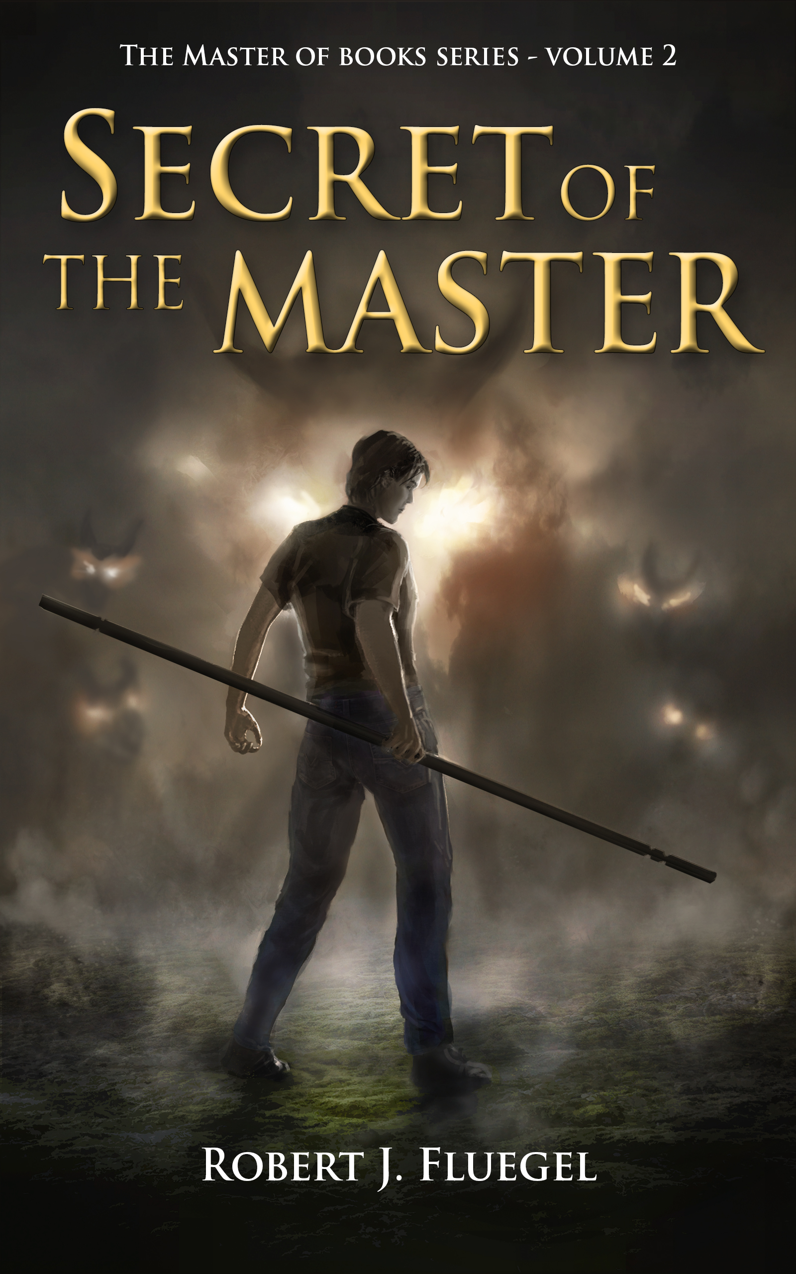
The artwork is professional, as before. However, it seems to lack a level of novelty appeal. The last cover stood out with magic being used on the tilting deck of a ship; compared to that, this image seems awfully generic — there’s nothing here to stand out from the YA fantasy novels which could be displayed to either side of it. And while readers who are already fans of the series won’t mind, you’re missing the opportunity to catch the interest of new readers who could see this second volume’s cover and look around to see if the first volume is available.
I don’t know the story, so I don’t know what other details could be pulled out and added to the artwork. Tentacles? Building silhouettes? Flowers around his feet? I dunno. But I would suggest going back to your cover artist and seeing if he’s amenable to adding something to uniquify* the image.
Other comments?
*I just made this word up.
It is really striking in thumbnail!
You could try tilting it a bit, and see what happens.
(n.b. *Nathan: perhaps, but uniquity IS an actual word, just in case you want to use that sometime.)
Waffs is right; it is striking in thumbnail. I also agree with Nathan that it still seems to be missing something.
I had to look twice (and squint) to note that “here, there be monsters.” Is there any way to sharpen the silhouettes of the monsters/dragons/??? in the fog? Or at least, maybe find a way to make the horns of the large one (center) emerge from the fog, so all we see are theses monstrous horns? THAT might be fun.
I still wish that the font was a bit more distinctive, but if you could make the horns emerge (think the prow of a Viking ship, coming out of the sea mist), I would think that this would be just about right.
This cover looks very professional, so that’s great. The only thing that jumps out at me as a mistake is the posterized photo of the ground. If it’s worth getting custom artwork, it’s worth also having them draw the ground.
But these neutral palettes, man. Maybe I shouldn’t judge because all kinds of books use neutral palettes these days, but my eye slides right off. Were the subject matter of the art more engaging, that would be less of a problem, but it’s a guy with a stick. He’s just standing there. As Hitch noted, you really have to look hard to see the monsters. (I thought they were birds.)
A more active pose, a brighter and more distinctive palette, a clear and distinctive monster–any of those would give the eye something to grab onto.
I think there is really nothing very wrong with this cover at all!
If I were to wonder about any one thing, it is that the shapes in the fog might be wee tad to subtle to hold up when the cover is at thumbnail size or in B&W.
Otherwise, I think anything else would be gilding the lily.
Your artist is doing a good job in general, but this cover is a little less exciting than the one you had on your first book. To get your readers’ blood pumping again, it needs two tweaks:
1. The picture needs to be skewed about twenty degrees to one side or the other. To the human mind, vertical and horizontal lines produce feelings of low energy and confinement; diagonal lines suggest high tension and energy. Right now, the only diagonal to be seen on your cover is the protagonist’s staff; it would be better for him and the ground on which he’s standing to be skewed diagonally instead.
Think of your cover as being like a still frame from a cinematic trailer. Trailers for action movies (and video games, such as Warcraft III) like to show the action at a “crazy” angle to make the audience feel like they’re racing into the action, much as your first book’s cover made us feel like we were sailing into battle by showing the ship’s deck listing sharply to starboard. Note how, at the trailer link I provided, when the flaming demonic creature emerges from its crater, everything in the trailer after that is shown at an angle to hint at the violence of the “reign of chaos” the narrator tells us has just been unleashed.
2. I like those glowing and radiating balrog/dragon/whatever eyes you’ve got shining, but they’re a bit difficult to see from the mist, particularly in thumbnail. For best results, add a little more fiery golden-red to the glow and boost the contrast. Also, sharpen up those horned silhouettes just a little so they’ll be easier to see in thumbnail; having the menace be a bit vague is fine, but clarifying the silhouettes will help your readers see just how much this vague menace towers over your protagonist, and add a further edge of apprehension to the overall energy of the picture.
Other than that, you’re pretty much good to go.
As usual I can’t say how much I appreciate Nathan and all those at this site. All your ideas really help!