The author says:
A MG/YA Fantasy/Fractured Fairy Tale.
Synopsis: Once upon a time, there was a girl who set out to learn the meaning of fear. Twelve-year-old Saena likes to steal words. She sees them shimmering in the air, beautiful and fragile and perfect; sometimes she plucks a word that she really likes and stores it away in her head so that it belongs to her. One day she plucks the word Mama, and her mother disappears into Saena’s head. This time, something is different. Saena has stolen her mother, and she can’t seem to return her. When a gold-necked nightingale with a strangled voice and red-and-green feathers appears at her window one night and promises to help her get her mother back, Saena is only too ready. Thus begins an adventure fraught with danger, as Saena and the nightingale – which calls itself Jiu – travel the secret moonlit roads that will take them into Fairy Country, guided by Saena’s mother and the words. They travel up hill and down dale, and across sparkling seas and cities made of glittering bone. Along the way Saena collects a strange assortment of companions, none of whom are even remotely what they seem. The words have never failed Saena before. But as they come closer to the place where all the lost things go and where the dark fairies hold sway, Saena is finding it increasingly difficult to see them. Her mother’s voice is fading fast, and at every turn Saena discovers more and more about her mother that puzzles and befuddles her. Who exactly is the Red Fairy? Why does the name Marya Morevna taste so familiar on Saena’s tongue? As a word thief, Saena knows better than anyone that nothing can be hidden away forever. But perhaps some things are better left alone…
Nathan says:
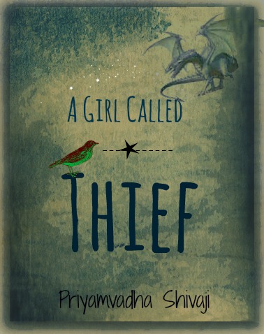
At first glance, I like it — the only problem I see is that the colors on the bird clash with the rest of the color.
At second glance, a few other problems emerge. The dragon in the upper right looks like it’s cut-and-pasted out of another source, as evidenced by the fact that it’s standing on nothing; you should find an image of a dragon flying (one which you have appropriate rights to, of course). And what’s with that dotted line through the star?
Other comments?
FWIW I really like this cover a lot just as it is. But I would never have guessed anything like a YA fairytale, even a ‘fractured’ one. The vibe I’m getting is dark and damaged and bleak and very adult: one look at this and I immediately thought of Kosinski’s The Painted Bird. https://books.google.com.tw/books/about/The_Painted_Bird.html?id=3ZIkE336nywC&source=kp_cover&redir_esc=y
I like this cover, too, with the only two caveats. The first is that the border is intrusive. The second is that the bird and dragon look disconnected…it is too obvious they came from different sources.
I have no problem with the color contrast in the bird, but I do wish that there was a little more contrast throughout the cover. It is so bleak and monochromatic that the thumbnail is hard to read.
I like this cover.
I don’t mind that the bird’s colors clash with the background. It creates a dissonance with the background that feels like it fits: “There’s something really wrong going on in the world that this story takes place.”
I agree that the standing dragon should be replaced by a flying one, considering its position on the cover. And the dashed line can go. The star can stand on its own.
I don’t mind that the bird is a contrasting color; I mind that its colors look really filtery and artificial. Just a bright red or bright green bird would probably be fine.
I like the typefaces in principle, but these look awfully familiar. Maybe something a little more obscure?
Is this the cover, or a picture of the cover? If it’s a picture of the cover, I’d recommend getting your camera or scanner cleaned before re-shooting it, and then cropping your finished product to eliminate everything that isn’t the cover. I’d also recommend brightening it by increasing the contrast; the dismal coloring makes it look awfully muddy right now.
As for what’s on the cover, the somewhat minimalist approach with the bird and the dragon is fine, but the different color saturation levels of each creature make them look far too obviously like a cut-and-paste job; either increase the dragon’s color saturation or decrease the bird’s until they match. As for the background, that muddy grayish-bluish-greenish speckling looks like nothing so much as mold and water damage; could you maybe lighten it and alter the hue to something other than the colors one typically sees on a manuscript rescued from a dirty toilet? The particular shading pattern you use on the background also makes this look like either the back cover of a standard left-to-right Western book or the front cover of a right-to-left Eastern book; I recommend mirroring your pattern if, as with practically everything written in English, the book is meant to be read from left to right.
A few other miscellaneous gripes and nitpicks: while the star in the middle of the cover might help center the prospective reader’s focus, that dotted line through it means nothing discernible to me or anyone else and serves no useful purpose, so you might as well dispense with it. The fonts you’re using aren’t as bad as MS Comic Sans, but look as if they were cast from the same amateurish mold. If you’re deliberately going for that childish crude-and-willowy hand-lettering look, why not actually letter the cover by hand? Such an old-fashioned design technique like that might add a little extra authenticity to the old-timey overall feel of it.
Mostly, everything on the cover just needs to be clearer. In thumbnail, everything looks even more like a bad scan of a moldy old manuscript. Creatures and objects in the foreground need to contrast more and be sharper, while the patterns in the background need to be paler and with a much lower contrast in order to keep from distracting readers from what’s happening in the foreground. Make what matters (the foreground) stand out, and what doesn’t (the background) recede into vagueness in order to keep from distracting your readers from things that might otherwise grab their attention on a sales page and on the shelves in an actual bookstore.