The designer says:
Commission work for a client.
Book summary: In a world ruled by fairies, humans have developed a rudimentary communication system akin to the Internet using fairy mirrors. After a social experiment involving those mirrors spins out, two teens must decide whether to come out with the truth and face the consequences, or watch their world burn with the fire of revolution. YA magical realism thriller involving fairies and Magic mirrors, with some satirical undertones that raises questions about the role and safety of the Internet in the 21st century. Could be described as Macbeth meets The Crucible meets a magical Internet.
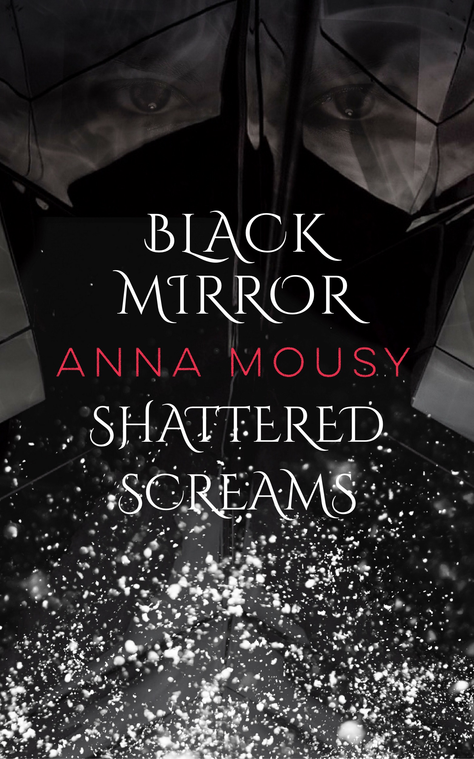
Designer’s note: I took inspiration from the simplistic cover of Gone Girl. While I do realize that’s an adult thriller while this is YA, I don’t think there’s too much of a difference in (cover art) style between adult and YA. The top part is supposed to be the magic mirrors involved in the book, while the bottom part is supposed to be shattered mirrors/glass. I hope those are recognizable on the thumbnail. A larger image will show the eyes in the mirror, which I hope looks creepy and mysterious. Hopefully the slightly orate font will hint at the fantasy elements, in what otherwise looks like a contemporary thriller cover.
Also, a question: I’m thinking about drawing blood in between the cracks of the top mirror part, and also have it drip down towards the title, in the style of Victoria Aveyard’s Red Queen. Would that be too much though? Thanks for all your help!
Nathan says:
No offense, but without you telling me that it’s supposed to be shattered mirrors, I would have had no clue what I’m looking at. A large part of what makes shattered mirrors look like shattered mirrors is the glinting glass along the edges, as well as the distortion of what is being reflected (see here). Instead of trying to freehand something that looks like a shattered mirror, my advice would be to take a photo of an actual shattered mirror, and then take an image — perhaps the heroine’s face, or some other striking image — and break it up between the shards, the way that a real shattered mirror reflects.
(Gotta tell you, “floating eyes” is a cliche we often see over at LBC.com — it’s been used poorly so often that I don’t know if it can be done right anymore.)
I also have a real problem with the title being divided by the byline. It seems like an attempt to be overly clever, at the expense of readability.
And then there’s the fact that the title and byline are crunched into the center. It’s not as if there’s stunning artwork that you don’t want to cover up, nor that it looks like an intentional use of negative space, what with all the meaningless detail/texture filling the rest (is that snow?).
I’d say make the text bigger (with the title separate from the byline), use an actual shattered mirror, add what you want into the mirror shards, and call it a day.
Anyone say different?
OK, first of all, I had no clue what the heck I was looking at until I read Nathan’s post. Now that I know what it’s supposed to be I can say, “Not happening.” The first thing I got from the image was spilled cocaine giving the cover the look of a YA drug addiction drama.
At the risk of hurting your feelings (not my intention) it would seem that producing the image you’re attempting is perhaps beyond your artistic ability. There is no shame in that. In such cases it’s best to Google a royalty-free image of a shattered mirror or purchase one that fits the cover and look you want.
As it stands I suggest you start from scratch and utilize the millions of quality images out there on tbe web to build your cover image.
Good Luck!
Agree with Nathan and Adrian. I could barely see the mirror at the top. Find a photo of broken glass, or draw directly from a real piece, paying close attention to what makes it look like glass or mirror. If the white splotches at the bottom are supposed to look like shards, it’s not working. My first thought was snow, (of whatever kind).
At first I thought it was someone wearing some kind of Sauron/Kylo Ren-style mask.
I thought the top part was supposed to be the broken mirrors and the bottom part depicted…snow? Cotton balls? Flowers? Falling on a roof? I have no idea what in the lower half is supposed to look like broken mirrors.
The type treatment makes me think this is something like “Black Mirror Book 1: Shattered Screams.”
Technical notes: The cracks in the top half of the image are uneven and slightly soft in a way that looks just like hand-drawn Photoshop lines (actual mirror edges should be either straight or very smoothly curved, and sharp in either case). The cut and paste outline of the eyes is clearly visible at full size. There’s some kind of grainy black artifact on the byline that looks like it might actually be part of the font.
“The top part is supposed to be the magic mirrors involved in the book, while the bottom part is supposed to be shattered mirrors/glass. I hope those are recognizable on the thumbnail. A larger image will show the eyes in the mirror, which I hope looks creepy and mysterious. Hopefully the slightly orate font will hint at the fantasy elements, in what otherwise looks like a contemporary thriller cover.”
I think the only people who would realize that those shapes are supposed to be mirrors are those who have already read the book. I saw the black shape between the shards before I recognized the shards for what they were…and only then because I re-read your description.
The white splattering looks exactly like that, not broken glass (if indeed that is what it is supposed to represent). The eyes may as well not be there.
I think the entire cover is far too subtle—while at the same time being much too busy—and relies far too much on pre-existing knowledge of the book, which a potential reader will not have.
I think you need to simplify the cover, focusing on just one clear unambiguous image that not only represents what the book is about but does so with immediacy.
Here are three examples where I used broken glass imagery..
Well, that didn’t work very well…
http://black-cat-studios.com/glass/
The main problem from the start is that when I first saw the thumbnail for this, it didn’t look like anything. Now that I’m looking at the full version, it still doesn’t look like anything. After reading the description, I can vaguely make out what looks like a few hanging shards with a pair of eyes in them up near the top. The rest just looks like… well, snow or sleet or pellets of fertilizer or firefly lights or just about anything but mirror shards.
The concept of the story is more or less clear: Disney’s Enchanted certainly suggested characters from a magical world might treat our televisions and computers monitors as a kind of magic mirror, and the part about the social experiment gone horribly wrong is reminiscent of an old Bloom County strip in which Oliver Wendell Jones’ hacking finally gets him into some real trouble. That characters in something like a fairy tale world might develop some equivalent of the internet using magic mirrors and then suffer from their network’s misuse is therefore quite a workable concept for a story. The problem here is that I’m not seeing any of this up on the cover.
From this cover, I can’t even see what size of mirror you have in mind; are these large wall-sized mirrors, little compact-sized mirrors (like a monitor on a handheld device), or a small mirror stand one could put on a desk like a PC monitor? If you could pull back enough for us to see the whole mirror, that would be a good start in introducing us to this world. This would work especially well if it’s the PC monitor sized mirror, and you put it on a sort of modern-looking office desk where the computer monitor would be, along with other magical equivalents to our technology. (Do these magic mirrors come with an equivalent of a mouse, a keyboard, a printer? Whatever those equivalents might be would probably be amusing for prospective readers to see.)
The other great draw for your client’s novel, however, is the fairies themselves. Are we talking about little winged Tinkerbell-style pixies here? If so, and if they’re ruling the world, it might be good to include them on your cover in some role. If you want to show a shattered magic mirror and maybe some blood dripping from the shards to hint at the violence which has broken out due to the social experiment gone wrong, why not present it as part of a crime scene? If a little fairy in a police uniform or a detective’s outfit or the like is standing (or floating) over the wreckage and solemnly examining the scene for clues, that’s so much the better for introducing this world to your readers and getting their attention at the same time.
Others here have noted that figuratively speaking, you’re too close to the story. I’m telling you that your cover is literally too close to your client’s story for us to make much sense of it; right now, your cover is showing the shattered mirror from far too close for us to understand anything about it. Take a step back from the story both figuratively and literally, and give us a clearer and more immediate image of what we’re supposed to be seeing on your cover. I don’t know about anyone else, but my eyes could never make any sense of those “magic eye” drawing; the vast majority of your client’s prospective readers likewise won’t be able to make anything out of the confusion on this cover.
In short, give us something concrete. Save the abstraction and subtlety for artsy-fartsy older readers who fancy themselves art critics, and give the young adults in your target audience something that will make more immediate sense to their eyes even as it strikes them odd for substituting the objects of a system of functional magic for technology.
There’s not much I can add here without beating a dead horse. I agree with most of what’s been said. I too got “snow” instead of “glass”, but the one thing that struck me after reading the description was that I don’t get “fairy” at all.
However on the up side, I do happen to like the placement of the text. I think it’s interesting and unusual. And I really like the combination of serif and san serif. These fonts work well together. That said, I would make them larger/bolder/more readable at thumbnail.
Oh, and if this evolves from here, it would help if there was a smidge less “glass” behind the lower part of the title so it could stand out more.