A special twofer!
The author says:
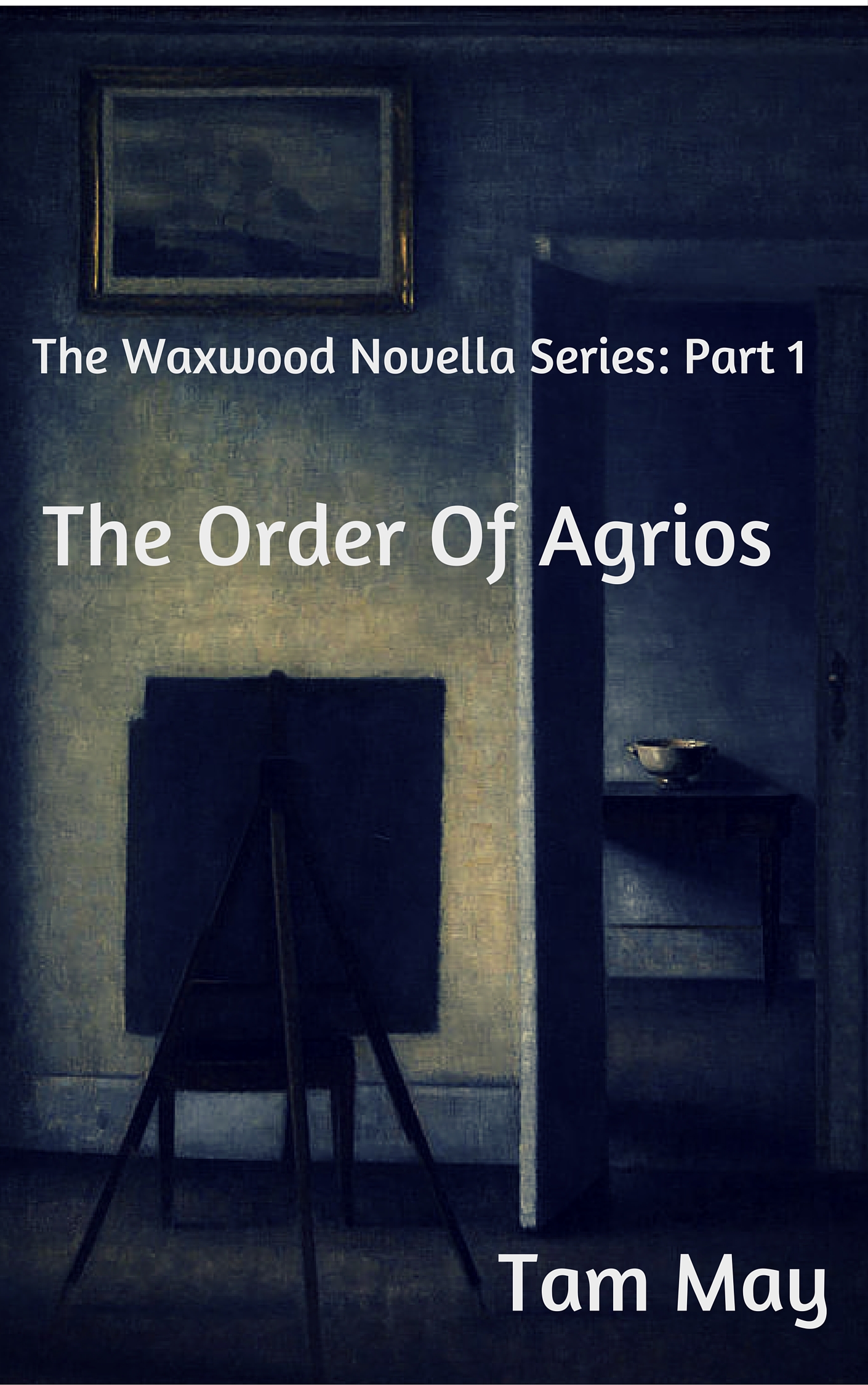
This literary novella is the first of a 3-part novella series.
Jacob Alderdice is the son and heir of the prominent San Francisco family. Although dearly loved by his sister Vivian, his philosophical and artistic lifestyle has made him a pariah to his tyrannical mother, Larissa.When the Alderdices take their yearly summer vacation to the prominent resort town of Waxwood, Jake meets Stevens, an older man with an obsession for leadership. He befriends Jake and introduces him to The Order Of Agrios, a group of misanthropes who have rejected the commercial and conventional luxuries of their former lives to live in the wild. Seduced at first by Stevens’ powerful and charismatic demeanor, Jake comes to realize that behind the man lies something more brutal and sinister.
Any feedback would be much appreciated!
The author says:
This literary novella is the second of a 3-part novella series.
Gena Flax, abandoned by her mother at a young age, has built her life around caring for her guardian Helen, whose physical illness and mental peculiarities have reduced her to a childish, neurotic, and clinging woman.One summer, she gives her aunt a gift of the sea. She takes a room at the exclusive Waxwood Inn in Waxwood, California with money she has scrimped and saved from two jobs and her aunt’s disability checks. But the gift reveals the depths of mental deterioration, betrayal, and family secrets.
Any feedback would be much appreciated!

Nathan says:
I put both of these books in one critique, because series branding is a big deal, and they should thus be considered as one unit.
I’ve joked before that “literary” fiction covers go out of their way to look like they’re about nothing in particular. That’s obviously hyperbole, but the fact remains that lit-fic covers eschew anything which looks like an obvious pointer to a specific genre: No planets, no silhouette figures running down dark alleys, no half-naked headless couples embracing, no wolves. By that metric, the first cover especially succeeds: The art (public domain — Google Image Search tells me that it’s by Vilhelm Hammershoi, d. 1916) is both exquisitely accomplished and understated, and is quietly intriguing for readers who avoid the “crowd-pleaser” elements of popular fiction.
Using the first cover as the lynchpin of the series, then, we move to the second cover, and we run into some problems:
- Part of series branding isn’t just typeface, it’s type placement. Even though the position type on the first cover is largely dictated by the layout of the artwork, it’s also a good arrangement on its own. But to continue the brand, the same type placement should be used on the other covers in the series, which obviously limits the images you can use — you have to have something that will fit behind the predetermined type layout. In eyeballing the second cover, I can see that mimicking the type layout of the first cover would put white letters across the lightest parts of the image — a liability for readability. But that’s okay, because…
- The image used for the second cover both isn’t good when considered by itself (it’s obviously a low-resolution image blown up to cover size with attendant problems, and the hues suggest that it was either poorly photographed to begin with, or it’s a print that hasn’t aged well), and doesn’t relate well to the image used on the first cover (a photograph instead of an antique painting). Wouldn’t it be better to use another obscure antique painting — either another Hammershoi, or something that shows similar age and quiet reserve?
In short: The first cover looks deliberate, while the second cover looks desperate. Make the second cover appeal to the same readers who are drawn to the first cover.
Other comments?
Love the painting, don’t love the type treatment. The curvy serifs and rounded v’s and w’s are just a little too cute for lit fic. Go with something a little more traditional.
And, yes, the photograph is no good. Find another matching painting, or else use photographs on both covers but find clearer, better-resolution covers.
I don’t care for the fonts chosen for this series. I agree with katz that they appear to cute for lit fic.
While the cover for the first book is certainly better than the second (the blurriness hurts my middle-aged eyes), the description offered makes the book sound more like a psychological thriller. While the lighting of the chosen painting adds to the mood, and the easel and canvas point to the protagonist, ultimately there’s nothing there to grab the reader.
As for the second cover, the theme of the image (mostly) matches the book description, but the out-of-focus image screams amateur. I’ll also point out that, if this is a home by the sea, where’s the ocean?
I would suggest, as Nathan typically does, that you go to your favorite bookstore (online or in person) and study the covers for the books that your novellas are looking to emulate. I’m sorry that I couldn’t be more helpful. 🙁
If covers for literary fiction are supposed to look like nothing in particular, that probably explains why I’m not much in the genre’s target audience. Like Vulcan literature with its lack of demons, “That might account for its popularity.” I guess I’m just not artsy-fartsy enough to appreciate the supposed intellectual appeal of abstractions that have no visible relation to what’s going on in the actual story.
Whatever else you do, consistency between covers is a necessity in a series, so follow the advice others have given you in that regard, and dump that blurry second cover for something similar in style and quality to your first cover. Might I also recommend changing your first cover for something a little more attention-grabbing, however? Your summaries speak of something “brutal and sinister” and “betrayal, and family secrets” and other such menacing subjects; could we maybe see some of that menace there on the covers?
Of course, you don’t have to be too literal about it; no pictures of people being tortured or blood splatters or anything like that. Symbolism would suffice: a shot of some shattered glass on a floor, for instance. Nobody actually has to drop any glass in the story itself for potential readers to grasp the obvious symbolic connection between shattered glass and the shattered mind it commonly represents.
My favorite example of successfully using such symbolism to get your point across is Alissa Nutting’s Tampa, on the cover of which a perfectly innocent picture of a button hole on a woman’s blouse manages to say everything that needs to be said about what’s in the story itself. (Hint: it’s not a story about button holes on blouses.) Try seeing if you can likewise summarize the main subject of each story with some solitary menacing symbol like that.
I’m going to have to agree with everyone here. I know, … that’s not particularly helpful.
The font is too casual for the subject matter and image. And, while I do like the image on cover #1 (Can’t believe you looked into its origin Nathan! Colour me impressed) because of its dark, moodiness, I think the text treatment (not just the font) could have made it more interesting. The designer could have played more with the scale of the text and perhaps larger caps and smaller mini-words (The and of) to fill the space better(?) It hurts my eyes how the “of” is bumping into that wall.
Adding a texture or gradient(?) or perhaps some colour(?) might help. Pure white type always looks a little DIY to me. I also think the “Series” text is too large and in your face.
The second image does nothing for me other than suggest agoraphobia. It just looks like a bad photograph. Ditto all my other text/font comments on this one too.
I hope some of that was helpful. It’s been a long while since I’ve had the chance to stop by and post something. I’m happy to say I’ve been SUPER busy!