The author says:
Charming outlaw with own transport and limited social skills seeks lucrative, employment at minimal risk.
When you’re running from a murderous government and work for an equally murderous gangster, accidentally torching his apartment is a bad move.
The Pan of Hamgee just wants a quiet life but destiny has other plans.
GENRE: Humorous Science Fiction Fantasy – and Petrolpunk or whatever you’d call steampunk if it was about cars… if such a thing exists.
AGE BAND: Teenagers – and anyone else who is interested.
Nathan says:
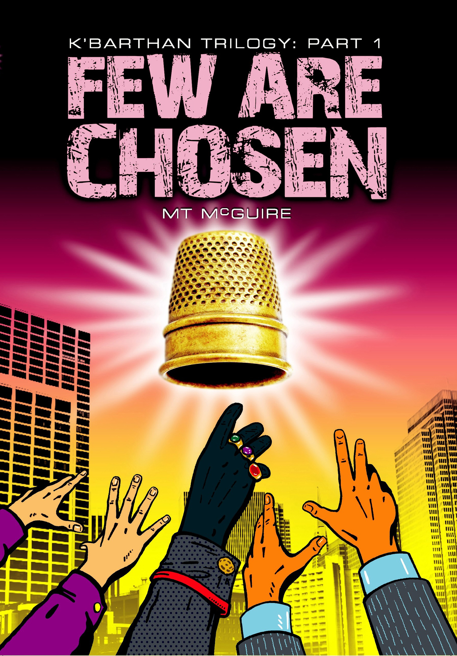
I really like it. The cover tells me almost nothing about the book, but it makes me strongly want to find out.
My only comment is I don’t like the way the thimble is rendered in a different style from the rest of the illustration. For one thing, it doesn’t have that pop-art vibe that informs everything else, and for another it makes the thimble harder to identify in the thumbnail.
That’s all I got. Anyone else?
I agree with Nathan’s points, Maybe just try a black outline around the thimble, see how that looks?
I’m not crazy about the black hand in the center. Is it supposed to be that dark? It’s almost as dark as the black lines. Also I think the author name should be larger, especially if this is going to be a series.
On my screen, the black hand looks dark blue.
My big question is if this will attract the target audience. Is this the kind of graphics petrolpunk, steampunk, or whatever kind of teenagers you want to call them, are into? It would be worth finding some of those kids and learning how they react. Both the pic and the font.
The right thumb of the bottom left person… whether or not it’s technically correct, it looks like a problem and calls attention.
I can’t add too much to everyone else’s points other than to underscore them:
Overall, the cover is striking, with a good use of color and design. It works very well at thumbnail size.
Even though I utterly fail to see any connection between the imagery and the description of the book, the cover does succeed in getting me to stop and want to take a look at the book, which the main thing a cover needs to do.
The mix of styles is jarring, however.
Likewise, the font used for the title seems ill-chosen.
While I like the look, I am not sure if the retro/comic book/pop art style really reflects the kind of book you are describing, though it’s hard to tell for sure from the short blurb.
The (apparently) completely black hand looks odd…and its central position gives it additional prominence. It looks especially bad at thumbnail size. (And speaking of thumbs: do indeed fix the thumb on the hand second from the left.)
If this the cover is based on clip/stock art, I presume you have permission to use the images (something often overlooked by authors and always worth mentioning).
I’m not sure either the font or the thimble match with the cartoon.
Great point about the blurb… I recently changed it from a longer one which did actually mention the thimble so… definitely channelling Homer.
The rest of you, thanks, real scales from the eyes stuff. I didn’t even notice the thumb so that one really intrigued me, ditto with the non drawn nature of the artefact. Also the middle hand is meant to be wearing black suede gloves which look dark blue in both thumbnail and full pic on my screen but I have the brightness racked right up. Note to self, look at future offerings with the brightness turned down.
Rest assured all stock art permissions are in place but to anyone else reading this, that is a very pertinent point. I commissioned it and it is exactly the kind of vibe I was looking for but it was actually done by an agency.
Cheers
MTM