The author says:
A dystopian high-tech novel set on another world. The main character has had his memory wiped by a group of scientists called the Developers and is struggling to stop them and rediscover his identity. This is book 3 in a 3 book series.
Synopsis: With the Developers’ plans to reengineer the human race in disarray, this may be the one chance Adan and the Sentient renegades have of saving the desert world of the Vast. Using the chronotrace, a device capable of looking back into time, Adan discovers their next point of attack, but a window to the past can’t prepare him for what the future has in store. He will have to risk his life, his future, and everything he’s fought for if he hopes to survive.
Nathan says:
As we’ve seen before, with later volumes in a series, brand continuity with the earlier books is as important as the quality of that particular volume’s cover, so here are the two earlier books in this series:
![cover[6]](https://covercritics.com/wp-content/uploads/2016/03/cover6.jpg)
![cover[1]](https://covercritics.com/wp-content/uploads/2016/03/cover1-2.jpg)
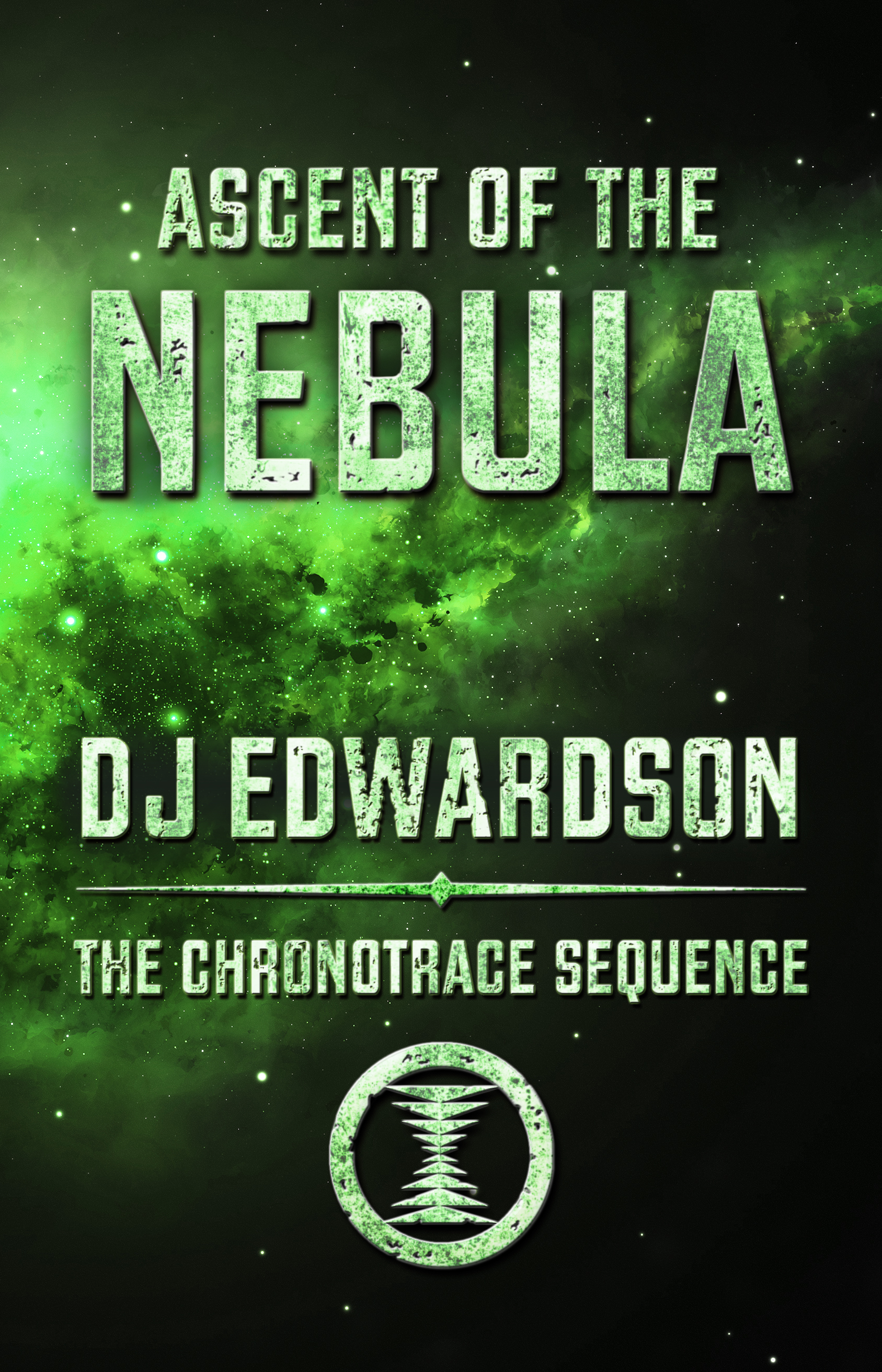
Honestly, I don’t think there’s much I would change. The branding is consistent across all three volumes, but the changing color scheme keeps them distinct, and the motif of strong typography over textured background works for me.
If I were to try to tweak anything, I’d see if I could adjust the kerning on “Nebula” (and while I was at it, on “Viscera” on the second book) so that I could enlarge that whole word — I like the way that “Vast” takes up the space on the first cover, and I’d want to imitate that more. But aside from that one thing…
Anyone else have a different take?
I’ll second what Nathan wrote, especially with regards to brand continuity. Fine looking series of sci-fi covers.
I like it, but I lack the sophistication of Nathan’s eye in this. I think the simplicity of linking the covers using colors the way you have is very effective in my opinion. I must be getting soft because this is the second cover submission I’ve deemed good to go recently, but I really do mean it.
Nice work.
Overall it’s good, and if we’re talking about brand continuity, it’s perfect. I like the colors, values, typography, and that series symbol.
Just taken on its own, though, I could do with stronger imagery. Because while it really grabs my eye well, there’s no meaning to it, nothing in the visuals (aside from the words) that could make me go “ooh, what’s this about?” (Especially since it’s not actually about nebulas.) It’s not essential, but some kind of meaningful image would hold my interest longer.
If you don’t want to do that, I’d go ahead and jack up the size of your typography so it fills the space more completely, since that’s the focal point anyway.
PS there are some halos on the nebula layer visible at full size. I’d blur those out, but it’s very minor, and that’s my only technical note.
Aside from the little tweaks of kerning (the V+A in Vast could also be a bit closer) these covers are great in my opinion.
Very well done.
The only problem I have is the title of Through the Viscera. Its might be just me, but yuk! The others are fine, and more than fine, and I like the covers in general, but viscera doesnt seem to fit, and I get a strong feeling of gross wetness and gore. Is that intended?
Well, what can I say? If there were any real problems with this kind of cover, those would have been obvious from this trilogy’s first cover, and the whole series would have needed an overhaul. Since there’s not any problem, and the covers pretty accurately reflect what the series is about (characters operating on a desert world named Vast; hey, there’s the desert right there on the first cover!), I see no need to mess with a winning formula now. All the author needs to do is ensure the cover styles and branding are consistent, as they are. At most, only some of the minor font tweaks others on here are recommending should be attempted; otherwise, leave the cover as it is.
They all look pretty good to me, too.
Nicely done. Though, for me, the word VISCERA and it’s series title are a little hard to read over the busy background, but it’s a strong enough font that it almost works. But I know that’s not the one we are critiquing. Ditto the kerning comments, otherwise good to go.
Kindly,
Tamian Wood
Graphic Designer