The author says:
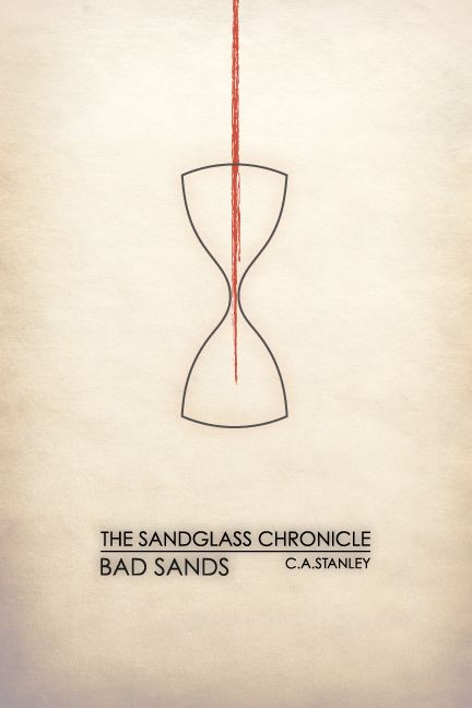
Title: Bad Sands (The Sandglass Chronicle #1)
Genre: Sword and sorcery fantasy
Target audience: Young adult
Set in the fictional land of Ternia, in the year 99 AS. After the Sunder War, 99 years ago, the people of the three continents of Ignisk, Glyne, and Fernlea mostly avoid contact with one another. A young man, born and raised in the great West Desert of Ignisk, must make the perilous journey north to Glyne in order to save his mother from an illness not seen since the war. Unforeseen developments steer his path, but will it lead to glory, or disaster?
Nathan says:
I like the whole “minimalist movie poster” thing as much as the next guy, but I fear it has misled a generation of designers. The reason that those movie posters can work is that we already know the movies in question — so when we see an iconic image from that movie, we can identify it and understand the image and its meaning. But if you’ve ever looked at one of those posters for a movie with which you’re completely unfamiliar, it falls flat because it’s completely meaningless to you.
This cover exhibits the same problem. If we already knew and loved the book, then this cover could be a witty encapsulation or callback to a central image of the story… but if you’re marketing your book only to people who have already read it, I’m thinking you’ve confined yourself to a very small market segment indeed.
Now, I actually like the type treatment very much, and I think it could work wonders with a different image (and if it were larger — there’s no reason to confine it to the center of the cover). But there’s nothing here to tell the potential reader of YA sword-& sorcery that THIS BOOK IS FOR YOU, which is what a cover’s primary mission is.
But like I said, I like the print. I think it could work very well to tell the potential reader that this is “not your father’s high fantasy” — but only if juxtaposed with artwork that tells them that it is fantasy.
Other comments?
I’ll second what Nathan wrote. When I first saw the image I thought that I was on the wrong site. I’m afraid that you’ve taken the minimalism too far. 🙁
I agree. This would be a great cover for a mid-century literary novel, but that’s not what it is. At all. This is YA fantasy, so that’s what you need to go for.
I think it’s a striking design…but perhaps not for your book. As others have pointed out, it does not say “young adult fantasy.” In fact, it doesn’t say “fantasy,” young adult or otherwise, let alone sword and sorcery.
Minimalism can work fine so long as the graphics chosen are meaningful to someone unfamiliar with the book, and doing this is certainly possible. In this case, you have to ask yourself: What would this cover say to someone seeing the book for the very first time? Is it a fantasy? a mystery? an historical thriller? It’s impossible to tell.
Even if the book were not for young adults, there are problems. Not the least of which is the ambiguity of the red streak. I presume it’s meant to be a stream of blood…but it simply does not look very much like that.
This cover reminds me a lot of the bleak seventies young-adult sci-fi that I read as a kid, and would be a GREAT cover for that genre.
Fantasy, though, not so much. I think the audience needs a slightly more obvious hook.
It’s just all wrong. This is a sword and sorcery book? Then by God there ought to be a sword and some sorcery on the cover! Go on Amazon and search “sword & sorcery” and have a gander at the cover art you see. THAT’S the look you’re going to want if your book is to sell. The trick is to make it look like the others but not.
Best of luck.
I think that for this book, a hourglass made in a style similar to the previous entry would work great. Or, one of these: http://www.amazon.com/s/ref=nb_sb_noss_1?url=search-alias%3Dgarden&field-keywords=hourglass+dragon . You could buy one, get someone with a good camera to take a high resolution photo of it, then get someone with good PhotoShop skills to cut it out and maybe add some magical effects inside the glass. Or find a good artist to draw you one. I think it would look striking on a cover. (and now I’ve got an urge to draw one :/)
Yes, the cover’s definitely too minimal, especially for young adults. Even in the UK, with its publishers’ liking for simpler covers, your target audience likely wouldn’t give this book a second glance. Here in the USA, it’ll sink without a trace. Your prospective readers are going to want to see some details before they’ll give your book a try.
Hourglasses and other sand clocks are not the most common motif in fantasy, but they have put in some appearances before. For your inspiration, I recommend looking to the dusty Middle Eastern fairy tales and fantasies as reference points. For younger audiences, Disney’s Aladdin captured this style in animation rather well. For more mature audiences, Prince of Persia: The Sands of Time (hey, another Disney movie!) may not have been the most memorable film, but its poster also captured this style in live action rather well and the film did prominently feature a giant sand clock as one of its central plot devices.
In fact, I would especially look to all things Prince of Persia-related for your artwork, as your story seems to have much the same kind of setting as the movie and games. Even if you’re thinking to work with a more western style with something more like the Arizona deserts with their blooming saguaro cacti and other prickly plant life rather than the dusty dunes of the Sahara or the barren rocky terrain of the Sinai Desert in Saudi Arabia, the Prince of Persia franchise deals a lot more with the sand clock motif at the heart of your story than just about anything else.
In any case, get some actual stock image or three-dimensional rendering of a sand clock to go on your cover. In the thumbnail as it stands now, your cover looks more like the kind of scan of a child’s scratchings that end up in the “art for a refrigerator” section on Lousy Book Covers. With all the sand clock and desert imagery available on the internet these days, I know you can do better than this. While you’re at it, you might want to look into some desert-themed weapons and magic as well; if this story is actually more in the Middle Eastern style, you might want to go with some scimitar-and-sorcery imagery showing your protagonist and other prominent characters dressed in robes and turbans and veils and the like in addition to the sand clock motif.
I’m torn. This is a lovely confident design, and this is from someone whose not usually too fond of minimalist posters. In another context I’d say go for it. E.g., if the books was non-fic in the vein of Malcolm Gladwell or something. Or even a YA book coming out from a major publisher with lots of promotion. You might be able to get away with something so different and fresh for the genre. Though even then, I feel the cover would need to give a little more away in terms of genre and readership.
But in this market you’re really leaning on cover artwork to do a lot of work and get the right audience at a glance. This won’t attract your readership, sadly.
It sounds like you’re book isn’t quite the current usual YA fare and is something slightly more akin – as Matt Nelson said – to the kinds of teenage fiction published in the 60s and 70s. So I can see why you’re veered towards this a-typical vibe. There’s got to be a happy compromise between this and a cover that would do a better job of grabbing the right audience’s attention, though…
Dammit, I told myself I wasn’t going to do any more of these cover mockups today, but my urge to procrastinate plus the unique challenges these covers presents has sucked me in again!
http://nestofstraightlines.tumblr.com/private/140801271631/tumblr_o3twfx3vJw1rv70iu
So this might be the start of a direction including more of a traditional illustrative element that gives the idea of setting and genre without losing the simplicity of the original design altogether.
It’s still far from a satisfactory cover for the job, especially at thumbnail size, but it might give you some thoughts on how to bring more genre trappings into your cover without losing your minimalist image.
Neat!
Still looks like a mid-century sci-fi novel. Could totally be the cover of a Dune novel. There’s still nothing here that would suggest to a 16-year-old that this was for them.
I guess I was thinking of something like this: https://www.waterstones.com/book/lirael/garth-nix/9780007137336
something has its cake and eats it – clearly says ‘fantasy’ and ‘YA’ with an atmospheric illustrated element, but also has a strong, dominant graphic that somehow makes the book look classier and more interesting than run-of-the-mill fantasy.